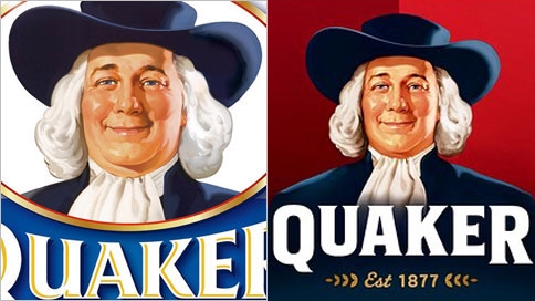
Given our collection of toy make-overs, I was curious when I heard that Quaker Oats had re-vamped their mascot, Larry. In the toys we’ve covered, the trend is towards greater feminization and sexualization. Larry, though, is a dude. And do we really need to sexualize our oatmeal? (Well, you never know.)
It turns out what prompted the mascot make-over wasn’t an effort to make Larry sexier, but to make him look healthier. According to the Wall Street Journal, the director of Quaker’s brand-design firm wanted to reinforce people’s association of oatmeal with “energy and healthy choices.” And by “healthy,” they mean “thin.” They reduced the roundness of his chin and cheeks. They also gave him a hair cut in order to expose the sides of his neck. Another representative of the brand redesign explains: “It’s the same neck,” but the haircut “makes him look thinner… We took about five pounds off him.”
If it’s tough for you to tell the difference between the two, it’s by design. Quaker wants the changes to work on a subconscious level. A fascinating peak into the motives and tactics of brand management.
Lisa Wade, PhD is an Associate Professor at Tulane University. She is the author of American Hookup, a book about college sexual culture; a textbook about gender; and a forthcoming introductory text: Terrible Magnificent Sociology. You can follow her on Twitter and Instagram.

Comments 22
Umlud — April 9, 2012
What has piqued my interest is a potential inference of peak in the OP's commentary. Color me peaked for having to try and determine what it might be. Please, oh please, can I just have a peek to see what you meant here?
;-)
Anonymous — April 9, 2012
I made a quick morphing video of the two faces:
http://dl.dropbox.com/u/15095292/quaker_oats_skinnier.avi
Christakacs — April 9, 2012
It's because he has been playing soccer:
http://articles.chicagotribune.com/2012-01-17/sports/chi-fire-gets-jersey-deal-with-quaker-oats-20120117_1_quaker-oats-jersey-andell-sports-group
guesty — April 9, 2012
Humorously, I don't see him as that much "thinner". Just "Younger". Which may also be on purpose.
Beth G. — April 9, 2012
It's clearly not the same neck, since there are highlights present in the old logo that are in shadow in the new logo, clearly showing a reduction in flesh poking out and getting hit by the light. So they are blatantly lying about that, perhaps as part of their effort to make the changes subconscious, like this post says.
Heather Zeigra — April 9, 2012
They also changed the way his ascot lays.
Juliet Jimenez — April 9, 2012
Change on a subconscious level? No, it's perfectly obvious that Larry lost about 50 pounds.
MPS — April 9, 2012
My doctor tells me its healthier to be thinner. At least, as I understand her, thinner than that guy.
Dianna Fielding — April 9, 2012
This may just be due to scanning, but he also appears to be more "tan" than in the original. I know in past posts there has been discussion about how white people tan as a sign of status. That may also be an attempt at swaying our subconscious minds.
Samuel A R Shipley — April 9, 2012
Is it just me or does the new guy look suspiciously like Speaker Boehner?
Gunnar Patriksson — April 10, 2012
Needs more sex appeal. I want my oatmeal to be part of a titillating breakfast!
Gilbert Pinfold — April 10, 2012
Those marketing gurus are devilishly clever. Or maybe... All those creative execs; all those salaries; all those workshops; all those consultants; all those meetings; gotta come up with something.
Ariel — April 10, 2012
Interesting post. But the difference is so damn subtle I think it's mostly negligible. I mean, is it ever ok for a company to re-vamp their mascot/product/branding? Or are they just supposed to do so in a vacuum where race/class/sex/sexual orientation and identity/ethnicity/body size/health status don't exist or have influence?
Francois Tremblay — April 10, 2012
I see no difference whatsoever. Someone needs to superpose the two so we can see...