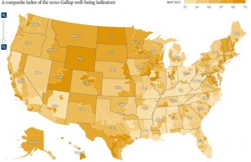
Kristina K. sent in a link to an interactive map at the New York Times that shows the results of Gallup’s 2010 polls of well-being. [UPDATE: Reader Danielle pointed out I forgot to provide a link to the map. Sorry! You can find it here.] Gallup surveys 1,000 people per day about a variety of indicators of well-being, including questions about physical, mental, and emotional health, various health-related behaviors, ability to access health care, access to adequate food and housing, and perceptions of their communities. Here are the overall composite scores, by congressional district (a higher score is better):
The general geographic pattern indicates a swath of relatively low well-being curving from Louisiana up through Michigan, while those in the upper Great Plains and the inter-mountain West are doing better than average.
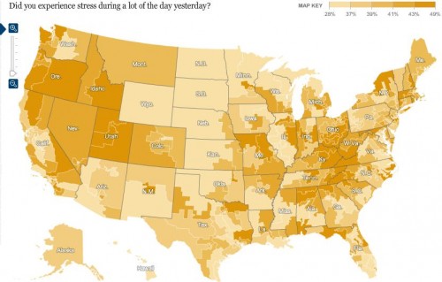
Percent reporting experiencing a lot of stress:
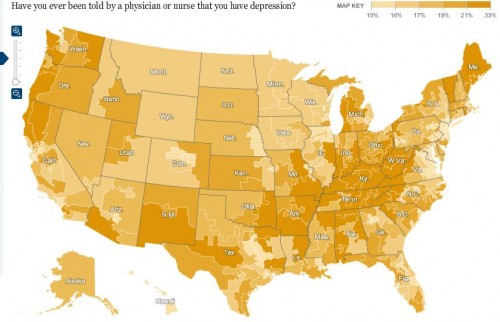
Percent who have ever been told they have depression:
Of course, this may reflect differences in rates of depression, but it could also reflect differences in medical professionals’ likelihood of identifying a set of symptoms as depression and bringing it up with a patient. For example, we see significant differences by state in the frequency of Caesarean sections among pregnant women.
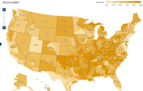
Percent of people who smoke:
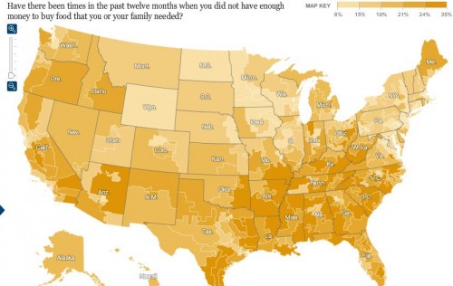
Percent reporting an inability to buy sufficient food:
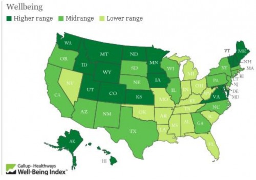
The Gallup page on well-being presents more data. Here is a map of 2009 overall well-being that is a bit easier to read since it’s presented by state rather than congressional district:
Hawaii had the highest overall score, at 70.2; West Virginia had the lowest, 60.5. If you go to their site and click on a state, you can get a breakdown of scores in each area (emotional well-being, physical health, healthy behaviors, and so on).
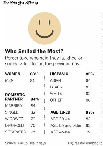
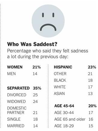
Finally, the NYT provides some demographic information on who was most likely to have said they spent a lot of the previous day laughing or smiling vs. being sad:

Comments 17
Dena — March 7, 2011
Women and Hispanic people are most likely to be both sad and smiling? Not that much of a surprise, I guess.
Marc — March 7, 2011
What a great post! interesting that neither Kentucky nor West Virginia has one single congressional district that isn't miserable. Considering the enormous quantity of weed grown in both states......
danielle — March 8, 2011
You should post (give credit to) the actual link to the interactive maps. I'd like to be able to zoom and have no idea where the originals are, other than somewhere on the NYT site.
danielle — March 8, 2011
LINK to the interactive maps, originally provided at the NY Times website:
http://www.nytimes.com/interactive/2011/03/06/weekinreview/20110306-happiness.html?scp=5&sq=well-being&st=cse
gasstationwithoutpumps — March 8, 2011
Why do you believe that the lower-resolution map is "easier to read since it’s presented by state rather than congressional district"? It hides some very important distinctions between coastal and inland California. The Congressional districts are closer to being the same size in terms of population, so presents a much clearer picture of the situation.
Makenzie — March 8, 2011
Is anyone else startled by how well Alaska is doing? I've always seen stats that indicated we had a lot of depression, suicide, alcohol abuse, etc.
I’d Be Stressed If I Had To Live In Buckeye Country « Zach Attack — March 8, 2011
[...] I’d Be Stressed If I Had To Live In Buckeye Country Here’s an interesting map of stress levels throughout the US. Courtesy of Sociological Images. [...]
R F — March 8, 2011
With Maine as an example, does the transition from the overall state of well-being in 2009 vs the apparent disparity of data presented (e.g. depression rates + poor access to food_ undermine the validity of the study? Also, as a New Englander, I was surprised to see that those who live in Western Massachusetts reported greater stress than those who live in the greater Boston region. Given, Western Massachusett's liberal and rural reputation, perhaps those who responded to the survey had a relative conception of their stress levels.
Waiting Room Reading 3/11…Plus Time Mag Articles « Welcome to the Doctor's Office — March 11, 2011
[...] MAP OF U.S. WELL-BEING INDICATORS by Gwen Sharp [...]
Emma Brooks — August 10, 2025
ealth campaigns, whether in 1922 or today, show how public messaging shapes both medical awareness and social expectations. In modern contexts, navigating health regulations can be just as complex, especially for professionals seeking to practice abroad. That’s where Felix Happich Consultancy helps, guiding healthcare providers through UAE licensing so they can focus on delivering quality care rather than paperwork.