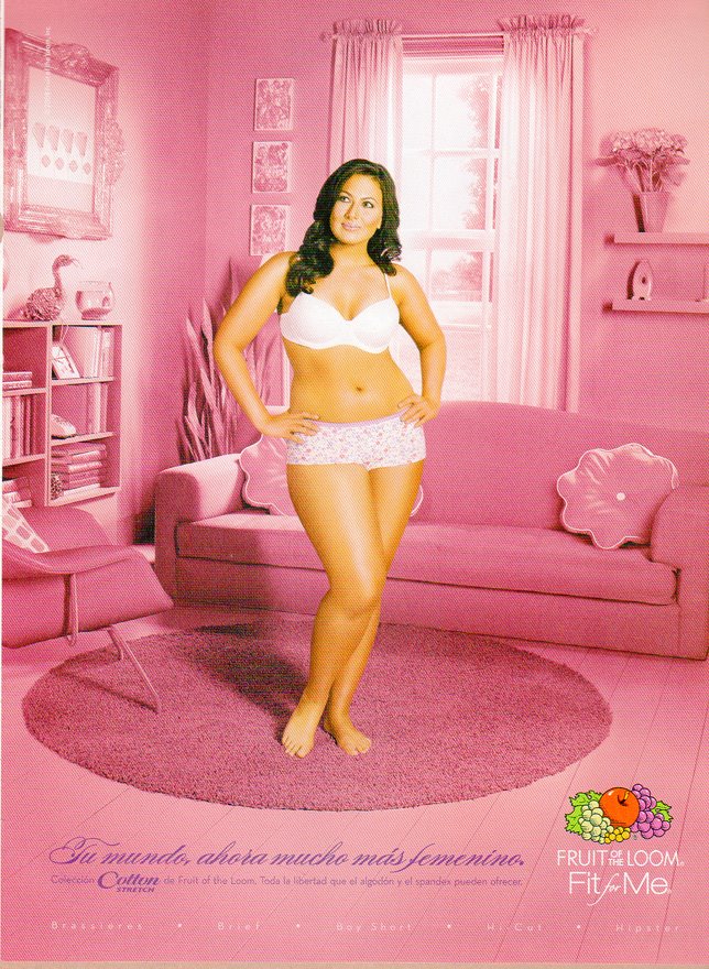
Multicult Classics posted these two Spanish-language Fruit of the Loom ads. They are an extra nice example of the way that color is used to communicate gender:
Text: “Your world, now much more feminine.”
See also this post of kids with their stuff, these pictures of the Toys ‘R Us aisles, these breast cancer PSAs, and these guns marketed to women.
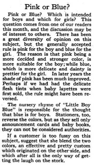
It’s obvious to us, today, that pink is for girls. But it wasn’t until about the 1950s that our current gendered color scheme became widely accepted. Before that, the colors were reversed. In this excerpt for a vintage advice column (found here), we learn that:
“…the generally accepted rule is pink for the boy and blue for the girl. The reason is that pink being a more decided and stronger color, is more suitable for the boy; while blue, which is more delicate and dainty is prettier for the girl.”


Comments 19
anon — September 3, 2008
i think the first image is a good example of how what is considered attractive varies by culture. the same image would probably not be run in the US because of her size (even though, in my opinion, she is a beautiful woman).
Dubi — September 3, 2008
Only goes to show we're not a rational species, we're a rationalizing species...
anon — September 3, 2008
i just got my most recent copy of Eurosport (a soccer catalog), and opened it shortly after reading this post. Found it interesting that women's gear section is indicated by a running header at the top of each page, distinct from the rest of the mag, in that it's blue. It's Carolina blue (UNC has been DOMINANT in women's college soccer for a LONG time), which may have a lot to do with it, but - blue none the less.
Anonymous — September 5, 2008
The things that strike me about these is the contrast of the size of the models and the types of undergarments. The thinner woman is shown with stereotypical 'sexy undies' where the larger woman is shown with a less overtly sexual choice.
The implication seems to be you don't get/need to be sexual if you have curves.
Dubi — September 5, 2008
Anonymous - that's a funny reading of it. Why isn't it more reasonable that the implication is "the sexy undies won't look good on your if you're not thin"?
Tim — September 7, 2008
It's OK to be sexual if you have curves, once one has rolls though, things are different unless one is in a society that finds obesity attractive.
Sociological Images » GUEST POST: BEAR WITH US — December 22, 2008
[...] couple of days later, Lisa at Sociological Images had a post reminding us that pink was once the color for boys. She linked to an article by Ben Goldacre in the [...]
Business Memes » GUEST POST: BEAR WITH US — December 30, 2008
[...] couple of days later, Lisa at Sociological Images had a post reminding us that pink was once the color for boys. She linked to an article by Ben Goldacre in the [...]
Michelle — April 26, 2009
The "Fit for me" brand is plus-size, thus the plus-size model.
Розово и синьо… | Даниела и Михаил — May 18, 2009
[...] guardian.co.uk, снимки: thesocietypages.org и [...]
B — July 3, 2009
what the name of the girl in the first pic?
Unico — August 15, 2009
First poster "anon". You are incorrect.
There are plenty of ads of women of various size in US magazines.
When Pink Was For Everyone: 1950s Bathrooms » Sociological Images — March 29, 2010
[...] it’s certainly here now, pink didn’t stabilize as a girls-only color until sometime in the 1950s. During that decade, pink was the in-style color for bathrooms in residential homes. Notice [...]
Michael Lawrence — June 28, 2011
I find it interesting that most of the comments deal with the models and less with the content of this post. In the '80s pink for guys was a hot trend. It has died down, but it is still okay for guys to wear pink. What it comes down to now is not necessarily the colour so much as the style. A pink polo shirt might be more socially acceptable than a pink v-neck tshirt on a guy, but then who knows...
“Pink or blue?” « Thinking Aloud — August 22, 2011
[...] Continue reading at thesocietypages.org The Sunday Sentinel in 1914 told American mothers: “If you like the colour note on the little one’s garments, use pink for the boy and blue for the girl, if you are a follower of convention.” Some sources suggest it wasn’t until the 1940s that the modern gender associations of girly pink became universally accepted. Pink is, therefore, perhaps not biologically girly. Boys who were raised in pink frilly dresses went down mines and fought in the second world war. Clothing conventions change over time. [...]
Cosas de hombres: hablar mucho, usar tacones y el color rosado. | Psicoloquio — January 26, 2013
[...] cultural temporal: antes de 1740, los hombres utilizaban tacones, y hace menos de un siglo, el rosado era para niños y el azul para niñas: …la regla generalmente aceptada es que el rosado es para el niño y el azul para la niña. [...]
Cosas de hombres: hablar mucho, usar tacones y el color rosado. — forosexy.com — February 4, 2013
[...] temporal: antes de 1740, los hombres utilizaban tacones (nota similar), y hace menos de un siglo, el rosado era para niños y el azul para niñas (nota relacionada): …la regla generalmente aceptada es que el rosado es para el niño y el azul [...]