
Where you grow up is consequential. It plays a critical role in shaping who you are likely to become. Where you live affects your future earnings, how much education you’re likely to receive, how long you live, and much more.
Sociologists who study this are interested in the concentrated accumulations of specific types and qualities of capital (economic, cultural, social) found in abundance in certain locations, less in more, and virtually absent in some. And, as inequalities intersect with one another, marginalization tends to pile up. For instance, those areas of the U.S. that are disproportionately Black and Latino are also areas struggling economically (see Dustin A. Cable’s racial dot map of the U.S.). Similarly, those areas of the country with the least upward mobility are also areas with some of the highest proportions of households of people of color. And, perhaps not shockingly (although it should be), schools in these areas receive fewer resources and have lower outcomes for students.
How much education you receive is, in part, a result of where you grow up. Think about it: you’re be more likely to end up with at least a bachelor’s degree if you grow up in an area where almost everyone is at least college educated. It’s not a requirement, but it’s more likely. And, if you do and go on to live in a similar community and have children, your kids will benefit from you carrying on that cycle as well. Of course, this system of advantages works in reverse for communities with lower levels of educational attainment.
Recently, a geography professor, Kyle Walker, mapped educational attainment in the U.S. Inspired by Cable’s map of racial segregation, Walker visualizes educational inequality in the U.S. from a bird’s eye view. And when we compare Walker’s map of educational attainment to Cable’s map of racial segregation, you can see how inequalities tend to accumulate.
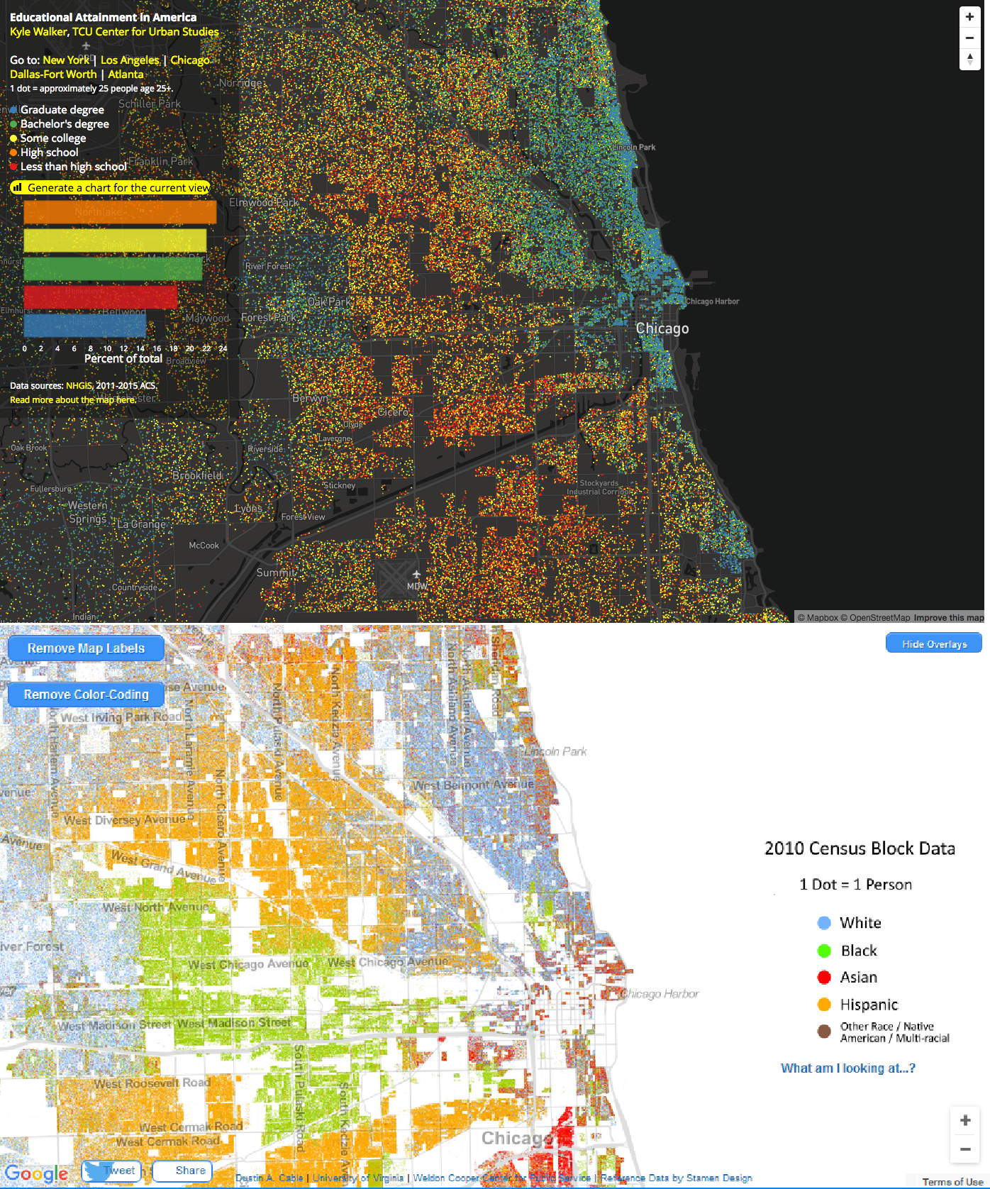
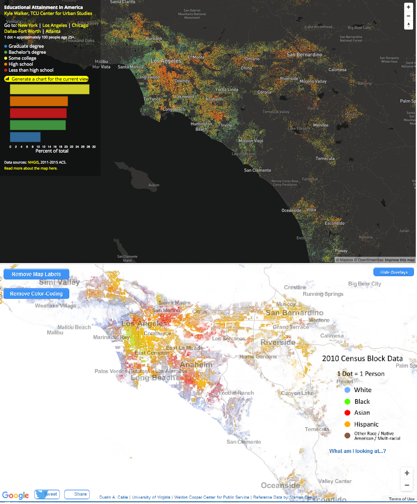
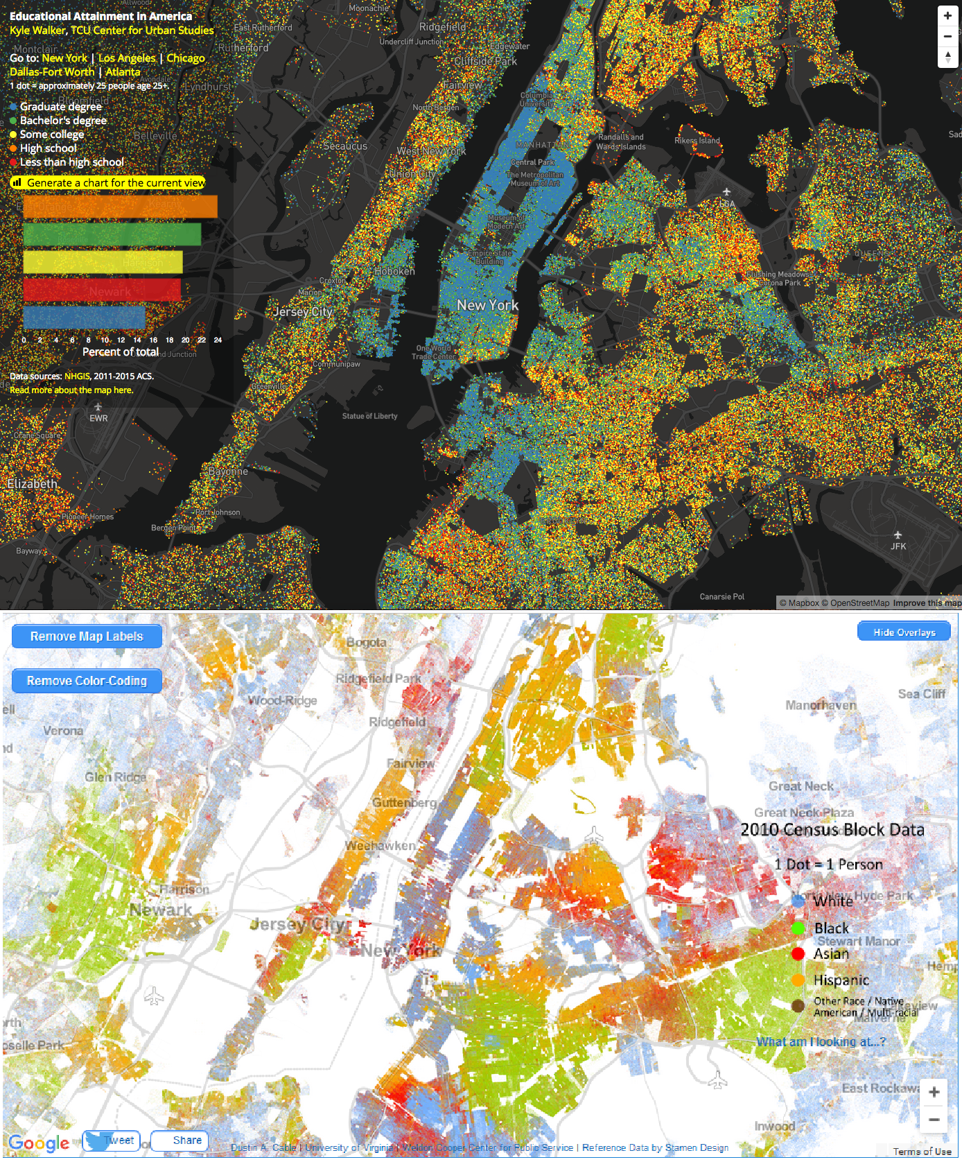
Below, I’ve displayed paired images of a selection of U.S. cities using both maps. In each image, the top map illustrates educational attainment and the bottom visualizes race.
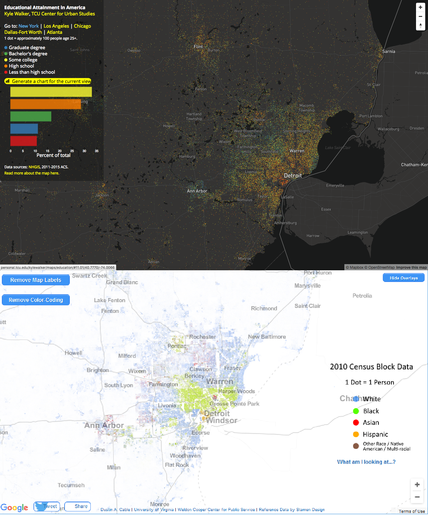
- On Walker’s map of educational attainment (top images in each pair), the colors indicate: less than high school, high school, some college, bachelor’s degree, and graduate degree.
- On Cable’s map of racial segregation (bottom images in each pair), the colors indicate: White, Black, Hispanic, Asian, and Other Race/Native American/Multi-Racial.
So, one way of comparing the images below is to look at how the blue areas compare on each map of the same region.
Below, you can see San Francisco, Berkeley, and San Jose, California in the same frame using Walker’s map of educational attainment (top) over Cable’s racial dot map (bottom).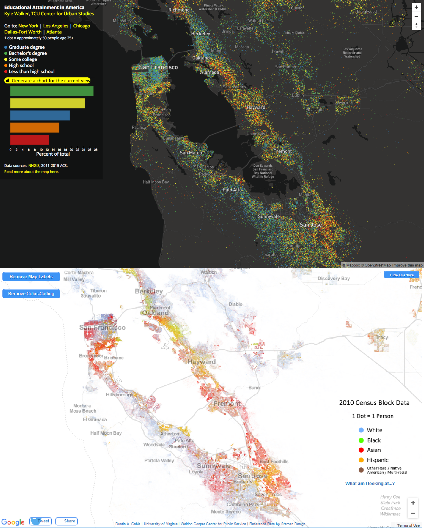 See how people are segregated by educational attainment (top image) and race (bottom image) in Chicago, Illinois:
 Los Angeles, California:
 New York City:
 Detroit, Michigan:
 Houston, Texas:
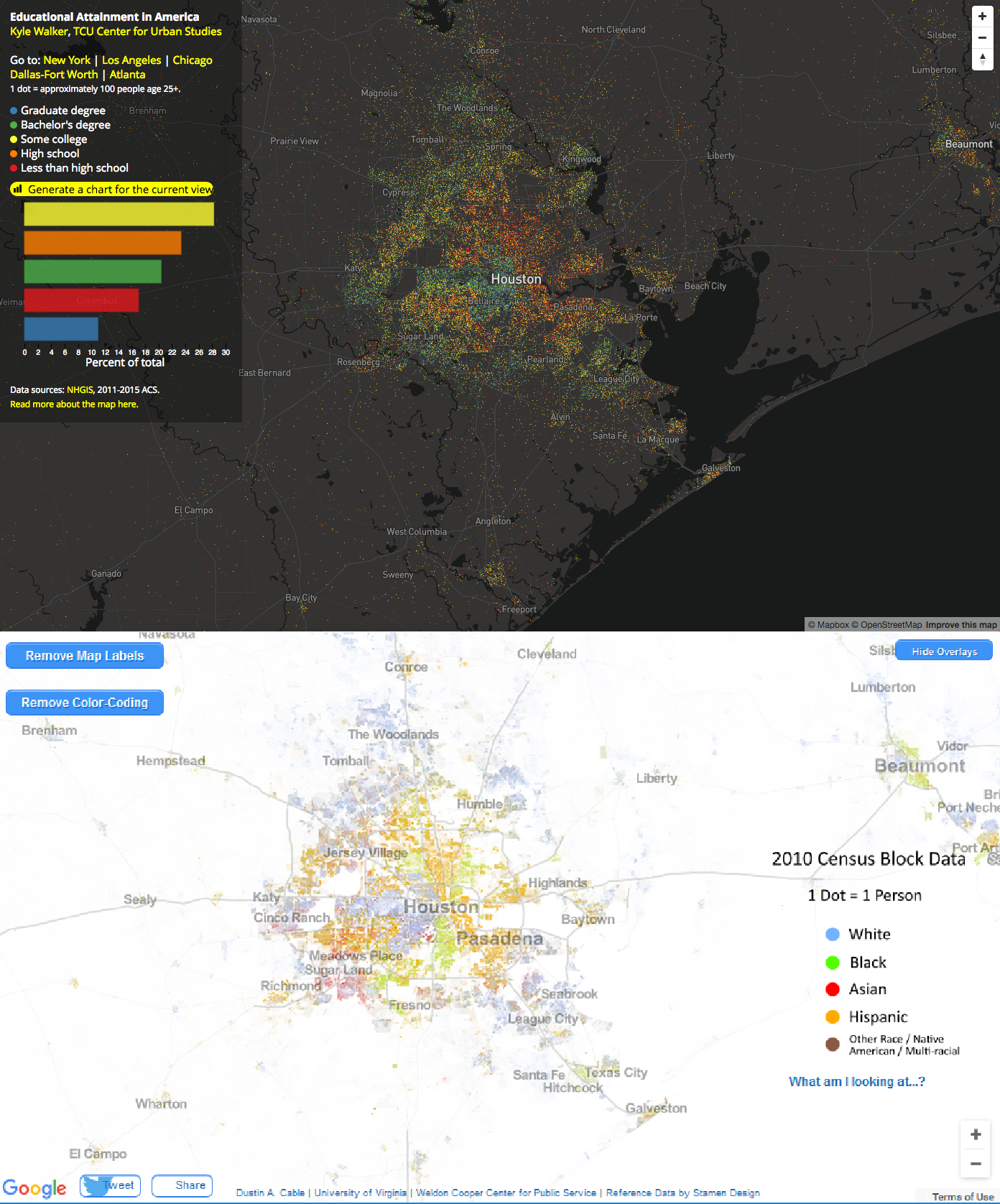 Compare regions of the U.S. examining Walker’s map with Cable’s racial dot map, you can see how racial and educational inequality intersect. While I only visualized cities above for comparison on both maps, if you examine Walker’s map of educational attainment, two broad trends with respect to segregation by educational attainment are easily visible:
- Urban/rural divide–people with bachelors and graduate degrees tend to be clustered in cities and metropolitan areas.
- Racial and economic inequalities–within metropolitan areas, you can see educational achievement segregation that both reflects and reinforces racial and economic segregation within the area (this is what you see above).
And, as research has shown, the levels of parents’ educational attainment within an area impacts the educational performances of the children living in that area as well. That’s how social reproduction happens. Sociologists are interested in how inequalities are passed on to subsequent generations. And it is sometimes hard to notice in your daily life because, as you can see above, we’re segregated from one another (by race, education, class, and more). And this segregation is one way interlocking inequalities persist.
Tristan Bridges, PhD is a professor at the University of California, Santa Barbara. He is the co-editor of Exploring Masculinities: Identity, Inequality, Inequality, and Change with C.J. Pascoe and studies gender and sexual identity and inequality. You can follow him on Twitter here. Tristan also blogs regularly at Inequality by (Interior) Design.
Comments 26
Carl Armstrong Jr. — March 24, 2017
https://www.youtube.com/watch?v=jX1uTui5I2c
Actually...
"Where you grow up is consequential." is, in fact wrong. In a modern, commercial society, where you live in terms of resources and--often--opportunity isn't consequential. Most of the people you are talking about are a few minutes car ride from each other, or a little longer on the bus.
What is consequential is WHOM you grow up with and what their influences are on you.
So...
" as research has shown, the levels of parents’ educational attainment within an area impacts the educational performances of the children living in that area as well. "
Isn't really about location, it's about social and cultural networks.
Likewise, if you compare other, insular populations like the Jewish populations in Europe which often are very physically distant from each other but quite close in terms of culture, you see comparative results for things like economic success based on culture and not on location.
However, you can use location as a shorthand for "neighborhoods" as in first order non-familial social networks. And, when you do so in places like Chicago, you find the failures upon which the crime rate revolves.
So, like the semi-fictional Longshanks said in Braveheart: "The trouble with Scotland, is that it is full of Scots" describes both his problem in the film and the sort of relationship you're talking about here. Location is irrelevant until you consider the population, their relationships, and the like. The differences--urban/rural divide, racial and economic inequalities, etc.--are not due to location but self-organization of cultures. Unless or until you move people around AND integrate them into the new location's culture, you won't see much change, only a reactive move (over time) of the cultures into other self-organizing areas.
Or, in other words, the suburbs keep moving out, the slums keep following until the property values snap back and gentrification displaces slums, starting the process again with new people and old cultures...
Education | Marginal Benefits — March 28, 2017
[…] Read Tristan Bridges, Sociological Images, Mar 20 , 2017 Racial and Educational Segregation in the US […]
A Year in Review and Best of 2017 – Inequality by (Interior) Design Edition – Inequality by (Interior) Design — January 10, 2018
[…] visualizing new data on shifts in the size and composition of the LGBT population in the U.S., or my post visualizing how racial and educational segregation overlap in the […]
L. Sted — October 26, 2018
Carl, I feel that you are leaving out way too many variables here. Self-organization of cultures comes second to location. A certain location may be the foundation for socio-economic barriers to upward mobility, no matter which culture 'self-organizes' there.
Race, Education, Running and Spatial Inequalities – Inequality by (Interior) Design — February 26, 2019
[…] while ago, I wrote a post at Sociological Images looking at the ways Dustin A. Cable’s map visualizing racial segregation in the U.S. compared […]
Crystal Waston — March 11, 2019
Good post! Racial discrimination is rapidly seen in educational instructions in the U.S. The social research representing through this article, is to some extent the real scenario of racial and educational segregation in the U.S. Anyway, I am an academic writer on GradeFixer. I work with college students. And so I can feel better this social crisis when discussing with them.
Nikki — June 3, 2019
Very nice post, thanks to the author. In general, this is to some extent the real scenario of racial and educational segregation in the United States. I, in fact, have been working with students for a very long time and not only from college students, and this problem is very serious. I am writing about this also in
Papersdude.com. It becomes much easier for me when I write about it.
Nikki — June 3, 2019
Very nice post, thanks to the author. In general, this is to some extent the real scenario of racial and educational segregation in the United States. I, in fact, have been working with students for a very long time and not only from college students, and this problem is very serious. I am writing about this also in
PapersDude.com. It becomes much easier for me when I write about it.
LisaTaylor — October 29, 2019
Great blog design. I like to follow your creative ideas in blogging. If you are looking for high-quality text on any topic, we https://subjecto.com/ will help you at any time of the day quickly and efficiently. Keep delighting us with new posts!
AnderSunny — December 23, 2019
Hey there!
Pollution is really a serious threat to humanity all around.It needs to be managed as soon as possible. With detailed composition and writing we need to spread awarness https://mystudentsessays.com/essay-on-pollution/ about it everywhere
regards,
Sandra Gibbon — December 23, 2019
Pollution is really a serious threat to humanity all around.It needs to be managed as soon as possible. With detailed composition and writing we need to spread awarnessPollution
Randy Olse — December 27, 2019
A. The following provides information on the vehicle oil capacity and for each type of engine oil:
Vehicle Engine Type https://carfluidfinder.com/
1. Transmission Type Oil Capacity (The vehicle oil capacity of the engine used by your vehicle is obtained by dividing the Capacity shown in Column B of the table by 7).
In this table Engine Capacity has the symbols "1" for 4 cyl. gasoline engines and "2" for diesels.
2. All other Engines or vehicles engine oil capacity (The vehicle oil capacity of your vehicle is obtained by dividing the Capacity shown in Column C of the table by 3).
Note: The proper type of engine oil to use depends on how fast your vehicle is moving and on
Nick — January 2, 2020
Good article. Thanks. Check these templates for your essay writing - https://noplag.com/essay-writing-templates/
How to celebrate Happiness with Friends and Family — January 19, 2020
[…] My Hobby Essay 500 words for High School & College Students […]
Carter12 — July 25, 2020
More info at http://essaypapers.reviews/
Carter12 — July 25, 2020
More info at http://essaypapers.reviews/
Jay N Myers — November 10, 2020
Hey there!
Pollution is really a serious threat to humanity all around. I, in fact, have been working with students for a very long time and not only from college students, and this problem is very serious. I also write it about and a blog called infotainmentbeatsCover my story as well.
BathroomScan.com — November 24, 2020
Thanks for pointing this serious matter, good luck. Because pollution is becoming a serious matter day by day and your efforts are priceless towards this matter.
Jenifer Daisel — November 24, 2020
You are doing priceless efforts towards a very serious matter, what would I like to say is good luck and be strong, I Would love to cover your story on my blog Bathroom Scan
ahmad raz — December 3, 2020
Well , extensively informative article but i am not completely agreed with your all detail, I belongs to pakistan where winter season is aggressively intense , we need to use warm cloths like Sweater, fur jeans etc...
sophia — March 26, 2021
Hello,
I have read this post and find out this post very informative. I have check some videos on youtube.com! youtube about this and the information shared in this blog is the fact.
May 17, 1954 – Over Sixty Years After Brown v. Board of Education – What Has Changed? | Legal Legacy — March 28, 2021
[…] can read a thorough 2017 update of data on racial and educational segregation in the U.S. here. The Southern Poverty Law Center published an analysis in 2020 […]
Stella — August 11, 2021
This content is very well written.
Susan — December 5, 2022
Tristan, as always the best of the best is written, and this thesocietypages article is no exception to the rule! Thank you for the work you've done.
Phoebe — November 21, 2023
. It offers wide variety of earrings designs.
Allen — June 26, 2024
Cisco 200-301 Dumps Questions are practice exam questions that help candidates prepare for the Cisco Certified Network Associate (CCNA) certification exam. These dumps typically include a variety of questions covering the exam's core topics such as network fundamentals, network access, IP connectivity, IP services, security fundamentals, and automation and programmability. They are designed to simulate the actual exam environment, allowing candidates to test their knowledge, identify areas for improvement, and build confidence before taking the official certification test.