
 At Junk Charts, Kaiser Fung drew my attention to a graph released by Reuters. It is so deeply misleading that I loathe to expose your eyeballs to it. So, I offer you this:
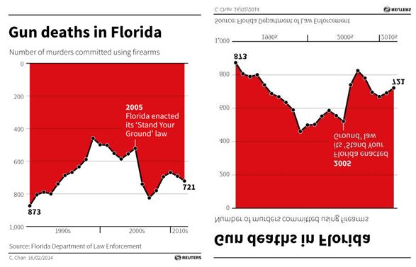 The original figure is on the left. It counts the number of gun deaths in Florida. A line rises, bounces a little, reaches a 2nd highest peak labeled “2005, Florida enacted its ‘Stand Your Ground’ law,” and falls precipitously.
What do you see?
Most people see a huge fall-off in the number of gun deaths after Stand Your Ground was passed. But that’s not what the graph shows. A quick look at the vertical axis reveals that the gun deaths are counted from top (0) to bottom (800). The highest peaks are the fewest gun deaths and the lowest ones are the most. A rise in the line, in other words, reveals a reduction in gun deaths. The graph on the right — flipped both horizontally and vertically — is more intuitive to most: a rising line reflects a rise in the number of gun deaths and a dropping a drop.
The proper conclusion, then, is that gun deaths skyrocketed after Stand Your Ground was enacted.
This example is a great reminder that we bring our own assumptions to our reading of any illustration of data. The original graph may have broken convention, making the intuitive read of the image incorrect, but the data is, presumably, sound. It’s our responsibility, then, to always do our due diligence in absorbing information. The alternative is to be duped.
Cross-posted at Pacific Standard.
Lisa Wade, PhD is an Associate Professor at Tulane University. She is the author of American Hookup, a book about college sexual culture; a textbook about gender; and a forthcoming introductory text: Terrible Magnificent Sociology. You can follow her on Twitter and Instagram.
Comments 57
Mr. S — April 17, 2014
It's a misleading image for sure, but it's not a lie or incorrect.
Also, while I have no doubt that the SYG implementation caused more gun deaths - there must have been situations where someone felt threatened and felt they now had a legal right to defend themselves with a gun. I'm sure there are others who acted more nefariously, and plotted to use the law as a shield.
But I'm wary of charts like this that plot a timeline with an inflection point at a given event; there are countless other variables that can influence gun deaths that are not constant over time. You can't prove cause and effect this way.
Lastly, the longer-term trend is fewer gun deaths since the 1990s. It's even better per capita, since Florida had a population of 13 million in 1990 and is approaching 20 million today. Roughly .0035% today vs. 0067% in 1990.
So I hardly think this is "lying with statistics" (as if that were even possible).
katiehippie — April 17, 2014
Very misleading. That was deliberate to promote an agenda.
Hoffmann — April 17, 2014
I have another point (I saw the image before and did not see the flipped labels):
The graph is promoted as "Gun deaths" but the numbers shown are murders. But if "stand your ground" is in act then in fact a gun death ist NOT a murder! So it's quite astonishing that the number rose instead of dropped (as all the previous gun deaths labled as "murder" woud now not be counted as "murder").
Also, I have absolutely no idea what happend to the number of citizens in florida, anybody has any clue wether they rose or sunk dramatically? It should have been gun deaths/x citizens to be a meaningful graph.
tl;dr
1. it's murders not gun deaths
2. it's absolute and not number of citizens-corrected
Ricky — April 17, 2014
This reminds me of those temperature graphs that tilt up on the right so that there appears to be a dramatic increase in temps but when the graphs are corrected to a straight baseline then there appears to be only a slight increase.
Djiril — April 17, 2014
Well, that goes beyond sneaky. Also, what was going on in the mid-90s?
Someone — April 18, 2014
It was clearly a mistake by the chart's designer: You can see that they tried to create a "dripping blood" effect but reversing the Y axis was just stupid. Ironically it turns the desired message on its head. You could say it was a kind of propaganda but with the opposite intention. Nevertheless, it failed. Don't mess with charts too much.
M — April 18, 2014
Not only is the chart inverted, but the numbers are also wrong (add 400 to each value to get into the actual range). See true chart here: http://www.fdle.state.fl.us/content/fsac/menu/crime-trends/violent-crime.aspx
It is true that there were 248 more murders in 2006 compared to 2005. However, I don't know how Florida defines "murder" in that chart, as they don't have a separate homicide column. The SUBSTANTIAL drop of 663 in forcible sex assaults at the same year might have something to do with the murder rate increase. We don't now whether these statistics comprise of initial reports, where a self defense situation that ends up being confirmed as homicide is registered as murder at the start... or not.
Gun deaths are up. Overall violent crime rate is WAY down. Judge yourself what that means.
Bill R — April 18, 2014
In all seriousness, what do you expect from this bunch...?
mimimur — April 18, 2014
As soon as I saw it, I thought "that is the worst graph I've ever seen"
bmm — April 18, 2014
Apparently it was not deliberate; the designer tweeted that her inspiration was a 2011 chart on Iraq War deaths from the South China Morning Post, which uses an inverted y-axis to chilling effect (http://www.visualisingdata.com/blog/wp-content/uploads/2013/04/IRAQ.jpg). The problem is that the Iraq chart contains multiple cues about how the chart works that are lacking in the Florida chart, beginning with the title ("Iraq's bloody toll"), the placement of the x-axis at the top, making it a bar instead of a line/area graph (which makes it easier to understand that the red is "dripping"), the presence of totals within the red, and the simple fact that there is more white than red, which makes it easier to tell that the white is the background (further helped by it being filled with additional information). So it seems less a matter of intentional deceit (at least on the designer's part) and more one of poor execution.
Pedro Alves — April 18, 2014
In research, we only use below the horizontal axis points if there are negative numbers, not positive!
That graph isn't intuitive on purpose, as it makes no sense to present that data with such representation. It's more than obvious that they tried to trick people.
Cuando el gráfico no miente, pero induce al error | sociologiabierta — April 18, 2014
[…] Lisa Wade, en Sociological Images, tiene un buen ejemplo de cómo aún cuando los gráficos entreguen información veraz y bien fundada, el modo de presentación de los datos puede llevar a los lectores a conclusiones erradas. […]
Avi — April 18, 2014
For those wondering about sources, the data (as far as I can tell) come from FDLE's Uniform Crime Reports (recent ones available from http://www.fdle.state.fl.us/Content/FSAC/UCR/UCR-Home.aspx ).
For UCR purposes, murder is "the willful (nonnegligent) killing of one human being by another" (see http://www.fbi.gov/about-us/cjis/ucr/crime-in-the-u.s/2010/crime-in-the-u.s.-2010/violent-crime/murdermain ). This is determined by police investigation without regard for judicial outcomes, meaning that most homicides justified under SYG are still reported as murders. (I say "most" because the UCR definition excludes cases where the victim was determined to be a felon killed either in mid-felony or by a peace officer in the line of duty.)
Veritas — April 18, 2014
In the process of legitimately criticizing the graph, you engage in deceptive rhetoric to seemingly push your own agenda. As others rightly point out, the data reports the number of reported gun related murders, not "gun deaths." Also, it's irresponsible to make the suggestion that the SYG law is in any way causally connected with the number of murders, especially considering that the number of murders has risen and fallen since the law was passed. Clearly this shows that there is more at play here than SYG. Lastly, using the word "skyrocketed" is intentionally deceptive, especially when emphasized with italics. There was certainly a dramatic rise in 2005, but it never reached the high reported in what appears to be 1990, and following that one year jump, the trend returned to a more typical year-to-year variation. Considering that the murder rate in the US is still much lower today than it was in the early 1970s, even while gun ownership is high, most states have passed concealed carry permit laws, and SYG is on the books in many states, firearms are not the cause for gun-related crime. I always find it intriguing how social scientists point to cultural, economic, and political factors to explain social problems, but on this one issue, they blame a hunk of metal and plastic.
JackDaw91 — April 19, 2014
Surely this graph wasn't released in a vacuum. I'd have to see the story it accompanied -- and especially the headline -- before I decided whether or not it was truly misleading, just as I'd want to see the caption on a photograph before I decided it was misleading.
TDHawkes — April 19, 2014
The first way is actually against science practice. In scientific graphs, zero is always at the base of the Y axis, and to the far left of the X axis.
Jim Lippard — April 21, 2014
It should be noted that the original uses of the chart by Christine Chan, at Reuters (where it is no longer present) and at Business Insider (which printed a note and a reversal of the chart to make it more clear) were both sources which explicitly and correctly stated that gun deaths have increased following Stand Your Ground. The articles themselves did not try to argue against the data using the chart to mislead. http://blogs.reuters.com/great-debate/2014/02/13/the-deadly-consequences-of-stand-your-ground-laws/ http://www.businessinsider.com/gun-deaths-in-florida-increased-with-stand-your-ground-2014-2
Marcopohlo — June 23, 2014
Lie? Nope.
http://usvsth3m.com/post/82779802419/creator-defends-graph-that-appears-to-erroneously-show
Guns don’t kill people…graphs do. Being both oi and vey. | WSMF Web Thing — December 22, 2014
[…] How to Lie with Statistics: Stand Your Ground and Gun Deaths » Sociological Images […]
Jason J. Shaw — December 28, 2014
Here's another misleading one! Notice the dotted line? To properly follow the information, it should descend and then curve to a horizontal line.
http://local72m.com/wp-content/files_mf/cache/th_e2593d918b411c1c116b570e1908874d_unifor_and_poverty.jpg
Tom Goodwillie — December 29, 2014
Yes. This is horrible. (But why do you say "flipped both horizontally and vertically"?)
powerhousepro — June 17, 2016
Now the AMA and SG are coming after our guns? First off their numbers are way off. Gun death numbers in the United States have been between 11,000 and 13,000 per year for many years. On the other hand death by the medical industry exceeds 250,000 per year. Lets break the numbers down...... 684 deaths per day to the medical industry and 35 deaths per day to guns. 28 deaths per hour to the medical industry and 1.4 deaths per hour to guns. HMMMMMMMM looks to me like the death that the medical industry commits is much more of an epidemic than guns. The truth will set you free!
Ionica Smeets toont manipulatie feiten met grafieken — March 9, 2017
[…] van gestegen. Voor een waarheidsgetrouw beeld moet de grafiek dus op zijn kop gelezen worden. The Society Pages koos dit voorbeeld dan ook als grootste leugen met statistieken in […]
Presentation of Data | Cultural Sociology — July 21, 2017
[…] data we present and how it is presented are very important. Sociological Images posted a particularly terrible example concerning gun death in […]
GADA03 - Lies, Damned Lies and Data Visualisations - 1df — June 6, 2021
[…] It looks like the ‘Stand Your Ground’ law resulted in a dip in deaths, but carefully reading the axes and the red makes it clear: it’s a lie. […]
mamies sexe — May 28, 2024
Je suis ravi de être capable de échanger virtuellement avec des mamie sexe. Leur attractivité et leur intelligence rendent assurément chaque discussion fascinante
sex bordeaux — May 31, 2024
Parler avec des sex bordeaux virtuellement est toujours une interaction bénéfique. Leur élégance et leur intelligence transforment chaque conversation inoubliable.
Sexe Brest — May 31, 2024
Toute interaction avec des Femme Sexe Brest est une occasion à apprécier la culture française. Leur amabilité et leur ardeur motivent chaque instant.
Sexe Femmes — June 2, 2024
Discuter avec des Femme Sexy en ligne est une expérience stimulante. Leur passion et leur connaissance ajoutent une substance unique à chaque interaction.