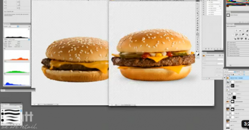
We’ve posted a number of examples that make it clear just how re-touched the images of people we see in magazines and ads are. Of course, everything else in those images is photoshopped too, leading to those “hmmm, this doesn’t look quite like it does on the box” moments.
McDonald’s Canada released a video showing a photoshoot for a hamburger. It reveals the techniques that are used to get that luscious, huge, fresh look that so tempts us in food ads. I think it’s great to add to the examples of retouching people to spark discussion on our relationship to the manipulated images around us and the effects of different types of retouched images.
Thanks to Dmitriy T.C. for the tip!


Comments 17
Andy The Nerd — July 4, 2012
This to me highlights the use of symbolism in human story-telling. With a barely cooked patty and lopsided toppings, I wouldn't want to eat the model. But the model contains all the elements of my idea of what I'd like to have in a sandwich, and so in that sense, it is an accurate representation of the end product, even without looking the same.
Tusconian — July 4, 2012
I think it's quite different than retouching people (though I am not really against people being retouched in small ways). Anyone who is tempted by a McDonald's quarter pounder on TV or in a magazine ad already knows that more than likely, their sandwich won't look like that. Heck, even if it looked like that after being cooked, those sandwiches are placed in little cardboard boxed or wrapped in wax paper, so it "looking nice" isn't really an option. You could package up the most beautiful gourmet meal in the world in to go boxes or wax paper, and it will look like crap. Plus, edible food tends not to photograph well, due to the lights. Anything that can melt, will, including condiments and warm cheese. If you think McDonald's retouches their food, look at any ice cream company. What they photograph isn't even food. The "Got Milk" commercials are similarly notorious.
Dianna Fielding — July 4, 2012
I find it very interesting that they made this video at all. I have not seen a similar video about retouching a person in advertising. (If one exists, I would love to see it.)
This practice of making food look better on camera than in real life is very common. Every good cook book practices this. I've heard stories of photographers propping up bits of meat in soup with toothpicks so the soup looked more robust.
I feel that I wouldn't want to eat the touched-up burger in real life. All the pickles and onions would be on one side and there would only be a squiggle of ketchup and mustard. Very disappointing.
Mel B. Sherman — July 4, 2012
I do understand the confusion some customers may experience when their burger looks puny compared to the model burger but there isn't a "food stylist" designing every component of the burger in 3-5 minutes for you as you wait. There is someone pulling a half-way, pre-made burger out of a container, changing it as you request (no pickles, no cheese, etc), shocking it in the microwave, and serving you as fast as possible to get you out of the line.
MD — July 4, 2012
this was the subject of an entire scene in the bell jar in the 1960s, so let's not think this is remarkable.
Lisa_Wade — July 4, 2012
It's also a great example of a company trying to craft a response to a common criticism. This seems to me to be a proactive form of brand management. Notice that they're careful not to sound defensive, but also claim that everything they're doing is designed to produce a *truthful* photograph.
Richard Burgess — July 4, 2012
Reminds me of this example of a sandwich
http://imgur.com/gallery/ehrRT
Hierophant2 — July 4, 2012
Why is this post labeled "food/agriculture"?
Ba doom tish
finette — July 11, 2012
Have you ever done anything about the infamous blue liquid used in menstrual pad and diaper ads? I think it would be interesting to look at when that started, how advertisers universally agreed on that as the visual euphemism, etc.
Perhaps more closely related to the topic here: I remember being fascinated as a child with the shape in which toothpaste always comes out of the tube in commercials. It's got perfect little up-and-downturned points, and a slight wave in the middle. I may have wasted a lot of toothpaste trying to attain that shape...