Re-posted in honor of Love Your Body Day.
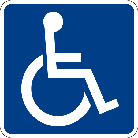
This symbol is the international symbol for persons with disabilities:

It looks pretty straightforward. Descriptive even.
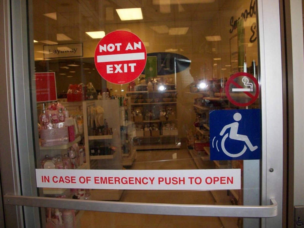
But check out this symbol that I saw at a T.J. Maxx in California:

Notice how the second symbol represents people with disabilities as active and independent. There are motion signs and the figure is pushing its own chair.
The comparison reveals how much the first represents them as passive and helpless.
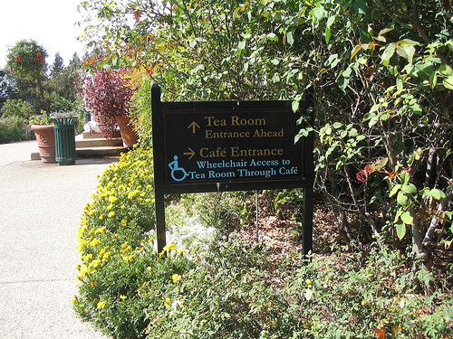
UPDATE! In the comments thread, Penny added a link to the symbol they use at the Huntington Library (Pasadena, CA):

For more posts on symbology, see our posts on traffic lights with female figures, stick figures and stick figures who parent, and default avatars.
Lisa Wade, PhD is an Associate Professor at Tulane University. She is the author of American Hookup, a book about college sexual culture; a textbook about gender; and a forthcoming introductory text: Terrible Magnificent Sociology. You can follow her on Twitter and Instagram.
Comments 44
Marge — December 15, 2009
Reminds me of what I always end up thinking when I see fire exit signs like this:
http://www.leosignage.com/productdetails.asp?menulevel=2&level=2&catcode=18&hdnGroupCode=79&hdnProdCode=22087G
The running person is active, the person in the wheelchair is static.
julian — December 15, 2009
I saw one of these at Marshall's* just the other day! It made me laugh, because to me, the sign we generally see says "help me i'm helpless." (NOT THAT THIS IS TRUE OF WHEELCHAIR USERS, BUT THIS IS HOW MUCH OF SOCIETY SEES PEOPLE WITH DISABILITIES.) The Marshall's/TJ Maxx sign says, "Get the fuck out of my way or I'm going to run you down!" Which is significantly more awesome, for obvious reasons.
*I've never been in a TJ Maxx's, but from what I've heard, it's pretty similar in idea to Marshall's -- maybe they are owned by the same parent company.
Carissa — December 15, 2009
On the flip side, the international/standard symbol is designed to be as simple and generic as possible; the arms are drawn in for clarification of the figure but they're not in a natural position either (they're hovering up over the lap parallel to the ground, meant more as representations of arms than anything). I don't read this as passive. The people on restroom signs are just standing there too, no motion lines or anything else suggesting what they can and can't do. I don't read passivity/helplessness into this, just a bland and straightforward symbol.
Elena — December 15, 2009
The poster for the Spanish sci-fi movie "Acción Mutante" had a, er, militant take on the logo.
Soxinc — December 15, 2009
The entire image suggested to me that the person was trying desperately to escape the store, despite the "NOT AN EXIT" sign, perhaps because they needed a cigarette.
I am possibly too literal.
Penny — December 15, 2009
Note: the symbol is generally used to mark features for accessibility (such as parking spaces, restrooms, and doors), *not* to represent people. The original symbol (designed in 1968 by Suzanne Koefoed) didn't even have a head--it was a wheelchair, not a person using a wheelchair.
The go-to article on the symbol's history is
Liat ben Moshe and Justin J. W. Powell, "Sign of our times? Revis(it)ing the International Symbol of Access," Disability & Society 22(5)(August 2007): 489-505.
The Huntington Gardens use a version of the symbol that's somewhere between the standard and the odd TJ Maxx version (it closely resembles the redesign from 2005 mentioned in the article above):
http://www.flickr.com/photos/11418107@N02/1303416595/
codeman38 — December 15, 2009
One interesting thing not touched on in this post is that the symbol doesn't accurately represent everyone who uses the accessibility features: not all PWD use a wheelchair!
Windows, Mac OS and Linux used to use the standard wheelchair icon to identify their accessibility features. In their most recent versions, however, they've changed this.
Mac OS and Linux (at least the distributions I use, anyway) now use the icon shown on this page from Apple, of a person with outstretched arms (indicating, at least in my opinion, independence, though your interpretation may vary).
Far more clever, at least in my opinion, is the icon used in Windows Vista and 7. Here's a page from Microsoft which features the icon. It's in the shape of the familiar wheelchair icon-- but it depicts two different paths which converge to the same location, which is a pretty good illustration of the abstract concept of accessibility.
Craig — December 15, 2009
This post was an eye-opener for me; something I hadn't ever thought about before but now seems like a heck of a good idea. My only concern is whether the form of a superior icon for PWD should involve using the arms for locomotion, when of course many persons in wheelchairs are unable to do so. If we started a campaign to replace the standard icon with the T.J. Maxx or Huntington one, would be be guilty of "erasing" (jolly fun word) the Stephen Hawkings of the world?
Is any symbol other than a pure abstraction suitable? Does the wheelchair icon today have so much "mindshare" that no fundamental change is practical? Does Microsoft, indeed, have the best idea? Has anyone checked the temperature in Hell?
Tiago — December 15, 2009
amazing how this slightest change in the symbol makes it look so positive and even inspiring.
especially with the way things are becoming today. I live in Rio and recently I went up to Corcovado to the big statue of Jesus and there was a guy with prosthetic legs, it was amazing to just contemplate for a moment the fact that he could walk around freely and was up on there, knowing he had walk up several steps to get there, the fact that he had lost his legs was apparently almost meaningless to him now. So, the wheelchair symbol is out of date, actually, it's not even like you're trying to make something seem better, it indeed is better...
urbanartiste — December 15, 2009
There are motorized wheelchairs, so even if a person does not have full use of their arms, many can still travel independently. I am really intrigued by this simple change in the symbol; this would make a great design project for my students.
Jamie — December 15, 2009
It looks dangerous to me, as if there's something wrong and the lines mean that an action either needs to be done or shouldn't be done. Am I an idiot?
nomadologist — December 15, 2009
I saw an image like the first one on a bus today, but instead of leaning back slightly, the figure in the wheelchair was leaning forward slightly. It conveyed "activeness" without complicating the image too much.
SaynaTheSpiffy — December 16, 2009
Hmm... I don't think that the original one is meant to portray disabled people as helpless or inactive, just as static. Like the other "bahroom people" stick figures. They're all pretty unrealistic and inactive looking. They seem kind of stiff and awkward. I'm with Carissa and Ben.
Though I do think that this is kind of cool to attempt to make the symbol more realistic.
JuliaA — December 17, 2009
as one of "them", i find the TJ maxx one annoying. it really bugs me. i'm not "active and independent" in the same way as the person portrayed, not at all. and the implication that someone like me might be less 'positive' than someone with more mobility is not so pleasant to me.
the first? as penny and others have said, static. what is there that's so offensive about sitting? i'm more offended by your statement that an icon of a still person in a wheelchair seems "passive and helpless".
i like the one penny linked to. it's more open to interpretation without excluding others quite so much. just about everything will exclude *someone*, though.
eolianbeck@gmail.com — December 18, 2009
Light
L — December 18, 2009
Okay, not to be overly internet cranky, but it would be really nice if, in a post relevant to disability, the most basic accessibility standards were respected for images -- alt tag and brief description. Because as a screen reader user I have no idea what you're talking about, and I would have liked to.
Weekend Link Love « The Feminist Texican — December 20, 2009
[...] Sociological Images: Disability Symbology [...]
Rosscott, Inc. » Archive » System in the Wild: Crashing Edition — December 26, 2009
[...] Finally, one from Systemic ColdfireSerge whom I had the pleasure of meeting back at Connecticon this past summer. This one has some real intellectual interest. It’s a post all about the different types of “disabled” graphics and what they imply (as you can see above, some are more active and imply a more able-bodied person and are not the passive “sit around” symbols you may be used to). If you only click on one of these, this one is worth the time. LINK. [...]
Odc64 SOM — October 19, 2011
A wheelchair bound fellow is on the homecoming court (running for "King") at my university this year. He isn't sponsored by a fraternity either. His branding includes this: http://hesonwheels.com/
Denise — October 19, 2011
My favorite is the Disability Ninja:
Amadi — October 19, 2011
It would be really nice if we could drop the polite fiction that a person in wheelchair represents "people with disabilities." It represents people using wheeled mobility devices. My disability isn't represented by a person in a wheelchair, and my accessibility needs aren't met by those designed for people who use wheelchairs, but that's where accessibility in the public sphere tends to begin and end.
Anonymous — October 20, 2011
The My Family stickers include active wheelchair users. Here's an example:
http://www.thestickerfamily.com.au/buy/wcm-wheelchair-mother/WCM