
Robin M. let us know about an image at Mother Jones that apportions out seats in the Senate and House of Representatives not by state or party, but by financial backers. Dave Gilson asks, “What if members of Congress were seated not by party but according to the industries which gave them the most money over their entire careers?” Here’s the methodology used to create the charts:
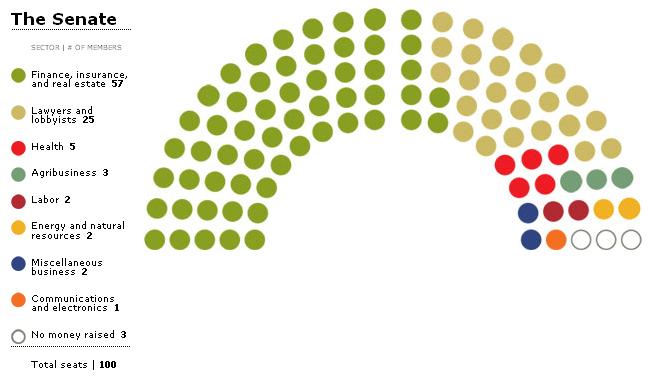
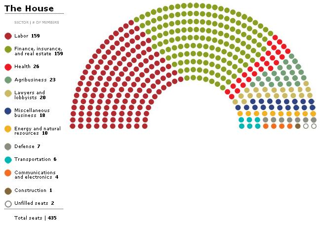
The Congressional seating chart is based on which industry has given the most to each member of Congress over his or her career. This means that members are seated according to the industry that has given a plurality of donations. For example, a member who received 20% of her donations from financial firms and 19% from unions would be seated in the finance, insurance, and real estate bloc.
Corporate donations include money given by companies’ employees and political action committees, unless noted otherwise. Counting employees as corporate donors isn’t perfect: You may not give to a candidate with your employer’s interests in mind. Yet excluding individual contributions would overlook “bundled” gifts from a company’s employees as well as gifts from executives and their families.
Clearly that doesn’t provide a perfect measure of where campaign money comes from, but it does give a sense of the major players. Here’s the result for the Senate, where finance/insurance/real estate wins the day:
And here we have the House, where labor unions play a much larger role:
Obviously the real impact of some of these industries will be greater than what shows up here, since many will be major, but not the single largest, source of funds to lots of candidates. And we don’t know the actual value of the donations for those seats; perhaps the transportation industry, say,contributes to fewer candidates but spent much more on them than labor did on average per campaign. Knowing who the biggest single donor to a politician is doesn’t necessarily tell us a lot about how beholden the official might feel to that industry. And it doesn’t include any of the indirect spending groups do on “issue ads” that don’t clearly endorse a particular candidate, or to the Democratic or Republican campaign committees overall rather than an individual.
Nonetheless, I think it’s a useful graphic for highlighting who some of the big players are.
UPDATE: Reader A.D. Pask-Hughes asks…well, “so what?” Fair question, especially given that I outline a number of methodological flaws. What struck me as interesting:
1) The differences in primary donors between the Senate and the House, particularly that labor is so much more visible in the House
2) The relatively low profile (from this measure) of defense
and
3) The difficulties in accurately measuring “influence” in Congress.
Comments 11
A.D. Pask-Hughes — October 12, 2010
You list some problems with the graphic, yet there are clearly more. This methodological problem, for example:
"a member who received 20% of her donations from financial firms and 19% from unions would be seated in the finance, insurance, and real estate bloc."
That's not particularly useful. Added to that the problem of dividing donors up into those categories (and the usefulness of those categories, as defined).
It also doesn't seem to point to any interesting conclusions: is it surprising that finance/insurance/real estate comes out "on top"?
This blog has some fantastic images, and some insightful discussions, but this seems to be like a particularly empty post.
larrycwilson — October 12, 2010
Back in the late 19th and early 20th Centuries, after the Civil War and before ratification of the 17th Amendment, the popular press was quick to point out the "Senator from Standard Oil" or the "Senator from the Beef Trust," to refelect which company or group had bribed sufficient State Legislators to get their candidate elected.
anonymous — October 12, 2010
Why does the low profile for defense surprise you? Since contractors can't donate to campaigns, it's hard to see where much money would come from.
Alan B — October 12, 2010
All the problems with this chart already exist (and are potentially more pronounced) when you compare politicians based on party alone. Red for republican and blue for democrat (ignoring the occasional tiny percentage of independents) gives you a single bit of information that is supposed to encode everything about a politician's platforms on every possible issue. Of course there is significant correlation between party and platform, but it is far from perfect. Obviously you don't get perfect correlation when you look at campaign funding either, but I wouldn't be surprised if it was almost as strong of a predictor. But this funding chart provides strictly more information, simply because there are 10 or so groups, rather than 2. The challenge is to find a useful compromise between conveying too much or too little about each member.
Mike — October 14, 2010
Seeing your edit talking about your surprise that defense related support for candidates/representatives seems to be lower than you expected - I think it might be worth considering who pushes for defense programs these days.
I'm very much out of the loop these days, but consider why the US Navy ended up having to purchase three Seawolf-class submarines: Newport News Naval Shipyard sued in a Virginia Federal Court that the awarding of the contract for two Seawolf boats was unfair, and that they needed a piece of the pie. IIRC this suit was jointly filed by the shipyard, and the unions that worked at the shipyard.
Philadelphia Naval Shipyard got the contract to refurbish the USS John F. Kennedy in the mid-nineties, against the wishes of the Navy (Which wanted to decommission the ship, to save money to pay for the so-called Peace Dividend.), specifically to keep the shipyard in business, and keep all the jobs there. Eventually, the contract extended the service life of the ship maybe five years, and kept the shipyard in business for about two more years. Again, one of the major groups supporting this were the unions at the shipyard, and their national affiliates.
Similarly, take a look at how the recently killed contract for the replacement Presidential helicopters suffered from becoming a project that "would save jobs for Americans." (There were many other problems with the contract, including pervasive mission-creep, where the original contract kept being amended to allow the helos to do more and more.)
While I wouldn't want to claim that all labor spending is necessarily defense related, there is a lot of labor support for expanding or even just protecting current defense industries.
Anonymous — October 15, 2010
It might be interesting to color code each seat 1/2 with financial backer and 1/2 with political party affiliation.