Dimitriy T.M. sent in another interesting link, this time to an interactive map that presents IRS data on inter-county moves — that is, how many people moved from one county to another in 2008, and where they moved to. The map doesn’t capture all moves, since the IRS only presents data if at least 10 people from a county moved to a particular destination county (so a county could have a lot of out-migration, but if people really spread out when they moved, it wouldn’t show up). Despite that limitation, it does highlight some interesting general trends.
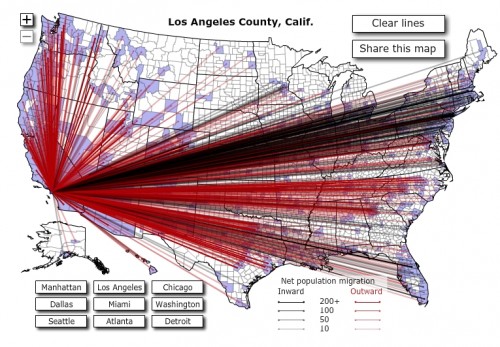
For instance, people from counties with big cities move to a variety of places, often far away from where they started (note that the width of the line indicates the number of immigrants, red = out-migration and black = in-migration, and the destination counties show up in blue):
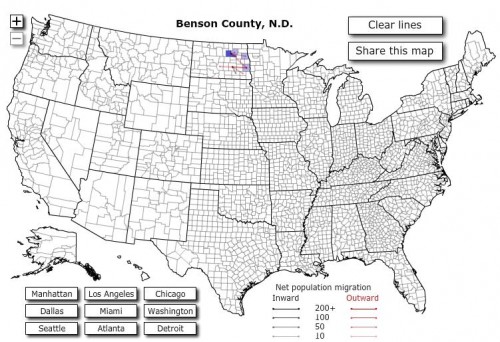
On the other hand, if you look at most counties in the U.S. that don’t have large metropolitan areas, you see that most movement is to relatively nearby counties. Here’s an example from North Dakota:
I suspect that the number of migrants in rural areas is going to be under-represented, since their smaller overall populations may make it more likely that less than 10 people would move to any particular place, so that’s important to keep in mind.
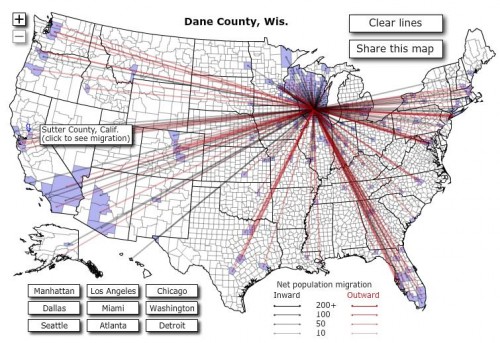
Also not surprisingly, counties with universities see a lot of migration, both in and out, and to a wide variety of destinations. Here is Dane County, the site of the University of Wisconsin-Madison:
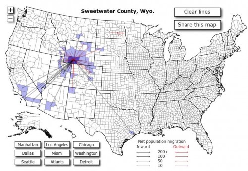
When I was looking around, I randomly clicked on Sweetwater County, Wyoming. I was surprised to see quite a bit of in-migration from distant counties:
I don’t know what’s going on there. There isn’t a university in the county. Does anyone know enough about Wyoming to have a guess?
UPDATE: Reader Caitlin says it’s related to oil production. Thanks for the info, Caitlin!
Anyway, it’s a sort of fun map to mess around with.


Comments 4
Anonymous — June 17, 2010
This is really interesting!
Caitlin — June 17, 2010
Oil production. All of lines leading to and from Sweetwater County are to areas also associated with oil and gas production. New Mexico, Utah, Wyoming, Southern California, Texas, Nevada and Colorado all contain either production, refining, or offices of oil companies.
(I work for a company with offices in Denver)
jim bolzi — June 17, 2010
Interestingly enough NCC Delaware gets a good bit of imigration from Florida-perhaps they're cashing in on our lack of an inheritance tax.