
People are often shockingly wrong about how much time they dedicate to various tasks. In general, we tend to overestimate how much time it takes to do things we dislike and underestimate how much time we spend on tasks we enjoy. So, people ritualistically overestimate how much time they spend on laundry, cleaning bathrooms, working out and underestimate how much time they spend watching television, napping, eating, or doing any number of tasks that provide them with joy.
Asking about how people use their time has been a mainstay on surveys dealing with households and family life. We ask people to assess how much time they spend on all manner of mundane tasks in their lives–everything from shopping, sleeping, watching television, attending to their children, and household labor is divided up into an astonishing number of variables. The assumption, of course, is that people can provide meaningful information or that their responses are an accurate (or approximately accurate) portrayal of the time they actually spend (see here). This is why time diary studies came into being–they produce a more accurate picture of how people use their time. People record their actual time use throughout the day in a diary, marking starting and stopping points of various activities. And there are a number of different scholars who rely on this method and these data. But Liana Sayer is among the leading scholars in the field. When I’ve seen her present, or others present on time use data, the data are almost always visualized in the same way (as stacked column charts). Personally, I love seeing the data this way. The changes jump out at me and I feel like I instantly recognize trends and distinctions they discuss. But I have learned in my classroom that students do not always have the same reaction.
I’m interested because I use data visualizations in class a lot. And in my (admittedly limited) experience, students have an easier time interpreting the story of time use data when it is visualized in some ways over others.
All of the examples here are pretty basic changes in data visualizations. But, learning these basics are necessary to help students read the more complex data visualizations they may encounter. Being able to interpret visualizations of temporal data is important; it’s part of what helps social scientists consider, measure, and critique the idea of “feminist change.” Distinguishing between men’s and women’s time use is only one pocket of this field. But, it’s the one I’ll focus on here, and on which Liana Sayer is among the foremost experts. The data I’m visualizing below come from one of Sayer’s most cited articles: “Gender, Time and Inequality: Trends in Women’s and Men’s Paid Work, Unpaid Work, and Free Time” (here – behind a paywall).
It’s fairly common to present time use data with a series of stacked columns (the same way the Census often illustrates shifts in household types). Below is a visualization of the differences between women’s and men’s minutes per day allocated to paid work, unpaid work, free time, and time dedicated to self care. It’s all time diary data and we talk about why this is more reliable and a better measure – but also why it is more difficult to collect, etc. Some students see the story of this graph immediately. I do too. Men’s time allocated to paid labor decreased while women’s increased. And women perform more unpaid work than do men. Lots of students, however, are stumped. 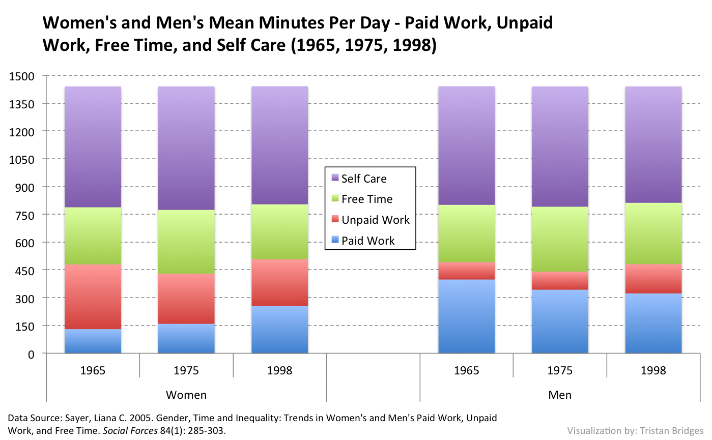
But when I present the data differently, students often have an easier time seeing the story the chart is produced to illustrate. The Pew Research Center visualizes a lot of their data using stacked bar graphs. And maybe it’s because these are more easily recognized by people with less experience with data visualization. I have found that more of my students are able to read the chart below than the one above (at least for temporal time use data comparisons).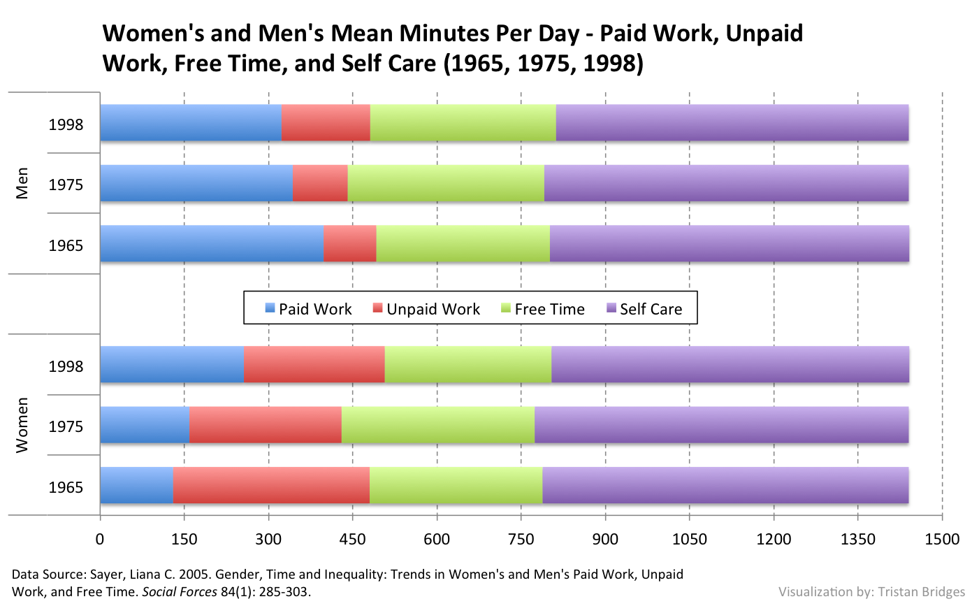
Another way of presenting these data might be to use clustered columns. I have also found that students are more quick to recognize the trend in these data with the graph below than they are with the initial stacked column chart.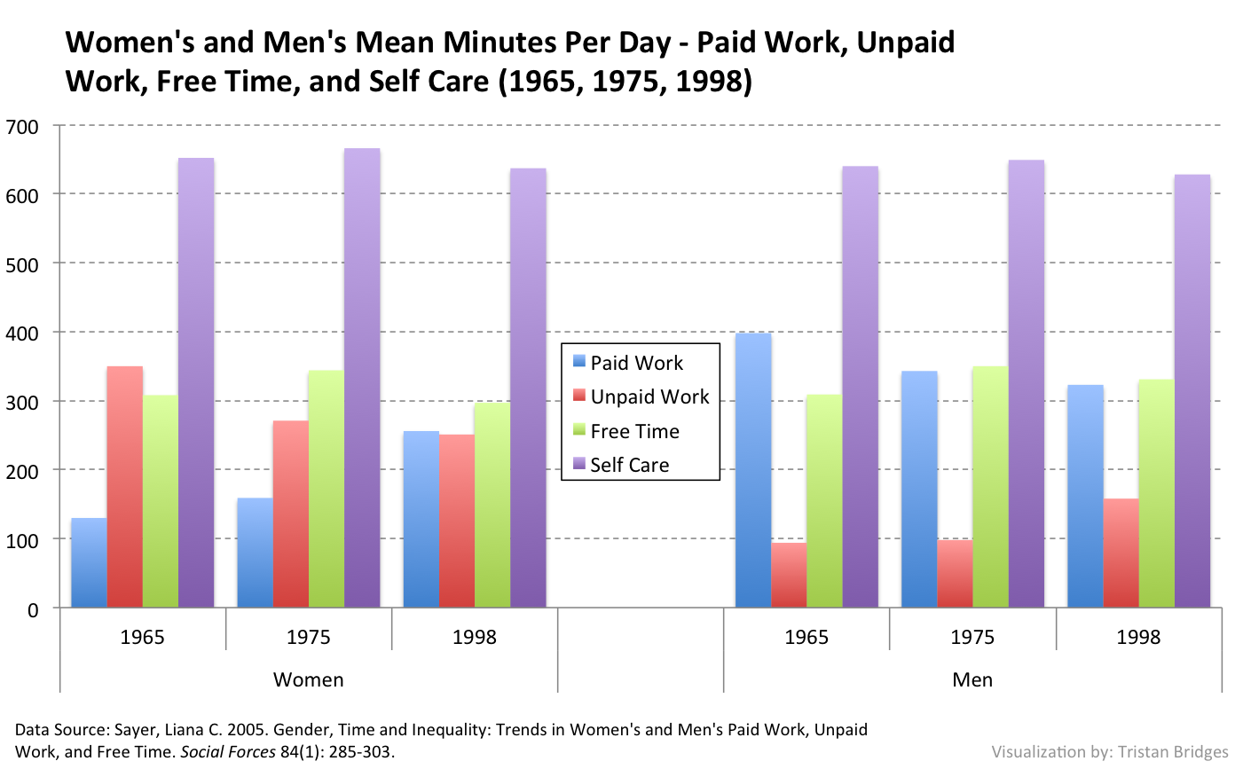
But, I’ve found that students have the easiest time with line charts for temporal time use data. On the chart below, I deleted the grid lines because The New York Times sometimes displays time trend data this way (see Philip Cohen’s piece on NYT Opinionater, “How Can We Jump-Start the Struggle for Gender Equality?” for an example). Students that struggle to recognize the trend in the clustered column chart, are much faster to see the trend here.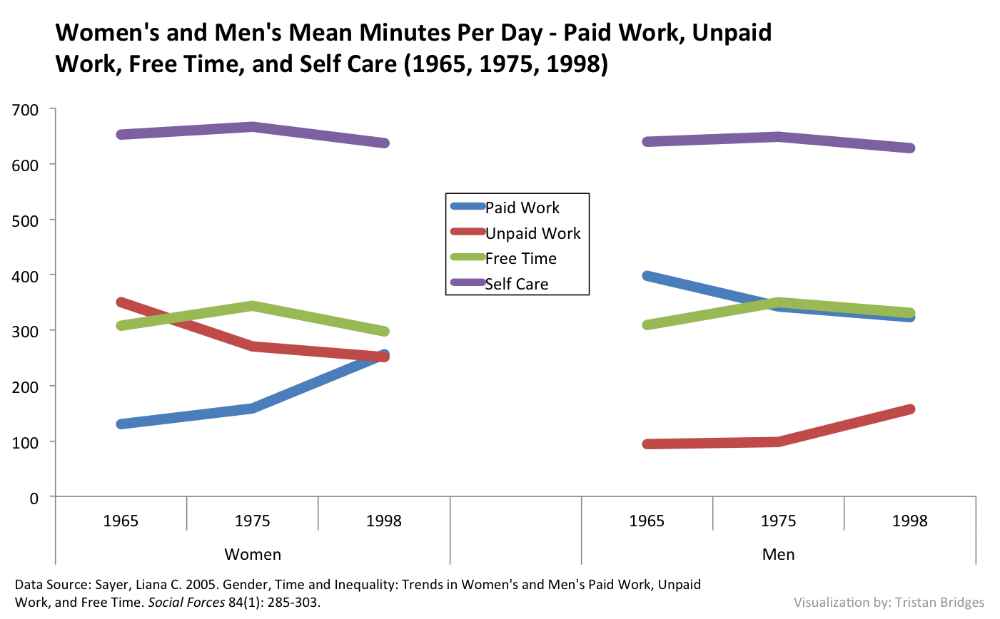
These aren’t an exhaustive set of examples, and all of them are basic visualizations. For instance, we might use a stacked area chart to show these data (as trends in the racial composition of the U.S. are often depicted), a scatterplot (as data on GDP and fertility rates are often illustrated), a series of pie charts (as men’s and women’s various compositions in different economic sectors are sometimes visualized), or something else entirely. 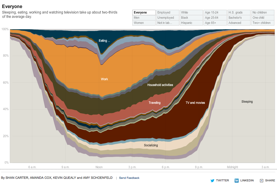 In fact, The New York Times produced a really incredible interactive stream graph visualizing data from The American Time Use Survey that illustrates differences in time use between groups. I sometimes have students explore this graph in my course on the sociology of gender. But many struggle interpreting it. This is, I think, in part due to the fact that we often take data visualization literacy for granted. It’s a skill, and it’s one we should be better at teaching.
I think the point I want to make is that we (or I, at least) need to think more carefully about how we visualize our data and findings to different audiences. Liana Sayer has an incredible mastery of this (she presents data in all of the ways mentioned in this post and more throughout her work). One thing that I’m thinking more about as I write and teach about research and findings amenable to data visualization is which visualizations are best suited to which kinds of data (something all scientists are concerned with), but also which visualizations work with which kinds of audiences. This is new territory to me.
Visualizing feminist change in a single chart is difficult. And it’s often accompanied by, “Well, this is true, but let me tell you about what these data don’t show…” But, I’m interested in how we make choices about visualizing feminist research and whether we need to make different kinds of choices when we talk about the findings with different kinds of audiences.