Costas K is a graphic designer who used Cyborgology Editor Nathan Jurgenson‘s post on digital dualism as part of a design project. The physical book explores the intersection of atoms and bits. The creator was invited to write a short essay about the project.
As kids, we were told to stop ‘wasting’ our time with electronic devices and that we should be outside, engaging with the ‘real’ world. Early on, the idea was planted into us that what we do using a computer is an alternative false state that bears no value. To still believe this is naive. Personally, I have met some of my best friends online. I make transactions, articulate opinions, receive feedback and get commissioned professional projects. How is this not real?
Still, when approaching the topic the first expressions that came to mind were ‘physical world’ and ‘digital world’ – the cornerstones of digital dualism. Nathan Jurgenson’s text ‘Digital dualism versus augmented reality’ helped me put things into perspective, before exploring them visually.
It is my belief that online activity is a continuation of what we do physically, following similar patterns – although this is not always recognisable. A room and a web page both provide a defined ‘space’ in which to hold different elements, and are connected with other such spaces. Facebook isn’t different to talking to your friends in a crowded city square, where other people can hear you. A ‘tweet’ is the equivalent of making a statement in front of the crowd.
As the digital aspect of life becomes increasingly important, so does design. The electronic environment is more formidable than the physical, and is not subject to certain limitations. Changing visuals is fast and cost-effective. Making a clean start is easy and this is not influenced by history (e.g. existing buildings) or nature. Resources are almost endless. Some new limitations appear which are determined mostly by the choices and equipment of the user. The user also contributes to the design of the environment, by customizing it. The outcome is not determined solely by the designer.
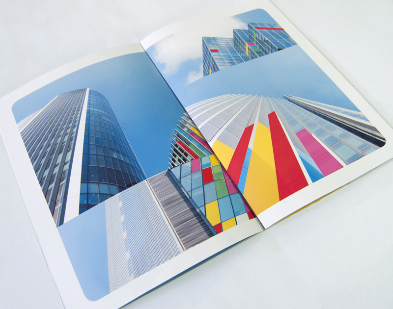
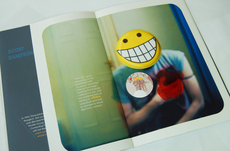
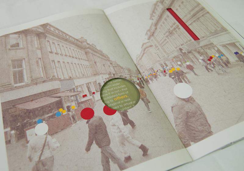
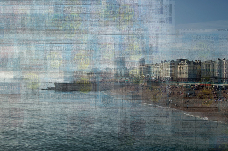
The result of my exploration is called ‘Connected’. The centrepiece is a booklet which explores the relationship between the physical world and online activity and uses photography, graphics, typography and cut-outs to establish conceptual and visual relationships, in accordance with the text. The latter is a collection of found sources, mostly in the form of quotes, with an editorial written by me. The only complete article included is ‘Digital dualism versus augmented reality’. The project also has a web aspect which is currently in the form of a model website (with static links) influenced by Net Art. Since the project is about the interconnection of the physical with the digital, it was important to use both types of elements. The digital aspect though was limited significantly by time constraints and I hope to explore it further in the future.
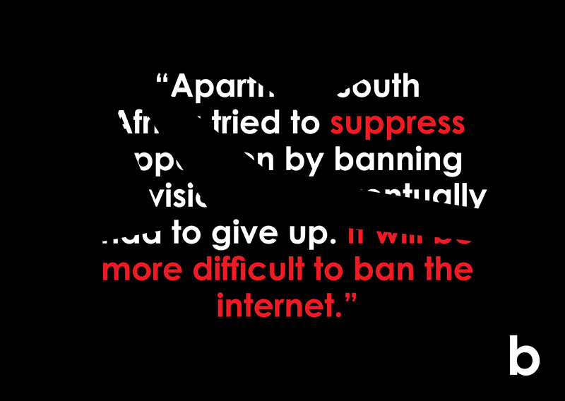
The main concepts that are examined in the project are: (a) digital elements becoming one with the physical world [fig. 1-2] (b) the idea of digital dualism (c) social networking [fig.3-4] (d) the political role of the internet in suppressive regimes [fig. 5] (e) the notion of ‘information overload’ [fig. 6]



Comments 6
Ned — June 2, 2011
Costas, this is amazing work both conceptually and stylistically. The end result, a narrative that exists in both physical and digital space, works beautifully to express the blur between the physical and digital. The playful form of the booklet, with its diecuts and bold colors, also serves as a great digital analogue to the (almost) limitless nature of design online.
I also agree with your statement that design is becoming more important as we augment our lives, although I would go so far as to say it's becoming essential if one wishes to be taken seriously. The era of boring, poorly designed websites is coming to a close as users equate good design with authority and truth. As an artist and designer, the opportunity to build, inform, and at times queer a visual language based on the quality of design is exciting... I absolutely love it when people take the onion seriously because it's designed that way, and I'll be the first to admit it's gotten me at least once.
Thanks so much for sharing this, it's really inspiring work.
Ned — June 2, 2011
*I meant to say that the book is a good physical analogue, sorry for mistyping.
Costas — June 2, 2011
Hi Ned. Thank you for your comments,they are much appreciated.
I believe you are right about design being essential. I didn't want to over-emphasize it though, because coming from the mouth (or keyboard) of a designer, I feared that it could seem a little biased.
I have to confess, I wish I had a lot more time to work on the digital aspect of this narrative.But unfortunately I didn't. I feel just feel that there's so much more room for exploration and development there.
I plan to start an MA next year and I am considering examining 'digital space' in more depth during the course. So hopefully I will have more to share about this next year.
P.S. A little more info about the project can be found here: http://www.behance.net/gallery/Connected/1526125
Costas — June 2, 2011
(By the way Ned, I just explored your web site. You have some very interesting work!)
Replqwtil — June 2, 2011
I think that the eminence of design is one of the most interesting developments from the 'digital revolution'. Reality, as we call it, is becoming ever more dominated by a malleable and democratized medium, and arcane aspects of design are rising in importance to match. If the medium is the message, then the entirety of reality is becomig the message, and every detail counts.
For me, at least, it is the rising importance of typography that is truly delightful! But the same is true of all aspects of design today. It is a delightful time to be a social observer!