nation: Honduras

This year tens of thousands of Central American children, fleeing violence and poverty, have been arriving in the U.S. seeking refuge.  It’s a stunning story that has been covered widely in the media and Americans’ opinions about immigration have taken a hit.

The Pew Research Center collected data regarding American leniency toward undocumented immigrants in February and July, before and after media coverage of this crisis began.  The results show that members of all political parties, on average, are less inclined to allow “immigrants living in U.S. who meet certain requirements” to stay legally (see far right column).

The strongest opponents are Republicans and members of the Tea Party.  These groups were more opposed to enabling undocumented immigrants to stay legally to begin with and they showed the greatest change in response to this new crisis.

1

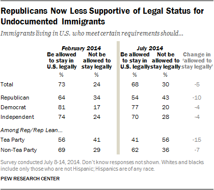
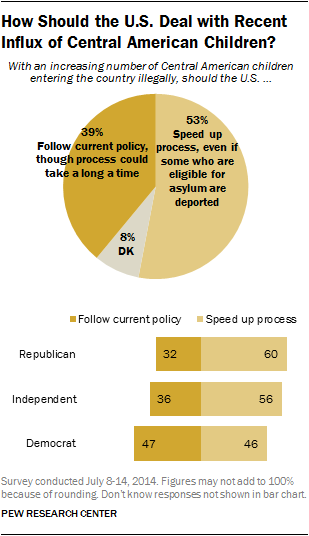
Republicans and Independents are also more likely than Democrats to think that we should speed up the deportation process, even if it means deporting children who are eligible for asylum.

2

Lisa Wade, PhD is an Associate Professor at Tulane University. She is the author of American Hookup, a book about college sexual culture; a textbook about gender; and a forthcoming introductory text: Terrible Magnificent Sociology. You can follow her on Twitter and Instagram.

There is one similarity between the Israel/Gaza crisis and the U.S. unaccompanied child immigrant crisis: National borders enforcing social inequality. When unequal populations are separated, the disparity creates social pressure at the border. The stronger the pressure, the greater the military force needed to maintain the separation.

To get a conservative estimate of the pressure at the Israel/Gaza border, I compared some numbers for Israel versus Gaza and the West Bank combined, from the World Bank (here’s a recent rundown of living conditions in Gaza specifically). I call that conservative because things are worse in Gaza than in the West Bank.

Then, just as demographic wishful thinking, I calculated what the single-state solution would look like on the day you opened the borders between Israel, the West Bank, and Gaza. I added country percentiles showing how each state ranks on the world scale (click to enlarge).

1

Israel’s per capita income is 6.2-times greater, its life expectancy is 6 years longer, its fertility rate is a quarter lower, and its age structure is reversed. Together, the Palestinian territories have a little more than half the Israeli population (living on less than 30% of the land). That means that combining them all into one country would move both populations’ averages a lot. For example, the new country would be substantially poorer (29% poorer) and younger than Israel, while increasing the national income of Palestinians by 444%. Israelis would fall from the 17th percentile worldwide in income, and the Palestinians would rise from the 69th, to meet at the 25th percentile.

Clearly, the separation keeps poor people away from rich people. Whether it increases or decreases conflict is a matter of debate.

Meanwhile

Meanwhile, the USA has its own enforced exclusion of poor people.

3
Photo of US/Tijuana border by Kordian from Flickr Creative Commons.

The current crisis at the southern border of the USA mostly involves children from Guatemala, Honduras, and El Salvador. They don’t actually share a border with the USA, of course, but their region does, and crossing into Mexico seems pretty easy, so it’s the same idea.

To make a parallel comparison to Israel and the West Bank/Gaza, I just used Guatemala, which is larger by population than Honduras and El Salvador combined, and also closest to the USA. The economic gap between the USA and Guatemala is even larger than the Israeli/Palestinian gap. However, because the USA is 21-times larger than Guatemala by population, we could easily absorb the entire Guatemalan population without much damaging our national averages. Per capita income in the USA, for example, would fall only 4%, while rising more than 7-times for Guatemala (click to enlarge):

4

This simplistic analysis yields a straightforward hypothesis: violence and military force at national borders rises as the income disparity across the border increases. Maybe someone has already tested that.

The demographic solution is obvious: open the borders, release the pressure, and devote resources to improving quality of life and social harmony instead of enforcing inequality. You’re welcome!

Cross-posted at Family Inequality.

Philip N. Cohen is a professor of sociology at the University of Maryland, College Park, and writes the blog Family Inequality. You can follow him on Twitter or Facebook.

Teresa C. sent in this image created using UNICEF data to show what percent of women surveyed in various countries said it was acceptable for their husbands to hit them:

international-womens-attitudes-towards-domestic-v-28079-1250786064-13

(Found at BuzzFeed.)

You can find the data and a breakdown of UNICEF data collection methods here. The data for many more countries are available there too. I can’t quite figure out why these particular countries were used in the image; they aren’t all of the countries with the highest percentages. As far as I can tell, the UNICEF data table only includes numbers for the “developing” nations and some countries from eastern Europe, which is UNICEF’s focus. But I do wonder what the numbers would be if you asked women in the U.S. a question along the lines of “is it ever acceptable for a man to hit a woman?” or “can you think of any situation where it might be understandable that a man would hit his wife or girlfriend?” You might get higher “support” for violence against women than you’d think. The UNICEF page doesn’t provide the wording of this question, which would be interesting to know.

That’s not to downplay the issue of women justifying or accepting violence against women, just that those of us in the “developed” nations need to be sure not to pat ourselves on the back too much about how enlightened we are about domestic violence.

And I can’t help but dislike the image, in that at first glance it would appear to be a pie chart in which all of the sections add up to 100%; really a bar graph would be a better way to illustrate this. But then, I had a dissertation advisor with a 5-page single-spaced document outlining his standards for data presentation.

UPDATE: Reader P. makes the point I was getting at above (that the wording might greatly impact how much “support” you find for violence against women) much better than I did:

What they were actually asked, in the MICS and the DHS (the two primary sources for the data), was this question:

“Sometimes a husband is annoyed or angered by things that his wife does.  In your opinion, is a husband justified in hitting or beating his wife in the following situations:

– If she goes out with out telling him?
– If she neglects the children?
– If she argues with him?
– If she refuses sex with him?
– If she burns the food?”

I bet you get very different rates for different “justifications,” which is important both for data-gathering/presentation and for anti-domestic violence campaigns. And, again, I bet if you broke down various “reasons” for hitting a woman, I bet you’d get higher-than-expected acceptance of them in countries in the “developed” countries that weren’t presented in the table.