
Cross-posted at Montclair SocioBlog.
In case you wondered about what we in the U.S. pay for health care compared with those unfree unfortunates who suffer under various forms of socialized medicine, here are some graphs from 2009 showing the advantages of what is sometimes called “the best health care system in the world.”
The graphs are from the International Federation of Health Plans. I’ve selected only four — to show the relative costs* of
- an office visit
- a day in the hospital
- a common procedure (childbirth without complications)
- a widely used drug (Lipitor)
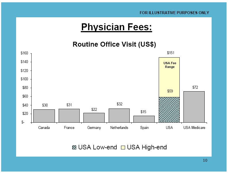
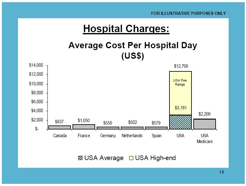
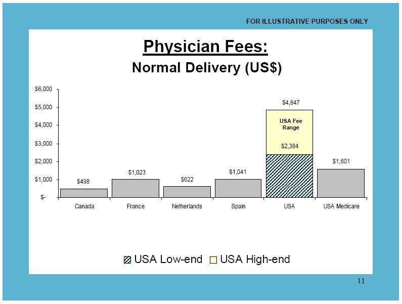
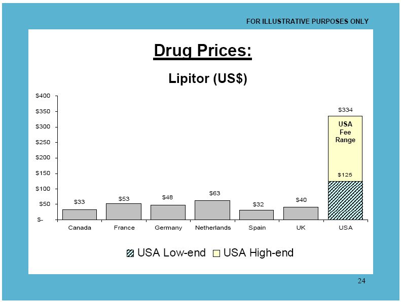
You can download all the charts here, but be warned: it gets boring. We’re number one in every chart, at least in this one category of how much we shell out.
Since we have the best health care in the world, this must mean that you get what you pay for. Our Lipitor must be four to ten times as good as the Lipitor that Canadians take.
Hat tip: Ezra Klein.
———————–
*These amounts are what providers are paid by governments or other insurers, not what the patient pays, which in many Eurpean countries is essentially nothing. See the footnotes for the tables in the original document. Or look at the comments on this at Boing Boing, a discussion which is remarkably civil (do they monitor comments?).
Comments 62
Yrro Simyarin — May 1, 2012
From the wikipedia article. Pfizer is an American company.
But hey, now that the US consumers have paid for it, everyone in the world gets to enjoy it for cheap.
The US has 93 Nobel Laureates in Medicine and Physiology. More than the entire EU. It has twice the number of people employed in the Biotech industry, and spends over 50% more on medical research.
Whatever we do to fix the outrageously costly and ridiculous system of government-subsidized, employer-funded insurance plans - we have to be so, so careful not to mess that up. Because having an environment that results in the invention of Lipitor is more important than saving money on not getting it at all.
Veg Nik — May 1, 2012
I support single-payer universal healthcare because it's best for the health of individuals and the society we live in.
In the US, excessive healthcare costs are the #1 cause of personal bankruptcy, accounting for a majority of the cases.
About 50 million Americans don't have health insurance. Those who do often have to pay high monthly fees as well as high co-payments for dr. visits and medications.
This is not a sane system and certainly not a compassionate one.
Obamacare is a very small step in the right direction, but it's not good enough.
We need to prioritize health and life instead of prioritizing corporate profit.
Anna — May 1, 2012
"*These amounts are what providers are paid by governments or other insurers, not what the patient pays, which in many Eurpean countries is essentially nothing."Yes, the patient pays nothing for medical services and medicine in many European countries. To suggest they pay "essentially" nothing is incorrect. The same goes for university tuition and other economic-related topics frequently raised in U.S./Western Europe comparisons. Europeans pay hefty taxes and also have taxes automatically removed from things their income and other economic holdings, (please, someone explain this better than me). Socialism requires that you give back to your government big-time in order to get various services for "free". Sometimes that system works remarkably and admirably, sometimes it is grossly mismanaged, inefficient, and harmful, both towards the nation as a whole, and towards the individual.American-style capitalism, from my understanding, places responsibility of paying for services on the individual and not the collective society, thus keeping taxes low. Is this working well? Is it sustainable? Is it fair to the community? To the individual? One thing is for certain, socialism and capitalism don't exist on some simple, convenient pendulum of good and evil, respectively.
Patrick — May 1, 2012
Thought some might enjoy this excerpt from the end of a recent lecture on reading pap smears:
There are hundreds of thousands of cells on a smear, and
among these, only a few may be abnormal.
The original idea was to repeat the test often, and to accept
that occasionally a nasty cell would be missed by the tech
who screens the slides for the pathologist.
Right or wrong, tort lawyers and militants soon got into the act.
As a result, the price of getting a pap smear read went from
almost nothing to maybe $100. The poor, who in the USA
probably won’t pay this out of pocket, are the very ones who
need testing the most.
decius — May 1, 2012
Why does it cost less to provide healthcare in other countries? Is it because there are more patients per medical professional, because medical professionals are paid less, or because overhead is lower? If overhead is lower, what service is cut or being provided at lower cost?
dond0010 — May 1, 2012
''These amounts are what providers are paid by governments or other insurers, not what the patient pays, which in many Eurpean countries is essentially nothing.''
This is incredibly misleading. In Germany, where I lived and worked for many years, 15% of my income was taken by the government to pay for health insurance. To say that an individual pays 'essentially nothing' is not true. This should be amended in the post.
However, do not misunderstand me. I am very pro-socialized medicine and the quality of care I received in Germany was just as good as in the United States. Unfortunately, socialized medicine is often presented as 'free' in European countries, which it is categorically not. Overall healthcare costs are cheaper in Europe, but to ignore the very real and necessary costs from taxation is dishonest.
When doctors follow the rules, are they violating the Hippocratic Oath? | Scholars and Rogues — May 2, 2012
[...] that my words landed like a whip, that he was forced to confront his role in the perpetuation of the most costly and corrupt health care system in the developed world. Or maybe he was just thinking about what else he needed to ask me since he hadn’t seen me in [...]
incensed — May 3, 2012
Oh I know all about this. I've been very sick this week, which is unusual for me. After I paid my rent, I THOUGHT that I had another hundred dollars to make it through the next two weeks, but when I wasn't getting better, I had to go to the doctor. In one morning, that entire hundred bucks was gone, and had I waited even hours longer, I could have been out even more money because the doctor was very tempted to send me to the ER. I supposedly have very good health insurance, but how good is it if I can't really afford to use it?
Another person I know has "good health insurance" but in the past year, it no longer covers medical tests. Tell me, besides office visits, what exactly is medical care without medical tests? This woman is a Type 1 diabetic! What the hell is she paying for? She'd be better off paying the big premiums to herself in a bank account!
I will say that the best health insurance experience I've had is when I was on Commonwealth Care, that scandalous state health insurance run by Massachusetts.
When doctors follow the rules, are they violating the Hippocratic Oath? « Scholars and Rogues — September 20, 2012
[...] that my words landed like a whip, that he was forced to confront his role in the perpetuation of the most costly and corrupt health care system in the developed world. Or maybe he was just thinking about what else he needed to ask me since he hadn’t seen me in [...]
When doctors follow the rules, are they violating the Hippocratic Oath? | Lullaby Pit — March 30, 2014
[…] that my words landed like a whip, that he was forced to confront his role in the perpetuation of the most costly and corrupt health care system in the developed world. Or maybe he was just thinking about what else he needed to ask me since he hadn’t seen me in […]
Aiden Aiden1 — July 15, 2021
If you have a medical insurance then hospital will charge you nothing but if not then it would really expensive for you ,in some insurance policy medicine like Marijuana gummies are also included so it will help you a lot. Medicines are very expensive in every country.
refrigerationpedia.com — May 24, 2023
Learn the reasons why your refrigerator or air conditioner isn't chilling properly, as well as how to properly fill the gas tank. the causes of a noisy air conditioner or refrigerator The refrigerator and air conditioner leak water due to the refrigerator's failure to refrigerationpedia.com properly freeze ice.causes of ice freezing incorrectly in refrigerators. How can I change the thermostat in my refrigerator and why does it have so much ice in it? For a refrigerator, is a compressor AC or DC? Which one is better? Which refrigerator gas .