Okay so I did a google search one day and I stumbled across two images that… well, I just have to show them to you:
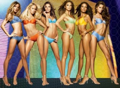
 (Victoria’s Secret models, found here)
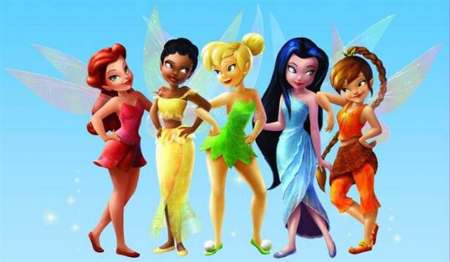
 (Disney fairies, found here)
I seriously don’t want to make too big of a deal out of this. I really don’t. I highly doubt that one of these images was modeled after the other or that there was some deliberate attempt to link Victoria’s Secret with Disney or sexy models with little girls.
That said, the two images point to a common visual trope. In this trope, a group of sexy women get lined up (often touching each other). They look almost identical, with the exception of a tiny bit of variation in skin color and hair. And they’re costumed in such a way as to make them look both alike and different (e.g., all in underwear of different colors).
The effect is to erase their individuality, but multiply the impact of the image. We don’t see a five or six women, we see Woman with a capital “W” (or Fairies in the second case). It’s like seeing a buffet from afar, you see Food, but not necessarily macaroni and cheese, little tuna sandwich triangles, fried okra, and fruit salad.
Let’s call it the there’s-no-such-thing-as-too-much-conformity-to-the-male-gaze trope. Or, I-like-my-women-like-I-like-my-collectibles (lots of ’em, all of a type, and on display). Or, women-come-in-a-rainbow-of-colors-just-kidding.
Do you have a better name for it?
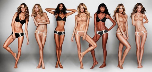
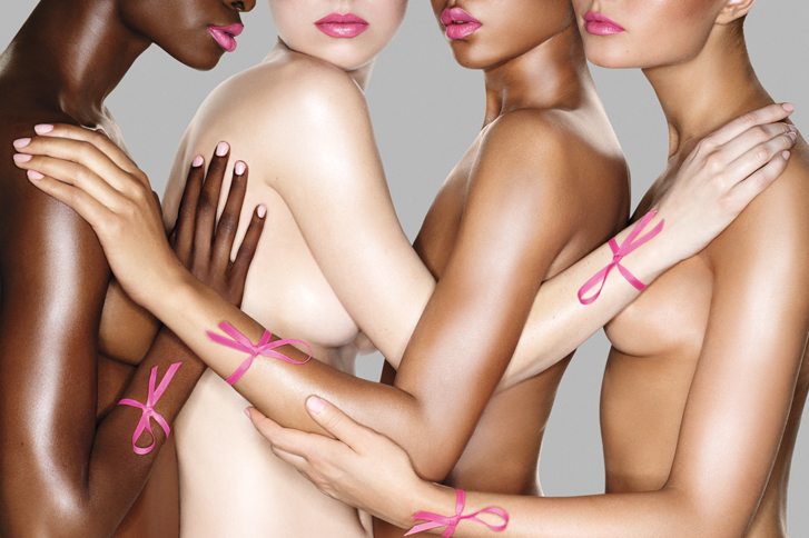
UPDATE: Here’s another one, sent in by Ann T. (says Ann’s boyfriend, “I know it makes ME think of cancer”):
And here’s one I found on the Ms. blog:
Caroline Heldman counts this as a form of sexual objectification. In these cases, women are shown as interchangeable, like objects. And, she writes, “like objects, ‘more is better,’ a market sentiment that erases the worth of individual women.”
Lisa Wade, PhD is an Associate Professor at Tulane University. She is the author of American Hookup, a book about college sexual culture; a textbook about gender; and a forthcoming introductory text: Terrible Magnificent Sociology. You can follow her on Twitter and Instagram.

Comments 44
Anonymous — October 28, 2011
A meaningful difference between the images is that the fairies are looking at one another, while the models and other women-as-collectible type images (eg the Disney princesses) often have them seemingly unaware of one another.
Theophile Escargot — October 28, 2011
I'm reminded of Picasso's "Les Demoiselles d'Avignon"
http://en.wikipedia.org/wiki/Les_Demoiselles_d%27Avignon
The significance there is apparently that it depicts prostitutes in a "parade" where they display themselves to the client so he can choose one of them.
MPS — October 28, 2011
Teams, sports teams and superhero teams, also pose like this. In those cases it's usually men. However I think the intended effect is as you say, to express the group as one united thing. In the case of athletes and superheroes, it's not seen as demeaning, I think because the thing they stand for conveys some higher status. The team is something revered, being a part of the team is admirable status. In the case of the underwear women, it's not clear what they stand for, as the united thing, and I suppose your read is as a more objectified sex object, which would be demeaning. That's not inconsistent with my response, as a heterosexual male, to seeing such images.
cee — October 28, 2011
Other pictures in a similar style:
http://images.picturesdepot.com/photo/c/csi-5241.jpg
http://media.onsugar.com/files/2011/04/16/5/1593/15933885/ac/CSI-New-York-Poster.jpg
http://www.gabriellekwan.com/wp-content/uploads/2010/10/gossip_girl_poster1.jpg
http://de.flash-screen.com/free-wallpaper/uploads/201011/imgs/1290666446_1280x1024_csi-ny.jpg
http://media.photobucket.com/image/csi%20pr%20photo/homur07/officewallpaper41024pr8.jpg
Other than the rainbow colors, these appear to be examples of a fairly standard trope for displaying a general cast of characters. Some of the other examples have slightly less overt 'lineups' with more staggered distances or varied poses, but others 'play it straight'.
In my opinion, the lingerie ad is clearly problematic, but for reasons independent of the lineup motif. The fairy image seems to have more in common with the t.v. materials, and doesn't appear problematic to my eye.
I'm interested in others' opinions and comparisons to the larger set.
Maurice Wade — October 28, 2011
What I find most interesting here is how each of the lineups exaggerates some physical feature. In the lineup of real (?) women, posture, shoes, etc. function to exaggerate leg length. In the other one, the heads are enormous relative to body size. Don't know if this means anything. But, I find it interesting.
Will L — October 28, 2011
I think the "feminine pose" and body contortions are interesting here too. Reminds me of http://jezebel.com/5829204/if-male-superheroes-posed-like-wonder-woman
Andres — October 28, 2011
On a side note, I actually like the fairy on the far right. She looks like she actually has some personality. And Tinkerbell looks decidedly uncomfortable (look at her forced smile and the distressed look in her eyes. She'd probably rather be fighting pirates right now.)
Guest — October 28, 2011
Here's an example of a lineup-style image that isn't offensive, but awesome:
http://tinyurl.com/3lku37b
It can be done!
Anonymous — October 28, 2011
A line is the easiest way to present a small group of people, end of story. It's a visual trope not because of sexual implications or displaying women as objects, but because it's the easiest way to present a small group of ANYTHING, aside from perhaps a V-shape, which comes off very similarly. Scan through photos of girls getting ready to go to a party, of students in halloween costumes, of families with a lot of children, of a band or sports team members, a wedding party, any situation where there is a group of more than two people acting as somewhat of a unit (REGARDLESS OF GENDER, and that's important). Chances are, assembling themselves in a line will show up at least once. Does this erase individuality? Possibly, but that is intentional both from the point of view of the photographer and those posing. They aren't saying "look at all of these people as individuals," but "look at this group of people." Not every situation calls for the individual to be the absolute most important aspect. In many situations, they HAVE to act as a unit as opposed to several individuals occupying the same space; that is not wrong.
Lizyockey — October 28, 2011
I just saw the (anti? trendy?) cancer ad yesterday in a friend's magazine and couldn't imagine what it was trying to accomplish. But I'm even more confused: the woman with the darkest skin was not in the ad I saw.
triciawang — October 29, 2011
yes this is totally a conformity trope!
This is part of a larger trend of portraying women with exagerrated body features - such as a big head - like the Bratz Dolls or Steve Madden Advertismenets (images attached).
Reut Gelblum — October 29, 2011
Well, two things
1. Disney characters ARE modeled after models, so why the surprise?
2. It's almost funny to see how variable the Disney characters are in hair color and hair style, in ethnicity and complexion (3 different shades of white?), but how perfectly bland they are in body type and in pose- just like the models!! (Oh, and they all have humongous tempting eyes, and tilt their head to one side making a tempting sideways look/ centering all IQ in one place...)
What the hell does “Think Pink” mean? | girlfriend junction — October 29, 2011
[...] image via Share this: [...]
Juliana Schwartz — October 29, 2011
haha, Ann's boyfriend is so right. When I want to support the fight against breast cancer, I generally call up my girlfriends so we can get naked together and touch each others' breasts...
Anonymous — November 10, 2011
I saw that breast cancer one in a display at Dillards, and my friends and I were casually talking about how cheap/vulgar/disconcerting/stupid it is to use svelte young naked ladies fondling each other to promote breast cancer awareness, and a worker got so offended when she over heard us (because her mom died of breast cancer, apparently). And I was so confused that she couldn't see that making cancer "sexy" trivializes the problem into simply something that makes you less sexy and fondle-able.
DT MSW — December 3, 2011
I think they are a bit more similar than just a trope. Compare the stances of the fairies and then take a look above at the models. See anything similar? One example is tinkerbell and the model in orange: that hip jut is exactly the same in both pictures. It is amazing to me that many people will comment about the sexualization of the models in those poses but not on the cartoons made for kids (that are also pretty well developed in the female form department for childs characters) in those poses. About the only thing that is different is the amount of clothing and where they are looking. Where do young girls get their body images? It starts with Tinkerbell...
Sexual Objectification, Part 1: What is it? : Ms. Magazine Blog — July 3, 2012
[...] image of a set of Victoria’s Secret models, borrowed from a previous Sociological Images post, has a similar effect. Their hair and skin color varies slightly, but they are also presented as [...]
Sexual Objectification, What is it? « BroadBlogs — November 26, 2012
[...] image of a set of Victoria’s Secret models, borrowed from a previous Sociological Images post, has a similar effect. Their hair and skin color varies slightly, but they are also presented as [...]
Gossipist – It’s Time for You to Stop Being a Sex Object – Pillowtok #34 — April 7, 2014
[…] image of a set of Victoria’s Secret models, borrowed from a previous SocImages post, has a similar effect. Their hair and skin color varies slightly, but they are also presented as […]
Eso que llamas cosificación masculina… no lo es. | Eugenia Andino — July 20, 2015
[…] Otras rasgos cosificadores: mostrar a personas o partes del cuerpo como si fueran intercambiables: “colecciones” de cosas. Aquí hay buenos ejemplos. […]