
Cross-posted at Jezebel.
Kelsey C. sent in a graph from the Bureau of Labor Statistics that highlights the gender wage gap. Among full-time workers during the last three months of 2010, men made more per week than women in each of these occupational categories:
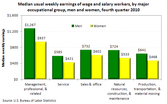
In terms of dollars, the gap is largest for the highest-paid workers — $330 — and smallest for those in sales/office, at $130. By percent, it’s worst for service (women make 72% as much as men in that sector) and again smallest for sales/office (women make 82% as much as men in that area).
And if we extrapolate this out, it adds up to a significant difference in annual earnings. If these income levels persisted for, say, 50 weeks, men in management would make $16,500 more than women; in sales, they’d make $6,500 more.
This is the only image the BLS provides, but if you’re interested in the topic, the full report has wages broken down by age and race/ethnicity (and sex within those categories) as well.
Comments 38
m — January 28, 2011
Is it just me, or does it seem like higher qualified jobs have a bigger gap than the ones of lower qualification? A bit depressing when considering the investment put into them.
Rob — January 28, 2011
There are a couple of things worth keeping in mind with analysis like this before one immediately assumes that the entire gap is caused by active discrimination by employers.
1) Women on average work fewer hours per week, so when looking at weekly salaries vs hourly salaries you see a larger gap. Part of this may be caused by employers giving women shorter shifts, and part may be caused by women requesting to work shorter hours.
2) Women at the aggregate level often have different job preferences within a specific broad job category. If men tend to prefer the higher paying jobs in an individual category like "Management" which can encompass a wide range of different jobs, that might contribute to the gap without it being caused directly by employer discrimination.
3) Analysis like this really ought to be controlling for years in the work force, years at current job, and years of education, as these three factors have been consistently demonstrated to be strong predictors of salary.
Lucy — January 28, 2011
One would think that if all those women are working at that much lower pay, that employers would be vaulting all over each other to hire them...especially in that "material moving" sector. What gives?
Renee — January 29, 2011
I don't really buy anecdotal evidence like that.
My last job I seem to recall doing quite a lot of work while my manager and supervisor (both men) talked baseball all the time.
Other guys liked talking about sexual conquests and games/movies. Guys are just as lazy and gossipy as women.
I also don't buy the whole "high physical" job crap. I was in the Army and had no problem doing what I was asked and I know from experience that it's way more than what any run of the mill job requires.
Like moving a 30 pound box of crap with a cart is hard manual labor, pshh...
Quit trolling and make me a sandwich.
m — January 29, 2011
See that most commenters here are women? If we snicker, we do so because we know ourselves and the women around us a lot better than you do from observing your coworkers. And also because someone who actually uses the wors feminazi unironically is about the worst source you can get for a statement like this.
katthemad — January 29, 2011
Ah yes, Feminazis, cuz wanting equal pay for equal work is EXACTLY the same as invading Poland.
nick — January 29, 2011
There is simply no way a woman is equal to a man and vice-versa. Until men and women come to terms that we are not equal in any way shape or form, all this nonsense about gender biases will disappear. My prior post was meant to be inflammatory and sollicite responses. Get a feel for the social conscience of this site. It's like saying men commit filicide more than women by 22% more. This is what the above stusy is saying right, men make on average 22% more than women?
Here is a nice little "official" chart you may look at which states women commit filicide in 29% of all 0-5yr child murders. Men are responsible for 31%.
So I guess if this study is correct, then we must be equal, right?
You know just sayin'
http://bjs.ojp.usdoj.gov/content/homicide/children.cfm#kidsrel
So of you can kill your kids as much as men, then you deserve equal pay! And men deserve equal parenting time, every time. Cuz we are equal right? I mean I shouldn't have to worry about going to court and getting shafted right? Cuz I will get 50% parenting time, right? If I go to court for more paretning time, is it to lower child support? I have heard that the feminazi say this is the only reason a guy would want more time with his kids. This notion is absurd on two fronts.
1. If the child support he’s paying you now isn’t enough to cover the basic expenses as is so often argued, then your claim makes no sense as having more child custody will be more costly to him than simply paying his court-ordered child support.
2. You can’t argue that he is trying for more child custody to reduce child support without also saying (without saying) that you’re fighting against his having more child custody to maximize child support.
So all this crap about gender equality seems to be a double standard. You don't all really believe it with so may court cases backlogging thte court system and costing billions in legal revenues which could be put back into the parents pockets, 50% to each. Maybe then I would sympathize with unequal pay mourning such as the thread topic. We should all be judged by a single standard if we are to get equal pay and equal parenting. Woemn abuse, men abuse, equally. Maybe it's time women get over themselves and get out of the 80's and into today's highly competitive mentality. Work for it.
nick — January 29, 2011
Reasons Women Supported Obama
According to Dr. Vicky Lowell, IPR's Acting Director, their research has shown that women feel more anxiety over financial burdens and their overall economic well-being than men. In women's perceptions, Obama was:
* Better equipped to deal with the nation's economic ills;
* Projected empathy for women's financial struggles;
* Understood how hard it can be to keep a job today while caring for families;
* Understood that women are more economically vulnerable than men;
* Offered hope while acknowledging women's struggles.
* Aware of the need for pay equity and work/life balanced policies.
* In touch with the need for expanded health insurance for children.
You go Bama!! Voting just ain't gonna cut it girls, need more activism. Get out there and put up a intelligent fight. Somethings gotta give. I'm off to make someone a sandwich.
nick — January 29, 2011
http://www.bbc.co.uk/news/uk-england-manchester-12309354
These ladies knew what to do. When you want something, go get it. Don't wait for ppl to guess what your thinking.
nick — January 29, 2011
Here's how you DO something about it! Learn to be doers ladies!!
http://www.nolo.com/legal-encyclopedia/article-30153.html
$oCraTTTe$$$$ — January 29, 2011
More men are convicted of crimes than women. Maybe this is also the byproduct of discrimination? Much like employers perceive men to be harder-working than women and therefore worthy of higher pay, police and judges assume men are more violent/criminally inclined than women and you get higher conviction rates.
This theory is particularly born out by the fact that men (like african-americans) are treated more harshly at sentencing than women. I.e. a man and woman convicted of the same crime will likely receive different sentences (trust me, you do not want to be black AND a man at a sentencing hearing).
I look forward to a society where prisons are filled with pretty white girls and Fortune 500 board rooms are run by obese black women. Men will run the daycare centers and dance in our strip clubs.
T — January 29, 2011
Wow, this thread deteriorated rather quickly....
Mindblogs: Part 9 « Law & Mind Sciences — January 29, 2011
[...] blog where people can submit images that they find sociologically compelling, ranging from graphs from the Bureau of Labor Statistics illustrating the gender wage gap and pictures of consumer products differentiating between [...]
The Gender Gap, Now With Illustrations - The Pursuit of Harpyness — January 30, 2011
[...] on Sociological Images, they point out that …if we extrapolate this out, it adds up to a significant difference in [...]
Brandon — January 31, 2011
Hey, Nick: I'm a man who embraces the "femi-nazi" cause. Try to wrap your head around that.
nick — January 31, 2011
Interesting article about equal pay. Here it is in it's entirety for your benefit and leisure. Kinda shows both sides of the coin.
Tory MP calls for male equality
Men are increasingly the victims of ‘obnoxious bigotry’ by women and should start ‘burning their briefs’ in protest, according to a rising Tory star.
Dominic Raab, a new MP tipped for high office, said men were getting a ‘raw deal’ from the cradle to the grave following years of anti-discrimination legislation favouring women.
He pointed out women in their 20s are now paid more than their male peers, who work longer hours, retire later and die earlier.
Mr Raab, the 37-year-old MP for Esher and Walton in Surrey and a former chief of staff to David Davis, called for an end to what he called feminist bigotry.
He said men were blamed by society for the banking crisis, discriminated against by parental leave rules which favour women who want time off and ignored by the courts when relationships break down and they seek custody of their children.
Mr Raab suggested men should rise up against what he called the ‘equality bandwagon’, which has pitted them against women since the 1960s, likening the cause to that of the Suffragettes.
‘Maybe it’s time men started burning their briefs, to put to an end once and for all what Emmeline Pankhurst used to call “the *double standard of sex morals”, the MP wrote in an article for the politicshome.com website.
Mr Raab welcomed the Government’s plans to make the system of parental leave more flexible, by allowing mothers and fathers to divide up time off evenly.
He said that sort of policy was more relevant than Labour’s ‘outdated and obsolete equality and diversity agenda’.
‘Take the gender pay gap. The fascinating thing is just how sexist its champions have become,’ he said. ‘It is almost taboo for a man to question the assertion that the rapidly dwindling pay gap is the result of discrimination, rather than genuine choice,’ he said.
‘Yet, research shows the pay gap has halved since the 1970s. Office for National Statistics data in December showed that, since 1997, the difference between full-time median earnings has fallen from 17 per cent to 10 per cent – and the shrinkage is accelerating.
'According to research for the Institute for Economic Affairs, women in their 20s earn one per cent more than men, single women a shade more.
'Gay men earn more than straight men, lesbian women more than heterosexual women. Does that sound like a society *riddled with discrimination?
‘Meanwhile, pay is just one of the terms of employment. Men work longer hours, enjoy their jobs less, commute further and are more likely to get the sack.’
Mr Raab said Britain now had some of the toughest anti-discrimination laws in the world, but was ‘blind to some of the most flagrant discrimination – against men’.
‘From the cradle to the grave, men are getting a raw deal. Men work longer hours, die earlier, but retire later than women. That won’t be fixed for another seven years.
‘One reason women are left *"holding the baby” is anti-male *discrimination in rights of maternity/paternity leave.
‘Meanwhile, young boys are *educationally disadvantaged *compared to girls, and divorced or separated fathers are systematically ignored by the courts.’
Mr Raab – whose wife Erika works in marketing for a major IT firm – said there was also more subtle sexism.
He said: ‘One Financial Times commentator recently complained that: “High-flying women are programmed to go for high-flying men. Most men aren’t attracted to women who are more successful than they are”.
‘Can you imagine the outrage if such trite generalisations were made about women, or other minorities? Feminists are now amongst the most obnoxious bigots.’
But Harriet Harman, Labour deputy leader and former equality minister, said: ‘Women still earn 20 per cent less than men, domestic violence claims the lives of women every week and women bear the brunt of poverty in the developing world.’
Nia Griffith, the shadow business minister, called on Mr Raab to "get real and stop being so self-pitying”.
"The reality is that women with very good qualifications time and time again do not get the top jobs and opportunities," she said.
Kate Green, chairman of the Women's Parliamentary Labour Party, said: "The equality and diversity agenda put in place by Labour has been hugely important in levelling the playing field for millions of people in the workplace and we need to ensure we continue to build on its success."
Labour MP Kate Green, former chairman of the London Child Poverty Commission, said: ‘This is exactly the kind of attitude that shows the Tories are out of touch.’
By James Chapman
Richard H. — January 31, 2011
I pull some feeds from The Society Pages into a Tumblog (Tumblr blog) I maintain for my sociology courses. Often the posts become good discussion fodder Occasionally, I will "reblog" material from the teaching blog into my personal one. Others have reblogged the post from there. This is far and away the most reblogged post I've ever had. The issue has struck a nerve and it's all over Tumblr now.
Johnathan — February 1, 2011
Women choose lower-paying jobs because they choose easier degree programs in university.
This is why the highest income bracket has the largest discrepancy.
For every CEO job, there are more male candidates, for every doctor job, there are more male candidates, for every senior engineering position, there are more male candidates. This all combines so that more males are in high-earning positions than females and therefore, since the sample sizes are similar, the average wage for males are higher than females.
nick — February 1, 2011
In the UK, men in their twenties are now paid less than women and parenting legislation discriminates against mums and dads who want to share parenting. This not only contributes to the parenting pay gap that affects women over 30, but also results in just 1 in 9 UK dads having the opportunity to continue sharing the parenting of their children after separation (compared to 1 in 3 dads in Sweden).
These global themes are reflected in our own citys where:
• A boy born in one of our poorest neighbourhoods will die 13 years sooner than a girl born in a wealthy neigbourhood
• Boys underperform girls at every level of education, are more likely to have literacy problems and less-likely to attend university
• The city has the second highest suicide rate and the highest rate of drug-related and alcohol-related deaths and harm in England – all of which are issues experienced predominantly by men
• Young men are twice as likely as any other group in our city to be the victims of violent crime
• The vast majority of homeless people and prisoners are male
• The overwhelming majority of young parents targeted for intervention work in the city are mothers
• Projects for women receive nearly 1,300 times more funding than men’s projects
• Community projects funded by the council are 50% more likely to benefit women
• Most public-facing services provided by the public and not-for-profit sector are predominantly run by female staff and volunteers, a situation which is at odds with the City council’s commitment to ensure that its workforce is representative of the communities it serves
The premise of this strategy is that the failure to relate to men and boys as a distinct group with specific needs is a cause of inequality and discrimination and is at direct odds with the Strategic Partnerships commitment to improving the quality of life of everyone in our city – including men and boys.
It is not possible to improve the lives of men, for example, if we are not first prepared to consider the unique experiences of men and boys as a group and understand the inequality and discrimination that they face.
This is a difficult approach for any city to take when operating in a broader strategic context that focuses on gender inequality as something that only women experience. However, if the city’s partners are truly committed to promoting opportunity for all, irrespective of gender, then there are some key strategic threads that we can draw upon to help our Strategic Partners to focus on the specific needs of men and boys more effectively.
nick — February 1, 2011
Wage Gap Myth... women execs actually earn MORE than men, not less.
As much as feminists love to parrot the statistic that women earn only 76 cents on the male dollar, they rarely bother to provide an explanation or solid evidence for this claim. But fortunately a smart new book has hit the shelves just in time for Equal Pay Day to help them out.
Equal pay for equal work has been enforced by the Equal Employment Opportunity Act since it was made law in 1972. The Equal Pay Act of 1963 and Title VII of the Civil Rights Act of 1964 also ban sex-based wage discrimination. So it seems pretty remarkable that the wage gap is so wide and pervasive even today. Attorneys should be having a field day with class-action lawsuits. But they are not. Could it be that even the legal establishment is complicit in this glaringly obvious patriarchal conspiracy?
The 76-cent statistic (now actually 80 cents, according to the U.S. Census Bureau) is misleading because it is a raw comparison of all working men and women. Thus a female receptionist working 40-hour weeks is tossed in with the male orthopedic surgeon putting in 70-hour weeks.
A study of the gender wage gap conducted by economist June O' Neill, former director of the Congressional Budget Office, found that women earn 98 percent of what men do when controlled for experience, education, and number of years on the job.
Warren Farrell, three-time board of directors member of the National Organization for Women New York City, exhaustively debunks the wage gap myth in his book "Why Men Earn More." Farrell documents occupations requiring bachelor's degrees in which women's starting salaries actually exceed men's. Female investment bankers and dieticians, for example, can expect to earn 116 percent to 130 percent of their male counterparts' salaries.
The real reason than men tend to out-earn women is the choices they make. Men are far more likely to take unpleasant and dangerous jobs, what Farrell calls the "death and exposure professions." For example, firefighting, truck driving, mining and logging -- to name just a few high-risk jobs -- are all more than 95 percent male. Conversely, low risk jobs like secretarial work and childcare are more than 95 percent female.
Farrell points out that in California, prison guards can earn $70,000 per year plus full medical benefits and retire after thirty years with a hefty retirement package. But it takes little imagination to figure out why California still has a difficult time staffing its prisons, and it goes without saying that most prison guards are male. Says Farrell, "As with most jobs, there's an inverse relationship between fulfillment and pay."
Because men are more likely to take jobs that are unpleasant, dangerous or dull in exchange for higher pay, they reap the financial benefit. Farrell summarizes this phenomenon this way: "Jobs that expose you to the sleet and the heat pay more than those that are indoors and neat."
Another reason women's average earnings are less than men's is that they take more time out of the workforce for care-giving. Women, more so than men, adjust their work schedules to accommodate their families, and in poll after poll, they express a preference to do so.
"Well, why can't men and women share domestic responsibilities 50-50 so women will be just as free and unencumbered as men are?" the conventional feminist argument goes. Such an arrangement is unrealistic as it requires both husband and wife to work part-time. Couples typically find it easiest for each partner to specialize and make the sacrifices required to sustain the family.
Scholars can debate whether it is societal pressure or innate desire that makes women elect to spend more time with their children. But so long as these decisions are a reflection of women's expressed preferences, this isn't a problem that needs to be solved.
Arrah Nielsen is a junior fellow at IWF.
Independent Women's Forum - Gender Wage Gap Is Feminist Fiction
Andreas Moser — February 19, 2011
Here is the REAL reason why women earn less than men: http://andreasmoser.wordpress.com/2011/02/19/gender-pay-gap/ They have different expectations in life, and the female preference for rich men forces men to earn more.
Wages for Females | Female Segregation — March 31, 2015
[…] http://thesocietypages.org/socimages/2011/01/28/the-gender-gap-in-wages/ […]