
The NYT has posted an interesting interactive map showing the results of the last slave Census taken in the U.S., in 1860, which I discovered via Jessica Brown and Jim Yocom. The map, which shows county-level data, illustrates how slave ownership varied throughout the South
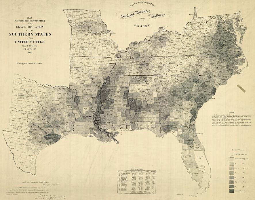
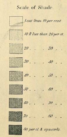
The shading (a new technique at the time, according to the NYT article) indicates what percent of the entire county’s population was enslaved:
You can see the percentage for each county, which is listed on the map, more easily if you zoom in on the pdf version. The cotton-belt area along the Mississippi River clearly stands out, as does Beaufort County, South Carolina, all with over 80% of the population enslaved. The highest rate I could pick out (the map got a little blurry as I zoomed) is in Issaquena County, Mississippi, where slaves appear to have made up 92.5% of the population.
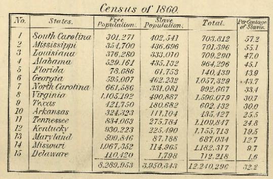
The map also included information on the overall population and % enslaved at the state level; in South Carolina and Mississippi, over half of the total state population was made up of slaves:
Also check out Lisa’s post on geology, the economy, and the concentration of slavery in the U.S.
As the NYT post points out, the map doesn’t show the dramatic increases in slavery in some areas. For instance, while Texas ranked fairly low in terms of the overall slave population, the number of slaves in the state had tripled between 1850 and 1860. The number had doubled in Mississippi between 1840 and 1860. Those growth rates make it rather hard to swallow the argument sometimes presented by those romanticizing the Confederacy that slavery was actually on the wane and would have soon been ended in the South anyway, without any need for federal interference, and wasn’t why the South seceded at all.
Jon Stewart and Larry Wilmore discussed this effort to frame discourses about the Civil War to erase the issue of slavery on The Daily Show:
Comments 28
conductress — December 11, 2010
The John Stewart video is good, although I don't have a problem with anyone commemorating the Nat Turner rebellion. I see why they used this example though.
DORU — December 11, 2010
Bringing up the issue of cruelty in the South always gives me the holy-than-those-people warm fuzzies, since it detracts from the cruelties perpetrated against minorities in my own geographic area. Sure, we enslaved blacks and oppress them even today (most are safely corralled into low-income neighborhoods or jail), but at least we did it for less time and to a lesser degree!
Ratoslov — December 12, 2010
I guess I'm more ignorant of the antebellum period than I thought I was... I didn't even know that there were parts of the South that were 80%+ enslaved. That's insane.
Makenzie — December 12, 2010
There is something about this matter-of-fact census of people who were /enslaved/ that is just viscerally more horrible to me than all the stuff I've read about American slavery. I feel ill.
GabyK — December 12, 2010
Does anyone either have a link to this that us Europeans can watch or could we have a transcript? I do love Daily show stuff but I'm not able to watch the daily show vids on this side of the pond.
I personally don't really know enough about the north/south divide in the US, but I don't think one needs to see it as a 'we're better than you' in this instance. The denial of slavery or its degree is a bad thing I think we can all agree. Very few systems were completely horrific in all instances but that doesn't mean they are not intrinsically wrong.
Laya — December 13, 2010
I wonder who was classified as "free" according to this map. One side of my family is from Worcester County, MD, and the other is from Wicomico County, MD. Both are in the "30-40%" range, but I know from research both families have done that there were many freed black settlements in both areas at the time this census was done. Some people chose to stay near their families rather than move North.
Fritz — December 14, 2010
Someone in GA once told me they preferred the term "The War of Northern Aggression".
I wonder what enslaved people called slavery? "The War of White Cruelty"?
tweets for 2010-12-12 « The Mushkush Digest — December 14, 2010
[...] of the Last U.S. Slave Census, 1860 – http://thesocietypages.org/socimages/2010/12/11/map-of-the-last-u-s-slave-census-1860/ [...]
Map of the Last U.S. Slave Census, 1860 » Sociological Images | Getgln's Blog — May 28, 2011
[...] Scoop.it – CommunityVillage3,950,343 slaves in the U.S. in 1860Show original This entry was posted in Uncategorized. Bookmark the permalink. ← Residential Racial [...]
Sid Meier’s Colonization – play log vol.3 « SAND STORM — August 19, 2012
[...] ◇ Map of the Last U.S. Slave Census, 1860 @ Sociological Images [...]
Around the Web | TEMP Minds — October 7, 2014
[…] Check out this cool map based on 1860 census data on slave populations. By shading the southern counties to represent the proportion of the population that is enslaved (a new technique at the time, we are told) the reader can identify some clear patterns on slave population density. […]
Around the Web | Savage Minds — October 8, 2014
[…] Check out this cool map based on 1860 census data on slave populations. By shading the southern counties to represent the proportion of the population that is enslaved (a new technique at the time, we are told) the reader can identify some clear patterns on slave population density. […]