
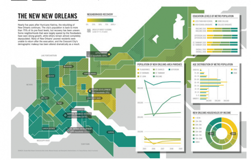
Allie B. sent us a link to an image at GOOD that presents some pre- and post-Katrina information about New Orleans. The map indicates levels of population recovery; the darker the shade of green, the more the population has rebounded:
A close-up of one section (areas with black shading had over 6 feet of floodwater):
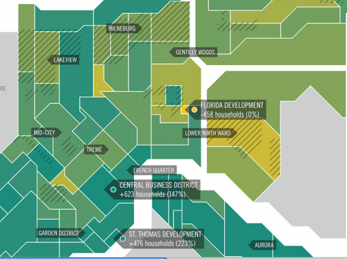
Notice that the Lower Ninth Ward, one of the hardest-hit areas, has among the lowest level of redevelopment.
There’s a much larger version of the map (with a not-too-specific list of sources) here.
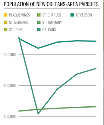
Changes in the populations of different parishes:
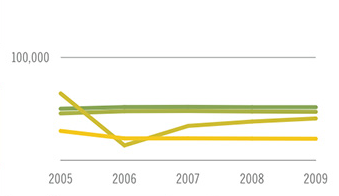
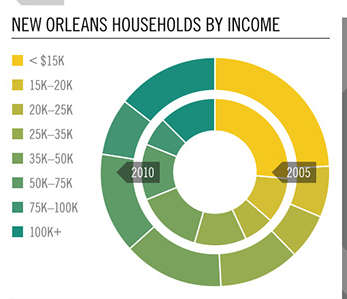
The income distribution has changed somewhat as well, with a smaller proportion in the lowest income categories (though notice that the dollar range included in each color isn’t consistent as you get into the higher incomes):
Comments 23
T — August 29, 2010
I know this comment is controversial... but I do wonder if it's actually *appropriate* that the lowest (below sea level) area of the city aren't being resettled.
PO — August 29, 2010
I agree. Why are rebuilding large chunks of a city that are bound to be underwater every 50 - 100 years?
If folks want to live there, then fine, but there should be no government assistance.
Lindsay — August 29, 2010
The chart nerd in me rails against the uselessness of that last chart. I mean, really, a nested pie graph? It sabotages the purpose of having a pie chart, which is quick visual comprehension.
Heather Leila — August 29, 2010
To those people who would ask if people should be allow and assisted to resettle low-lying areas of New Orleans, I would say this: there are numerous cities in the U.S. where humans cannot live without great amounts of resources and technology assisting them. LA and Las Vegas are deserts which face water crises every so often, which can't support themselves agriculturally without massive irrigation projects. There are numerous cities in the mid-west which must constantly rebuild after tornadoes. Florida is constantly battered by hurricanes.
A home is more than the environmental challenges it faces. It is a culture, a history, a community. The Lower Ninth Ward pre-dates the levee that was cut through it and which eventually failed and caused the massive flooding. It is not bound to happen again if the Federal Government does what it is supposed to do. The levees are Federal responsibilities, built to benefit industry- not the people who were already living there.
It IS wrong to ask if people should be allowed and assisted in rebuilding New Orleans, the Ninth Ward specifically. How dare anyone ask if this community deserves to exist. No one asks if LA, Las Vegas or Miami deserve to exist.
Heather Leila — August 29, 2010
That's great then, that people question L.A. So, the next time an entire neighborhood is leveled by an earthquake, will people question rebuilding it? Because people shouldn't have been living there anyway?
The Ninth Ward neighborhood was there before the canal and the levee. The levee wouldn't have broken and flooded the neighborhood if the government had maintained it the way they are supposed to. So, to ask if people should live there anymore, yes, it is callous. It's implying it's the residents' fault for living in a hazard zone when it wasn't hazardous when their grandparents moved there. The government is saying they will maintain the levees better this time...and if that's true, the flooding shouldn't happen again. The flooding isn't inevitable. But could it happen again? Yes, but not because of the weather, because of human neglect.
I think calling the people of the Ninth Ward who want to return home beggars (as a different poster did) that shouldn't be allowed to choose where they live is classist and racist. Why shouldn't poor people be allowed to live where their grandparents did? If the government is responsible for the destruction of those homes, why shouldn't the gov be responsible for helping to rebuild them? (and the extent to which this is happening is questionable)
If better urban planners had been present when the canal was built, maybe it wouldn't have been built at all.