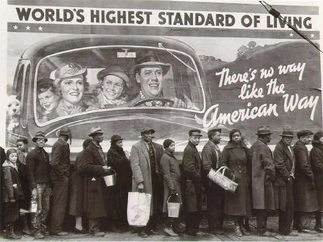
Marc sent in this image (found here):
According to this site, the photo was taken by Margaret Bourke-White; this site, where you can buy old issues of LIFE magazine, lists the photo in the index for the February 15, 1937, issue. Apparently the people standing in line were flood victims.
This is a great image for sparking discussion about “the American Way” and what that was meant to be (clearly white and presumably middle-class, from the mural), and the ways in which non-whites (and poor whites) are often invisible in depictions of what America is. And, of course, it could be a great image for a discussion of rhetoric and propaganda (for instance, murals proclaiming how wonderful the standard of living is even though the Great Depression was by no means over).
Thanks, Marc!


Comments 22
acolyte — May 31, 2008
Remember the American Way is always synonymous with the white way? That is why an all American girl is always white, blue eyed and blonde. Minorities and the disadvantaged dont figure in this equation one bit.
Tom — June 1, 2008
Margaret Bourke-White was a fantastic photographer, I have a book of her early work but can't find one of her later work, which is her political era. She photographed Gandhi and Nehru, Nuremberg after the Blitz, and plenty of scenes like this around America. If you can her later work, it is well worth checking out. And if you find a book of it, please tell me!
Dangger — June 1, 2008
A few days ago we were making a list of things a superheroe needs. Like the ability to drive any typ of vehicle and stuff like that.
If you take a look at comic superheroes they represent a lot of the american way. Must of the main ones (spidey, hulk, thor, ironman, 4 fantastic, batman) are white, male adults that, when they are not fighting crime, really experience the american way.
juglar del zipa — September 21, 2009
amazing
Lim — February 3, 2010
Look at EVERY Negro state or country in the world and the picture is the same.
Figure that one out ? ......No brainer ...right ?
Elise — March 21, 2010
Cette photo est magnifique :)
guest — February 27, 2012
sooooooooo ironic..
Bomboncaro34 — February 29, 2012
hola
Bomboncaro342 — February 29, 2012
why they have a sad face?
Bomboncaro32 — February 29, 2012
chucho esta biien feo!!! y k todo mexico se entere
Laquieres_siono — February 29, 2012
alonDra piiensa como cucaracha y toma mediicina para cagar!
Laquieres_siono — February 29, 2012
ana se tarda muchOo en el baño x k no puede cagar
Laquieres_siono — February 29, 2012
Alondra guerrero mireles esta biien mensa y tiiene facebook
Ratboy_13 — February 29, 2012
se la pelam a chucho
Laquieres_siono — February 29, 2012
diana huele a mierda
Laquieres_siono — February 29, 2012
diana apesta a culooooooooo!!!!
Laquieres_siono — February 29, 2012
dianan puga
Laquieres_siono — February 29, 2012
a chuicho se la pelan
Laquieres_siono — February 29, 2012
chantal le apesta la panocha a pescado
Bamdskjdjdm — February 29, 2012
carlos y chucho son putos!
Silent photo thread. (Contains graphic images!) - Page 56 — June 4, 2012
[...] [...]
ThePeopleofDetroit — August 14, 2012
I just downloaded "There's No Place Like America Today" by Curtis Mayfield. Loved the album cover art and wanted to know what it was inspired by. Great, great photograph.
- Noah
http://thepeopleofdetroit.com