politics

Companies donate to political campaigns in order to gain some leverage over policy making processes.  This fun interactive graphic (via) allows you to see which companies donate primarily to Republican and Democratic campaigns, and which straddle the political fence.  These are the companies with the largest total contribution:

Capture

The most Republican leaning:

Capturerep

The most Democratic leaning:

Capturedem

You can also search by type of company.  For example, media and entertainment:

Captureent

Transportation:

Capturetrans

Pharmaceuticals:

Capturepharm

UPDATE: Comments on this thread have been closed.

—————————

Lisa Wade is a professor of sociology at Occidental College. You can follow her on Twitter and Facebook.

This Associated Press interactive graphic (via) displays the number of uninsured by state and provides state-specific details on the rise of health insurance costs (for employers and employees) for each state.  The number of uninsured (darker = larger #s; note that this data is highly tied to the number of residents in each state):

Capture

Some data for Illinois:

Capture2

To interpret:  In Illinois, the amount of money an employer pays each year, on average, for a family has increased 65.3% over the last ten years, and the amount the employee pays has increased 88.4%.  Employees with families now spend, on average, $2,743 a year for their health insurance.  That translates into 7% of the family income (assuming a single breadwinner), up from 4% in 1996.  Over a million workers in Illinois are not so lucky; they have no health insurance at all.

This data reminds us that, in addition to many uninsured, many of us are already paying for health insurance, so the use of taxes to pay for government provided health care would not necessarily cost those who are already insured and may actually save them money.

—————————

Lisa Wade is a professor of sociology at Occidental College. You can follow her on Twitter and Facebook.
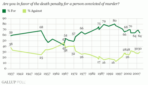
I found this graph of public support for the death penalty over time at the Gallup Poll website:

death penalty

I’m not sure what the “2828” and “3030” are at the right-hand side of the “% Against” line–perhaps they didn’t round off the %s? I looked at the specific %s given in a table and that seems to fit–that they were supposed to be 28% and 30% and somehow weren’t entered correctly.

Some other questions that were asked:

Generally speaking, do you believe the death penalty is applied fairly or unfairly in this country today?


Fairly

Unfairly

No opinion


%

%

%

2008 Oct 3-5

54

38

8

2007 Oct 4-7

57

38

5

2006 May 8-11

60

35

4

2005 May 2-5

61

35

4

2004 May 2-4

55

39

6

2003 May 5-7

60

37

3

2002 May 6-9

53

40

7

2000 Jun 23-25

51

41

8

Asked about if the person believes an innocent person has been executed in the past 5 years:


Yes, in past
five years

No, not

No
opinion

2006 May 8-11

63%

27

10

2005 May 2-5

59%

33

8

2003 May 5-7

73%

22

5

Do you feel that the death penalty acts as a deterrent to the commitment of murder, that it lowers the murder rate, or not?


Yes, does

No, does not

No opinion


%

%

%

2006 May 8-11

34

64

2

2004 May 2-4

35

62

3

1991 Jun 13-16

51

41

8

1986 Jan 10-13

61

32

7

1985 Jan 11-14

62

31

7

The answer to that last question is interesting in that it indicates people do not, in general, support the death penalty because they believe it reduces the likelihood of more murders. The most common response to why people support it is based on a retaliation/”eye for an eye” principle, not deterrance:


May
19-21,
2003

Feb
19-21,
2001

Feb
14-15,
2000

Jun.
13-16,
1991


%

%

%

%

An eye for an eye/They took a life/Fits the crime

37

48

40

40

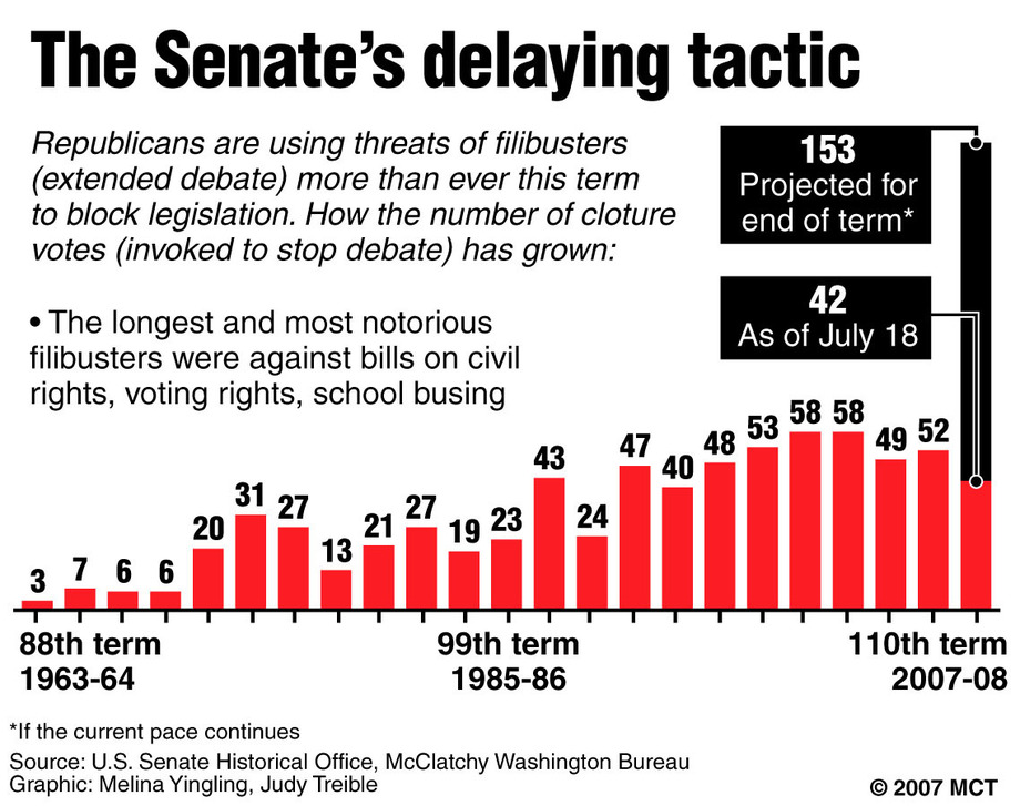
Filibustering in the U.S. Senate (preventing a vote on a bill with continuous speech–or at least the threat of it, since often now a Senator just has to state that s/he intends to filibuster; if there aren’t 60 Senators to vote for cloture, they often just pretend the filibuster happened without making a person actually do it)–has been increasing over time:

654-20070720-FILIBUSTERS_large_prod_affiliate_91

Why? Greg Koger at the Monkey Cage has a fascinating explanation (via Matthew Yglesias):

So why did the Senate change? The stock answer is that the chamber’s responsibilities grew with the size and scope of the federal government, so it became more costly to sit around watching obstructionists kill time. There is some truth in that explanation. Also, however, senators’ work habits changed. The introduction of railroads, cars, and (especially) air travel made sitting around in the Senate chamber so…boring. Tedious. Totally lame. During the mid-20th century, the Senate increasingly became a Tuesday-Thursday club, and individual senators began insisting that major legislation be kept from the floor to accomodate their travel schedules. A serious attrition effort would mean cancelled speeches in Manhattan and Chicago, no trips to the Delaware coast, and waiting longer to return to the ranch back in Texas.

—————————

Lisa Wade is a professor of sociology at Occidental College. You can follow her on Twitter and Facebook.
Since George W. Bush became president, a common criticism of him and his presidency has been that of nepotism: that he only rose to prominence because he is a member of a distinguished, wealthy family that has been involved in politics for generations. In the 2000 election, both candidates were the sons of men who held high political office. When Hillary Clinton became a serious contender for the Democratic nomination, many people (including me) thought there might be something a little disturbing in the fact that we might be flip-flopping between two families for as much as 28 years (if she won two terms). It seemed like evidence that American politics is becoming increasingly exclusive, with family connections playing a huge role in who ends up in positions of power.

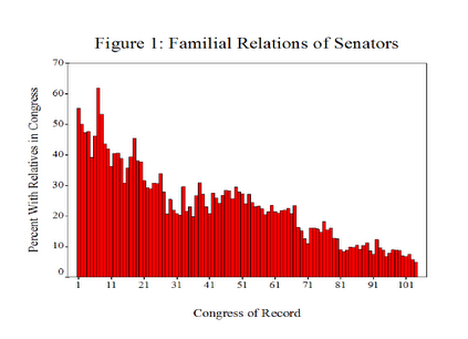
It is certainly true that family connections can have a lot of influence in U.S. politics. But Tom Schaller at FiveThirtyEight shows that, at least in the Senate, it’s becoming less common to have family members who also served in the Senate. Here’s a graph showing the percent of Senators in each Congress who had relatives who had served in Congress (at the same time or in the past):

Picture 1

The trend was clearly downward regardless, but Schaller points out that starting with Senators elected to the 64th Congress (in session 1915-1917), Senators were popularly elected rather than appointed. (Only 1/3 of Senators go up for re-election each time, so it wasn’t until the 66th Congress (1919-1921) that all serving Senators had been elected.)

So what we see is that in at least one part of the federal government, this particular type of family tie has decreased over time. Of course, there are many other ways family connections might help a person get elected to the Senate, and there are many other political offices that might be more or less influenced by a person’s family ties. If we looked at the percent of all Cabinet members, say, or Representatives, who had family members who had served in any major federal political position, we might see a much more obvious trend. But at the very least, the picture seems more complicated than arguments that our political system is dominated by a few family dynasties suggest.

The other thing that interests me is the fact that even Schaller seems to automatically equate having a family member previously (or currently) serve in the Senate with nepotism. I agree with a lot of his points about nepotism in general and the ways in which people often oppose “affirmative action” while never noticing the many, many ways they have themselves gotten an advantage from policies or personal connections that are, for all intents and purposes, forms of affirmative action. That said, nepotism as it is generally understood refers to people getting positions based on family connections regardless of whether they are qualified for or deserve them. I think Schaller is using the word in the looser sense of “getting a position based on family connections” without necessarily implying a lack of qualification. But I think for a lot of people, the fact that someone had a relative who previously served in high political office would be automatic evidence of nepotism (in the more derogatory sense) at play. And while I’m sure it often is, and that many people who get a job through family ties aren’t even vaguely qualified for them, I don’t know that showing that an official had a family member who previously held political office is prima facie evidence of nepotism. Presumably at least some people follow a family member into office and are completely and totally deserving of it, and thus might fit the less negative definition of nepotism I believe Schaller is using but not nepotism in the sense of “unqualified person who gets a job just because of Daddy.”

Etan B. sent in this ad (found Etan’s blog) that the CDU, a conservative German political party, is using to compare its candidate, Vera Lengsefeld, to Angela Merkel. The ad shows a photo of Merkel on the left and Lengsfeld on the right. Both women are in dresses that reveal cleavage (the photo of Merkel generated a lot of discussion when it first appeared about whether she was dressed too sexily):

merkel

The text on the left, across the image of Merkel, says “We have more to offer,” the implication being, of course, that the conservative party has more to rely on than cleavage. Lengsfeld explained the ad this way:

If only a tenth of them also look at the content of my policies, I will have reached many more people than I could have done with classic street canvassing.

UPDATE: Now I’m confused. Elena says,

Merkel is the chairwoman of the CDU. Both women belong to the same party, and according to the ad both have “[more] to offer”.

I apologize for the confusion about Merkel’s party–I read in two different places the account I gave above. So I guess the CDU is basically saying you should vote for it because it has candidates that are sexy? I kinda think that’s actually worse than what I originally thought it was. Elena, thanks so much for the clarification!

You can also read an article about the controversial ad at NPR.

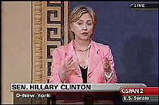
As Etan points out, it’s reminiscent of the scrutiny Hillary Clinton received after she wore this outfit on the Senate floor:

PH2007071902669

As far as men go, in 2000 Rolling Stone was accused of airbrushing this cover photo of Al Gore to make his crotch bulge bigger (via):

gorepak3

So there are lots of examples of efforts to delegitimize political candidates by focusing on their looks or sexuality, but the Lengsfeld one is the most blatant I’ve seen recently.


This clip from The Daily Show nicely illustrates how ridiculous and utterly meaningless the statistics we encounter can be:

This probably goes without saying, but there are multiple problems here:

1. Viewers of these shows are a self-selected group who are quite likely watching because they agree with the hosts to some degree, so it wouldn’t be surprising they’d agree with the hosts’ views.

2. Viewers who care enough to text are an even more unusual group, likely to be those who feel most passionately about an issue.

3. Only those people watching the show and are able to text right then are able to vote.

4. The wording of the questions is clearly intended to lead to a particular answer, using leading phrases like “are you outraged,” which responsible social scientists would never use–any question that uses something along the lines of “don’t you agree” or “wouldn’t you say that” makes it more likely the respondents will, indeed, agree with the point.

5. The hosts actively cajole viewers to give a specific answer if they aren’t getting as many of that answer as they wanted.

Of course, the hosts aren’t trying to present factual, useful information and almost certainly know very well that they’re manipulating questions to get results that will appear to overwhelmingly support their position. But we’re inundated with “statistics” such as these every day that are completely meaningless, but many many people don’t know how to evaluate them. This little clip shows some of the things a person should look for as an indication that a number was created to support a particular viewpoint and should be viewed with extreme skepticism, if not dismissed altogether.

Gwen Sharp is an associate professor of sociology at Nevada State College. You can follow her on Twitter at @gwensharpnv.

U.S. tobacco companies–through political donations, lobbying efforts, and networks–are able to exert some control over the degree to which, and how, the U.S. government controls its industry.  One area of resistance involves warning labels.  The tobacco company has been resisting the very idea that cigarettes cause cancer, and the advertising of this fact, for decades.

This photo of cigarettes on sale at a duty free shop in Düsseldorf, Germany, sent in by Steve W., gives us some perspective on just how successful they’ve been:

CIMG4252

Here, for comparison, is a photo of cartons of Marlboro’s on sale in Texas:

doc49fd157246239836939343

In case you can’t read it, the large text above the “Marlboro” logo reads: “Flip Top Box.”

—————————

Lisa Wade is a professor of sociology at Occidental College. You can follow her on Twitter and Facebook.