When we talk about residential segregation, we’re generally focusing on race, and for good reason — many cities in the U.S. still have incredibly high rates of racial segregation. However, a recent Pew Research Center report looks at economic segregation, which is increasing in U.S. neighborhoods.

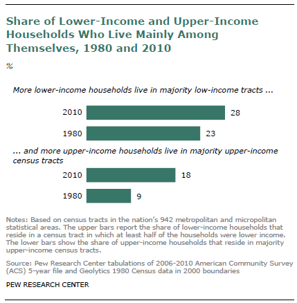
Economic segregation refers to the degree to which people in different social classes live mostly among other people of their class. In 2010, the majority (76%) of people in the U.S. lived in middle-class or mixed-income neighborhoods. But economic segregation has increased in the last few decades. More of both lower-income and upper-income households live in Census tracts made up of households primarily like themselves:

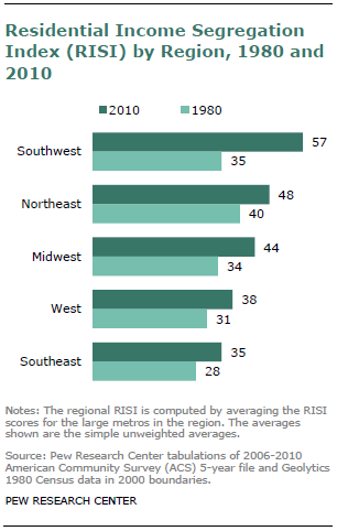
The RISI index for a city just combines the % of both groups that live in tracts dominated by their own income group (so the maximum score is 200). Looking at RISI scores by region, we see that the Southwest has the most economic segregation, and has increased more than any other region in the past 30 years:

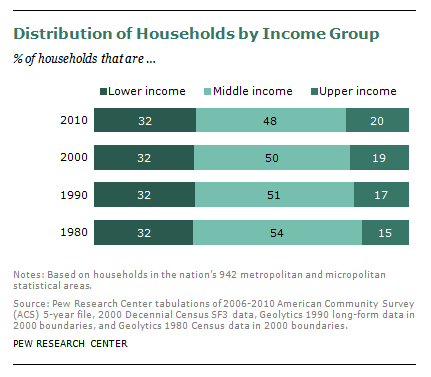
The Pew report argues that this is related to the general increase in income inequality, with less than half of the U.S. population falling into the middle class by 2010, and the upper class (here defined as those making more than $104,000) increasing:

Economic segregation is still a less prominent feature of cities than racial segregation is. But given its steady increase, it’s worth thinking about the consequences of the relative isolation of different social classes from one another. When the rich, poor, and middle-income groups live in different parts of town, who will have the political influence to draw municipal spending to their neighborhoods? How will this growing residential pattern affect who has access to nice parks, public facilities such as libraries and recreation centers, and maintenance for schools and roads — or, alternatively, whose neighborhoods become the location for generally undesirable or unpleasant industries or land uses?

Earlier this week I wrote a post asking Is the Sky Blue?, discussing the way that culture influences our perception of color.  In the comments thread Will Robertson linked to a fascinating 8-minute BBC Horizon clip.  The video features an expert explaining how language changes how children process color in the brain.

We also travel to Namibia to visit with the Himba tribe.  They have different color categories than we do in the West, making them “color blind” to certain distinctions we easily parse out, but revealing ways in which we, too, can be color blind.

Lisa Wade, PhD is an Associate Professor at Tulane University. She is the author of American Hookup, a book about college sexual culture; a textbook about gender; and a forthcoming introductory text: Terrible Magnificent Sociology. You can follow her on Twitter and Instagram.

Thanks to Leticia, Caely, Anjan G., Liz, Bradley K., and Kelsey P. for their patience.  Our SocImages email inbox is a hot mess, and sometimes things fall through the cracks.  This is certainly true for the short video below, one of the responses to the “Shit Girls Say” clip that inspired a round of copycats last December.  We decided to post about it belatedly because it remains a great example of something called a microaggression.

Microaggressions are “brief and commonplace daily verbal, behavioral, or environmental indignities, whether intentional or unintentional, that communicate hostile, derogatory, or negative… slights and insults” (source).  These are often subtle.  So the recipient feels badly, but it can be difficult to explain exactly why, especially to someone who isn’t sympathetic to issues of bias.  The Microaggressions Project has hundreds, maybe thousands, of examples.

In this video, Franchesca Leigh poses as a “White girl” and says many of the things that she and other “Black girls” hear routinely.  To Leigh, these are microaggressions.  They variously trivialize and show insensitivity towards race and racism, remind the listener that she is considered different and strange, homogenize and stereotype Black people, and more…

Lisa Wade, PhD is an Associate Professor at Tulane University. She is the author of American Hookup, a book about college sexual culture; a textbook about gender; and a forthcoming introductory text: Terrible Magnificent Sociology. You can follow her on Twitter and Instagram.

U.S. presidential candidate Mitt Romney recently traveled to Britain, Israel, and Poland, presumably to shore up his foreign policy credentials. Among a number of other statements that got a lot of attention, Romney praised Israel’s health care system, comparing it positively to the U.S. He stressed the cost differences, pointing out that Israel spends significantly less of its GDP on health care. This drew media attention because Israel has universal coverage provided by the state, and the glowing statements seemed a little odd in light of the Republicans’ opposition to the Affordable Care Act and the demonizing of the program as socialism.

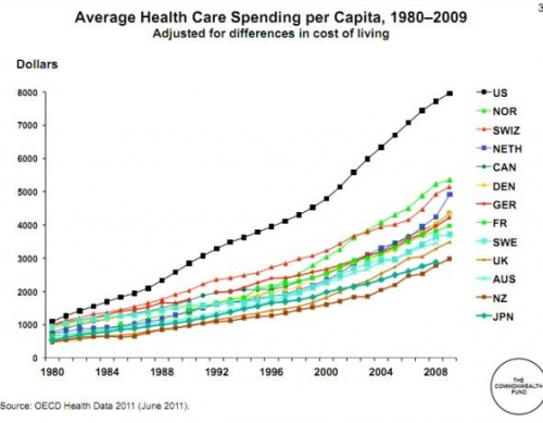
But all that aside, how much do Americans spend on health care? Well…a lot. Elizabeth McM. sent us a link to a story at The Atlantic comparing U.S. medical spending to a number of other nations:

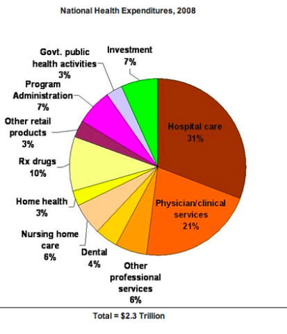
What are we spending it on? Hospital care is the single largest expense, followed by the cost of doctor/clinic visits. Another 10% is prescription drugs. The remainder falls into a variety of categories:

With overall spending distributed among so many different sectors of the health care sector, reducing costs requires more than just increased efficiency by hospitals or lowered drug costs — it requires changes and savings throughout the system.

I’ve heard critiques about both the uniforms of the beach volleyball players at this year’s Olympics in London (i.e., bikinis) and the photographic coverage of the athletes (i.e., “butt shots”).  Then yesterday eight readers — Tom Megginson, Cheryl S., Cerberus Xt, Richard D., Anna G., @sphericalfruit, @bfwriter, and @HaphazardSoc — sent us a link to a story that asked the question: “What if every Olympic sport was photographed like beach volleyball?”  More on that later.

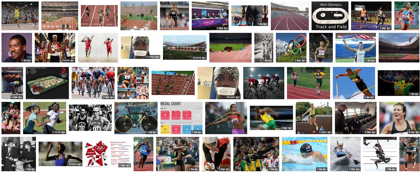
First, I wanted to see if the rumors were true, so I googled beach vollyball and three other sports: track, diving, and gymnastics.  All involve relatively skimpy uniforms, but beach volleyball certainly stood out.  The top results included five photographs of just butts in bikini bottoms and four “cheesecake” pictures in which women are posed to look like pin-ups and volleyball is not part of the picture (all images can be clicked to get a closer view).

That may not seem like a lot but, in contrast, none of the top photos for the other three sports included butt shots or pin-up poses (with the exception of one butt shot for track, but it was of a fully-clothed man and used as a photographic device, not a source of titillation).

There’s an interesting lesson here that goes beyond the sexual objectification of women and asks “which women? and why? (because the sport is associated with the beach?) and in response to whose rules? (who is in charge of uniforms?) and to whose benefit? (the photographers, the Olympics, their corporate and media sponsors?).”

Gymnastics: 

Diving:

Track:


Lisa Wade, PhD is an Associate Professor at Tulane University. She is the author of American Hookup, a book about college sexual culture; a textbook about gender; and a forthcoming introductory text: Terrible Magnificent Sociology. You can follow her on Twitter and Instagram.

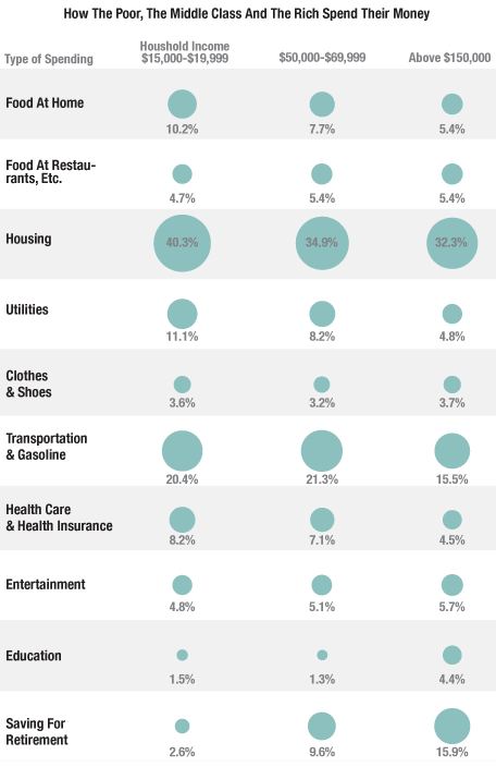
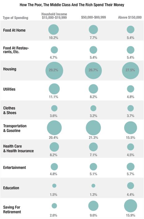
NPR’s Planet Money blog posted an interesting image of differences in how we allocate income based on how much we make. The image looks at three income groups and shows what percent of their  household income budget they spend various categories, using Bureau of Labor Statistics Consumer Expenditure Survey data:

As we see, the largest expense for every group is housing; for the low-income group, 40% of their income goes just to paying for a place to live. They also use more of their income to cover basic necessities — utilities, food eaten at home, transportation.The high-income group, on the other hand,  spends quite a bit more on education.

Look at that last row: saving for retirement (which includes Social Security contributions). This is a particularly striking difference. The affluent are able to put away a significant portion of their income for retirement; for those living just above the poverty line, it’s much, much less than the amount financial planners would recommend (even the middle-income group is saving about the minimum amount generally recommended to prepare for retirement). When so much of your income goes to simply meeting day-to-day needs, saving for the future is a luxury many just cannot afford.

UPDATE: NPR has updated their post, saying the image they had up initially incorrectly. They posted a new image, with notably lower spending on housing:

Eagle-eyed reader David C. pointed this out to me. The revised numbers seem surprisingly low to both of us.Looking at the NPR post again, I think I misunderstood what they were representing; I think this isn’t the percent of total income, but rather % of the household budget, which may not be identical. That said, I looked at some Consumer Expenditure Survey data (here and here) and can’t get the numbers to work out to what they’re showing in the updated image. If someone can, please send us a note at socimages(at)thesocietypages.org and we’ll do another update. Thanks!

Cross-posted at Reports from the Economic Front.

The Pew Research Center recently published a report titled “Pervasive Gloom About the World Economy.” The following two charts come from Chapter 4 which is called “The Causalities: Faith in Hard Work and Capitalism.”

The first suggests that the belief that hard work pays off remains strong in only a few countries: Pakistan (81%), the U.S. (77%), Tunisia (73%), Brazil (69%), India (67%) and Mexico (65%). The low scores in China, Germany, and Japan are worth noting. This is not to say that people everywhere are not working hard, just that many no longer believe there is a strong connection between their effort and outcome.

The second chart highlights the fact that growing numbers of people are losing faith in free market capitalism.  Despite mainstream claims that “there is no alternative,” a high percentage of people in many countries do not believe that the free market system makes people better off.

GlobeScan polled more than 12,000 adults across 23 countries about their attitudes towards economic inequality and, as the chart below reveals, the results were remarkably similar to those highlighted above.  In fact, as GlobeScan noted, “In 12 countries over 50% of people said they did not believe that the rich deserved their wealth.

It certainly seems that large numbers of people in many different countries are open to new ways of organizing economic activity.

Martin Hart-Landsberg is a professor of economics at Lewis and Clark College. You can follow him at Reports from the Economic Front.

Part of the challenge of taking care of a blog involves keeping the archive alive.  One way to do that is to link readers to older posts they they might be interested in.  We do that, in part, with an automated process called Link Within.  When we publish a post, the program searches our archive for similar posts and includes a set of thumbnails at the bottom that readers can click on if they’d like to know more.

At the bottom of a recent post about the role of carrots in World War II, for example, linkwithin offered these options:


There are pitfalls to this type of program that illustrate a bigger problem involved with talking about social inequality.  A reader named Sarah C. emailed us the following observation in response the thumbnails that followed a post about the sexual objectification of women:

I wanted to point out the dissonance I feel when I spend time reading a thoughtful article about gender equality and then when I finish the bottom of the page greets me with a line of 100 x 100 px images of sexualized womens’ bodies.  They are the same kinds of images I would see browsing Cracked or College Humor, or other mainstream sites.  The Huffington Post does it too – sites claiming to be (and often actually are) more or less progressive are using sexist tactics to get people to click, or at least that’s what it seems like…

I think it’s great to include examples of objectification in your posts in order to illustrate your point.  But using those images as a thumbnail gets you the wrong attention.  It feels hypocritical, or at least incongruous with your blog’s goals.

This is what Sarah saw:

Since the thumbnails are automatically generated, we don’t actually know what the thumbnails will be until we see the published post on the site.  So, upon seeing Sarah’s screenshot of the thumbnails, I was taken aback.  I understood immediately why she felt compelled to send us an email.

The phenomenon goes far beyond thumbnails.  Even if we did away with Link Within, our posts on the sexual objectification of women would include images that sexually objectified women.  We are Sociological Images, after all.   So our posts drawing attention to and criticizing the phenomenon also reinforce it.  It’s two steps forward and one step back, plus or minus a step.

But even if we weren’t an image-based blog, even if we simply discussed sexual objectification without an accompanying visual, doing so would remind readers that women are objectified, that they need to worry about how their bodies look, and that they’re being judged by their appearance.  At least one study has demonstrated that simply being exposed to objectifying words, devoid of imagery, can increase the degree to which women self-objectify.

Talking about sexual objectification always threatens to deepen the degree to which people feel sexually objectified, even if that is the opposite of one’s intention.  This phenomenon applies just as well to other forms of oppression.  Talking about the way in which state policies help or hinder Mexican immigrants to the U.S., for example, potentially further entrenches the idea that all Latinos are “illegals.”  Pointing out under-development in parts of Africa potentially affirms the notion that all of Africa is economically backward or politically corrupt.  Referring to women’s lack of representation in math and science may make women even more anxious about pursuing these careers.

This is one of the ways that power works.  It  co-opts the strategies available for fighting back.   Power is flexible and accommodating, it controls and convinces through all possible channels, it finds ways to infiltrate all mediums.  This is why it’s so hard, in the first place, to eradicate prejudice and inequality.

Coming to our blog is, for these reasons, a scary proposition.  Because we sometimes talk about ugly things, there will be ugly things here.  Taking out the thumbnails won’t change that; neither would deleting all of the images we reproduce.  Deleting all posts that address inequality would, but then we would be silently complicit with the status quo.  So, we keep blogging, and we keep uploading, and we keep trying to engage our readers further… for better or worse.

Lisa Wade, PhD is an Associate Professor at Tulane University. She is the author of American Hookup, a book about college sexual culture; a textbook about gender; and a forthcoming introductory text: Terrible Magnificent Sociology. You can follow her on Twitter and Instagram.