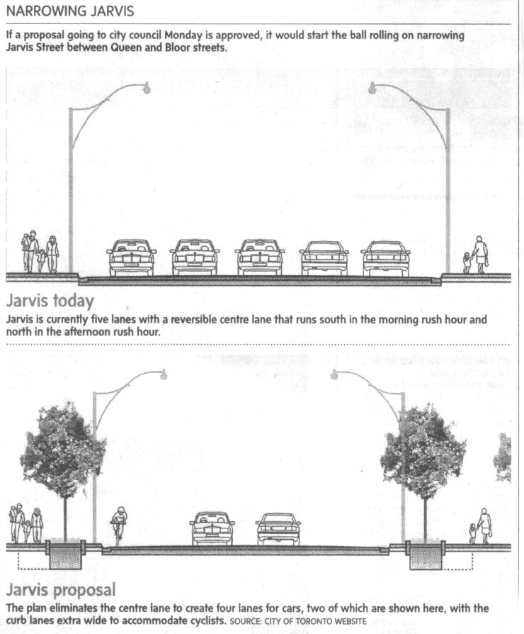
Jim C. sent us this graphic designed to illustrate a proposal to reduce the lanes on Jarvis Street in Toronto from five to four (Globe and Mail, May 22, 2009, p. A12). As Jim points out, the text of the graphic describes the proposal accurately, and even points out that the graphic misrepresents the change, but the graphic itself still gives the impression that the reduction will be to two, not four lanes.

It is a good example of how much graphics matter. Even with the text, it is potentially misleading. Such misrepresentation can also be purposeful and political. Jim speculates that this is the case here:
As is often the case whenever there are modest efforts to make space on city streets for pedestrians and cyclists, right-wing councillors (and affluent commuters) raised the spectre of traffic chaos and a ‘war on the car’.
If you’re interested in comparing the representation of this proposal by the Globe with its representation in the proposal itself, check out the final page of the proposal. Thanks to Nick J. B. in the comments for the link.
—————————
Lisa Wade is a professor of sociology at Occidental College. You can follow her on Twitter and Facebook.

Comments 9
iz — June 10, 2009
Ah, so this explains all the articles alluding to the "war against cars" that have been popping up on every newspaper in the city in these past couple of weeks. Geez...
hypatia — June 10, 2009
As someone who lives in the city it really is interesting to see how much resistance has built up against bike lanes.
Unfortunately it is pretty hard for me to feel sorry for many of those who will be "affected" by this. Jim C. has it right with his description of the complainers, a majority are very "affluent" individuals who live North of Jarvis Street, many of whom could easily access the subway system (one major street over) but choose not to.
Trabb's Boy — June 11, 2009
This is a politically hot issue, but I disagree with the explanation of the picture. I think the second picture is trying to sell the idea. First of all, the reduction in road size is exaggerated. In the second picture, the road is 4/5 the size of the first picture, which would not allow for the planned bike lanes. As a consequence, the planned widening of the sidewalks is also exaggerated. The trees shown are large and lush, with an extra tree shown off to the right.
I think the goal here is to present a lovely, calm boulevard, when, in fact, we will still have a road jammed (probably more jammed) with four lanes of traffic. If all four lanes of cars were shown in the second picture, there would probably be a lot of people saying, "We're spending all this money for such a minor difference?"
opminded — June 11, 2009
"right-wing councillors" ????
Duran — June 11, 2009
I live in Seattle. Don't talk to me about biker vs. car wars. I am actually afraid to ride my bike sometimes it's gotten so bad. Not because of malevolent drivers per se, but because the violence has escalated on both sides.
Nick J Boragina — June 11, 2009
Its a semi-falsehood, on the part of the Globe. The real images are here http://www.toronto.ca/involved/projects/jarvis/pdf/2009-01-22_panel.pdf The image they took is of the 4 lanes WITHOUT a bike lane. The images WITH the bike lane - as proposed - have all 4 cars.
Lyndsay — June 12, 2009
I am moving to Toronto in September and they can't build bike lanes fast enough. That picture IS confusing if you don't read the text.
simono — June 12, 2009
when i, as a european, first heard of "war on cars", that sounded like something a mayor might promote and support. like a a good thing.
especially the last couple of weeks there was a lot of international discussion about how the north european cities have mostly succeded in reducing car traffic the last 10 years. some of them like kopenhagen and amsterdam have 40% of their traffic on bikes.
motorized traffic is ususally seen as a (necessary) burden - of course some won't aggree with that. especiall in austria and germany where the car-industry is very strong, getting rid of cars in cities hasn't progressed much in the past decade.
see for example
http://www.bike-eu.com/news/3420/european-cities-commit-to-cycling.html
http://www.kk.dk/Nyheder/2009/April/NyFilmOmCykelbyenKoebenhavn.aspx
Daniel E. Nash — May 2, 2020
Very nice sociological message has been delivered through images. Yes, I will speak in accordance with the writer which topcvwritersuk.com help to provides cv/resume work. Lanes should be reduced so that trees, bicycle riders and other people can walk alongside the road.