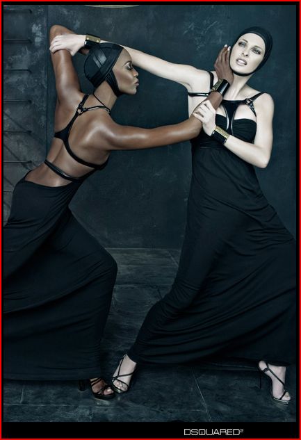
Bri a sent in this ad, found in Interview Magazine, and we’d like to know what you think of it:

It reminds me, somewhat, of this post featuring a billboard for Playstation with a black and white woman fighting.
Bri a sent in this ad, found in Interview Magazine, and we’d like to know what you think of it:

It reminds me, somewhat, of this post featuring a billboard for Playstation with a black and white woman fighting.
Comments 17
thoughtcounts Z — March 8, 2009
Well, there's the catfight thing, their clothing looks very bondage-like, and I think it looks like the white woman is defending herself from the black woman's attack (and they both look pretty chill about it, like it is choreographed/staged). I had no idea what was being advertised at first, just found the image unsettling, nightmarish.
I searched "dsquared" to see what this was supposed to be an ad for and found the designers' website (two guys named Dean and Dan, they make clothes and sunglasses). They have old advertisements up there under "Campaign" -- I found all but two of them equally unsettling. SS2008 was particularly notable for confusing women and crash test dummies.
Claudia — March 8, 2009
The first thing I thought about this photo, and the black model in particular, was 'architectural'. The photograph is really interesting compositionally, with the positive and negative spaces of the two bodies creating all sorts of eyecatching organic shapes. The focal point of the photo, however, is the white model's face, and her distressed expression. Everything in the black model's body, from the long arrow of her arm to her profile to the movement implied by her lean and her back leg being out of frame, point to the white model.
The photo is lit to emphasize the black model's toned arms and back, while her face is in profile, her eyes closed and demure, almost in shadow. The black garments and background serve to further emphasize the contrast between the models' skin tones, and in my opinion set the black model back. I am not sure what the conventions are for fashion photographers working with models who have darker skin, but I'm willing to bet that the lighting is much more favorable.
I agree with thoughtcounts that the white model is fending the black one off but neither she nor the viewer (universally marked white) is really threatened by the black model: the white model is stronger, as evidenced by her firm grip on the black model's wrists, her wide, open stance, and, again the black model's demure expression and the fact that part of her body is actually cut off - we cannot even see her back leg at all.
meerkat — March 8, 2009
I thought of the PS2 ad too.
Ang — March 8, 2009
One thing I noticed: I'm almost certain this is Naomi Campbell and Linda Evangelista, two of the biggest in the '90s 'supermodel' era. Naomi Campbell is known for being, uh, cranky in particular. Not excusing the image; I just thought it was interesting that these are not Any Old Models.
eloriane — March 8, 2009
Claudia-- to go further with the "part of her body is actually cut off" comment, the second half of the black model's left arm is missing. It looks like one of the more common "photoshop disasters," where a body part disappears behind something (in this case, her head) and doesn't continue on the other end. It might just be coincidental, but it does seem to affect the impact of the photograph, somehow, that both of the white model's hands are visible and strong, whereas the black model only had the one hand, pushing ineffectually against the white model's face.
Dubi — March 8, 2009
eloriane - the second hand doesn't go missing - you can see a bit of it just under the white model's wristband, and the rest of it is behind her head.
anon — March 8, 2009
I liked Claudia's comment. I found the ad compositionally intriguing. Unlike the PSP ad, I didn't see any context of race other than the juxtaposition of skin tone. While PSP ad stages a woman who is identified as "white is coming" in literal and figural opposition to a black woman, this one doesn't seem to carry any normative value.
The PSP involves a threatening white woman's assault on a strong, unafraid black woman, while this one seems to be more of a grappling or martial arts, even dance-like, interaction--almost as if they are practicing some scene out of the Matrix. Also, this ad portrays the black woman as sleek and sensual while the other depicts the white woman as an erotic dominatrix.
Fernando — March 8, 2009
question: what if it were two women of any other ethnic background except black and white? Would anybody care? Not trying to ignore the history of racism against black people, but point is that we should care about context first, not imagery. That is, what should matter is the reason why the image was created, not the image itself.
Vidya — March 8, 2009
"what if it were two women of any other ethnic background except black and white? Would anybody care?"
The colour of the women in the ad is precisely what makes this an issue for discussion re: race and representation
"...we should care about context first, not imagery. That is, what should matter is the reason why the image was created, not the image itself."
I thought that, by this point, we'd all finally accepted the 'death of the author'? It's become standard practice in both the humanities and social sciences to see meaning as something constructed by the reader/viewer in interaction with the text/image, not to seek to establish the supposed 'authorial intent'.
Sabriel — March 9, 2009
The first thing that struck me is that it looked like they were swimming, mostly because the back of Naomi Campbell's dress has a racerback style and it looks like a bathing suit. They also both look like they're wearing swimming caps. The ladder in the background looks like the ladder to get out of a pool, and the fabric is very fluid looking.
If they are supposed to be under water, I don't know how that changes things, except the threat of drowning perhaps. That's really subtle, though.
The second thing I noticed is that the white model looked very unstable. Those shoes are awful and her ankles are in a weird position. I asked my boyfriend about it, who does martial arts, and he said:
"The black woman has a good stance, the white woman's stance is terrible. I mean, they're both wearing heals which makes the whole situation laughable for both of them really, but... yeah, the black woman looks ok and the white woman looks terrible."
Apparently her inner knee and foot are especially weak, and the arm she's using to protect her face looks like it doesn't have very much power with the way she's turned her shoulders out and is reaching the arm across her body. The whole posture is weak and weird.
I asked for some clarification about Naomi, because it looks to me like she's not that stable, and he said "It works for what she's doing. It looks more like an aikido stance. It's not a good stance for hitting things, but it's good for pushing or grappling. The main thing is that she's supporting her weight on that back leg. Okay, I don't really know because I can't see her back foot, but it looks like she's got her feet in a good position. When you've got your feet in a good position there is really more wiggle room in terms of what you do with your upper body."
So based on that it is kind of interesting that the back foot is cut out of the frame. It seems to me like that back foot is influencing the action in the shot whether or not we choose to "recognize" it by allowing it to be in the frame. It's there, and it's giving Naomi the advantage. The white woman just won't recognize that advantage, and neither will the camera/viewer. It sure seems like she's about to get her ass handed to her, though.
Fernando — March 9, 2009
Vidya, it is important when people are trying to make judgment over something, judgement that might have serious negative repercussion for the author. It is naive to think we can ignore the intention and the context. Sometimes those things are part of the meaning of the story. We can take a text from the 15th century and pretend that its context isn't important.
Acknowledging the intention and the context of a piece does not mean our thoughts about it must be restricted, we can think whatever we want to think, anything can inspires however we want. But if we will make judgement on something, then context is important.
And my point with asking that question was to imagine if it wasn't about a black and a white woman, would it raise much of a fuss?
Fernando — March 9, 2009
*we CAN'T take a text...
alby — March 9, 2009
Fernando, with advertising, pretty much nothing is on accident. If this were two white women I'm sure it would still be discussed because it's two women fighting, which is a HUGE theme in advertising. No one is saying that context doesn't matter, it obviously does. If this were a post racial world maybe we wouldn't explore the race aspect. But we don't live in a post-racial world by any stretch of the imagination.
Fat Angie — March 10, 2009
Maybe it's because I come from an aesthetic background, as well as one in dance, but I also see it as the black woman coming from a place of strength and grace. She's on the forward swing of her stance, and it's almost like she's about to take the lead in a tango. The emphasis on her back and shoulders are showing her strength, as is her placid expression, she's almost ninja-like (this also goes along with her dark skin being almost background-level dark), but she's not too aggressive, her hand is caressing the other figure.
I get the feeling these two are supposed to be lovers to an extent. The black woman is more confident in her sexuality, while the white woman is afraid and defensive.
In any case, I think this is a good thing for the photograph. We're talking about it. It's more than an ad, it's art.
Asada — March 19, 2009
It looks like they are fighting and the black woman is so totally winning!
Le Chat Noir — May 16, 2009
I agree with the first comment that their clothing looks very bondage-like. The first thing that popped into my head was that this reminded me of S&M imagery. I'm sure it's intended to titillate the male viewer as such.
My second thought was how patriarchy loves to show women fighting one another and this plays right into that.
Blix — August 23, 2011
If the facial expressions were different in any way, the meaning would change. Imagine if both were smiling, or both had angry expressions.