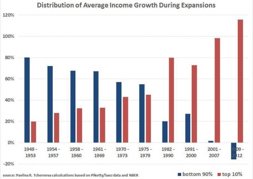
The graph below represents the share of the income growth that went to the richest 10% of Americans in ten different economic recoveries. The chart comes from economist Pavlina Tcherneva.
It’s quite clear from the far right blue and red columns that the top 10% have captured 100% of the income gains in the most recent economic “recovery,” while the bottom 90% have seen a decline in incomes even post-recession.
It’s also quite clear that the economic benefits of recoveries haven’t always gone to the rich, but that they have done so increasingly so over time. None of this is inevitable; change our economic policies, change the numbers.
Via Andrew Sullivan.
Lisa Wade, PhD is an Associate Professor at Tulane University. She is the author of American Hookup, a book about college sexual culture; a textbook about gender; and a forthcoming introductory text: Terrible Magnificent Sociology. You can follow her on Twitter and Instagram.

Comments 8
Bill R — September 27, 2014
This kind of post--with such a paucity of information, missing critical details, leaving one wonder about definitions (income? wealth? net worth?), missing any counterargument, and with the expected provocative headline that smacks of wing-nut-leftist rhetoric--is essentially anti-intellectual and serves more to confuse and incite than educate.
If your intent is to present an academic perspective for intelligent people to engage please stop the bullshit. Most of the people who comment on this board are far more intelligent than you give them credit for.
And FWIW, we're all wondering what the stats would look like if Piketty and Saez controlled for education-level and income (gains?) from a balanced investment portfolio. My guess is that would tilt the graph dramatically, but we'll never know will we?
Using the wrong carrot and stick | Jeffrey A. Langstraat, Ph.D. — September 28, 2014
[…] recent post from Sociological Images helps make the point. At the community college level, we’re pretty much training folks in […]
Kali — September 29, 2014
Note the period of reversal. Thanks to Reagonomics and trickle-down myths.
Whose recovery is it anyway? | KVCAP Poverty Bulletin — February 2, 2015
[…] http://thesocietypages.org/socimages/2014/09/27/sat-stat-staggering-graph-reveals-the-cooptation-of-… […]