This month the Census Bureau released a supplemental poverty report to provide a broader picture of the poor in the U.S. The official poverty rate is based on a measure developed in the early 1960s. Researchers at the time determined that families spent about 1/3 of their income on food, so they calculated the lowest possible cost of a minimally nutritionally sufficient diet for a particular family size, multiplied it by 3, and the resulting number determined who was defined as poor. The amount has been adjusted for inflation but otherwise the measure is the same.
Critics argue this definition may no longer make sense. Since the 1960s, food has generally gotten cheaper while housing has become a much bigger portion of many families’ budgets. The measure doesn’t account for the different costs of living (especially for housing) in different parts of the U.S. It also doesn’t take government benefits a family might be receiving into account.
The supplemental measure is meant to address some of these problems; it will be released each year along with the standard poverty measure. It attempts to determine how much is needed to cover housing, food, clothing, utilities, and a bit for other needs (transportation, personal care items, etc.), while taking public assistance benefits into account.
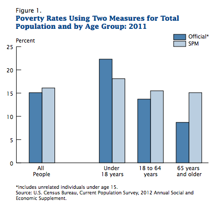
The supplemental poverty measure (SPM) showed a somewhat higher poverty rate overall (16.1% vs. 15% with the official poverty rate). Because it takes benefits such as daycare subsidies, nutritional assistance programs, etc., into account, the SPM actually showed a lower poverty rate for children under 18 than the official rate does. However, adults were more likely to be defined as poor with the SPM. This is especially true for older adults. For those over 65, 8.7% are officially poor, but with the SPM, it’s 15.1%:
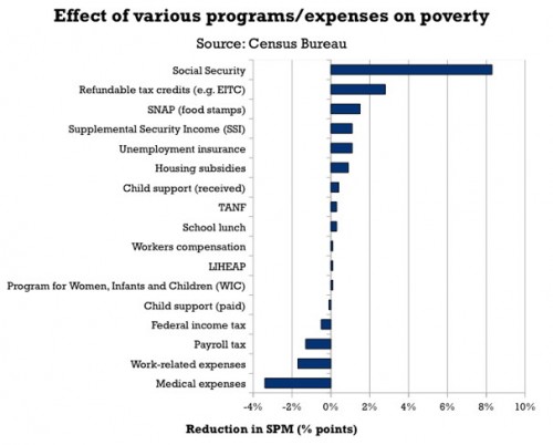
Dylan Matthews, at the Washington Post, created a graph to show the impact of some important expenses and government assistance programs on poverty, since the SPM takes benefits, and a greater range of expenses, into account in its measure. The graph shows how much each program/expense reduced the adjusted poverty rate, based on data presented in the report.
Social Security has the single biggest impact; it reduced the SPM by 8 percentage points. That is, if they had not included Social Security benefits in the measure, the SPM poverty rate would have been 24.1%, not 16.1%. On the other hand, taking Temporary Aid to Needy Families (TANF), the cash assistance program created in the welfare reform process in the 1990s, into account did little to affect the calculated poverty rate, indicating it does little to alleviate poverty (intentionally so, many would argue). Note the axis is percentage points, not percent:
At the bottom of the graph we see several items that increased the supplemental poverty rate: looking at how much income tax people paid (countering the myth that low-income people don’t pay income taxes), payroll axes, expenses related to work, and medical expenses, with out-of-pocket medical expenses being the largest factor.
There’s tons of data in the tables that show which groups would be more or less likely to be defined as poor in the official and supplemental poverty rates. Check out the full report.
Gwen Sharp is an associate professor of sociology at Nevada State College. You can follow her on Twitter at @gwensharpnv.


Comments 8
COMPARING OFFICIAL AND SUPPLEMENTAL POVERTY RATES | Welcome to the Doctor's Office — November 15, 2012
[...] from SocImages [...]
Ali — November 17, 2012
What I find interesting is that the child support (paid) amount seems to have less of a negative effect--in terms of personal finance-- than child support (received) has in the other direction. From personal experience, I can see where that could be the case, but it is interesting to see depicted in data. Not sure exactly what to make of it, since the person who is generally on the paying end is a father while a mother may be more likely to be receiving. I would like to see how much the data fluctuates depending on if the receiving person had one, two, or more children to care for versus the person paying only having to be responsible for themselves and this theoretical 1+ children.
stilladyj — November 28, 2012
Rent definitely costs more than food. Food is 14% of my income, while rent is 31% (Milwaukee, WI). That's with a roommate, and it's about to go up when I have to find a place on my own.
James Jordan — August 21, 2023
I agree that this is an important issue to understand and discuss, especially in light of the current economic and social challenges facing many Americans.
Auto Detailing Services in Hampton Bays NY