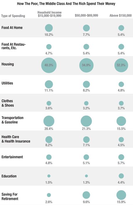
NPR’s Planet Money blog posted an interesting image of differences in how we allocate income based on how much we make. The image looks at three income groups and shows what percent of their household income budget they spend various categories, using Bureau of Labor Statistics Consumer Expenditure Survey data:
As we see, the largest expense for every group is housing; for the low-income group, 40% of their income goes just to paying for a place to live. They also use more of their income to cover basic necessities — utilities, food eaten at home, transportation.The high-income group, on the other hand, spends quite a bit more on education.
Look at that last row: saving for retirement (which includes Social Security contributions). This is a particularly striking difference. The affluent are able to put away a significant portion of their income for retirement; for those living just above the poverty line, it’s much, much less than the amount financial planners would recommend (even the middle-income group is saving about the minimum amount generally recommended to prepare for retirement). When so much of your income goes to simply meeting day-to-day needs, saving for the future is a luxury many just cannot afford.
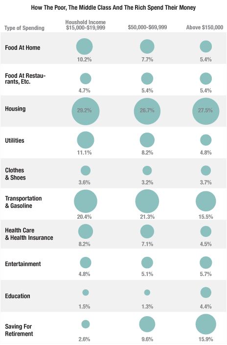
UPDATE: NPR has updated their post, saying the image they had up initially incorrectly. They posted a new image, with notably lower spending on housing:
Eagle-eyed reader David C. pointed this out to me. The revised numbers seem surprisingly low to both of us.Looking at the NPR post again, I think I misunderstood what they were representing; I think this isn’t the percent of total income, but rather % of the household budget, which may not be identical. That said, I looked at some Consumer Expenditure Survey data (here and here) and can’t get the numbers to work out to what they’re showing in the updated image. If someone can, please send us a note at socimages(at)thesocietypages.org and we’ll do another update. Thanks!


Comments 21
Snuhfoo — August 2, 2012
Ummm.... is there a reason 20k-49k and 70-149k are excluded? Just to make a clearer distinction between poor, middle and rich? It bothers me a little that the average American income isn't represented on this chart.
Jonah Ostroff — August 2, 2012
I guess some of these categories intersect (since the numbers in the first column sum to 107.4%), but for the life of me I can't figure out how.
decius — August 2, 2012
Also interesting: The typical low income family spends a total of 107.4% of their spending. This falls to 103.8% for middle income families, and 97.6% for rich families.
daodae — August 2, 2012
There is something deeply wrong with a situation where housing consumes such a large chunk of peoples income. Construction is much more quick and mechanised. Manual labor time per housing unit is down. Less and more lasting raw material is needed as input. Energy efficiency has improved greatly in insulation. In short, the real costs in terms of resource and labor input for housing has decreased a lot. But the capitalist market cost for housing is ever high.
Housing cost levels in capitalist society seem to function similar to unemployment levels: the system needs both to stay high to reproduce itself.
Jamesly — August 2, 2012
There's a correction to the housing numbers on the Planet Money Blog. The figures are now: 29.2%, 26.7%, 27.5%
HOUSEHOLD SPENDING BY CLASS #InterestingFindings « Welcome to the Doctor's Office — August 2, 2012
[...] from SocImages [...]
Grace — August 3, 2012
Well, the median household income in the US is $52K, so it does represent middle income. My guess is that they didn't want to have too many categories, since these three alone clearly show where the similarities and differences in proportional spending between 3 groups. If the intermediate income categories followed the same trends, they wouldn't add anything new to the chart.
» Some supporting info on The New Jim Crow… Introduction to Political Science 101 class blog — November 19, 2012
[...] Spending by class [...]
Smith Jordan — October 13, 2023
StoreOpinion.Ca is an online platform that allows customers to provide feedback and opinions on their shopping experiences. Various retail stores use it to gather valuable insights and improve their services. After the survey, everyone can win a $1000 Optimum PC gift card.