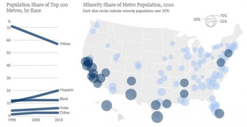
Sangyoub Park sent us a link to a post by the Brookings Institution about the changing racial/ethnic demographics of the 100 largest metro areas in the U.S. While White non-Hispanics still make up the majority in those areas (at 57% of the population), the minority population has grown rapidly in a number of cities; 22 of the top 100 metro areas are now majority-minority:
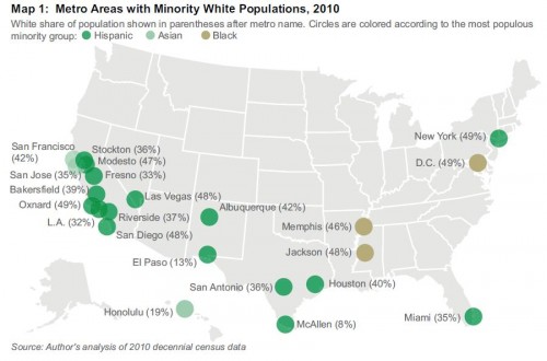
A detailed map of the majority-minority metro areas, with the largest racial/ethnic minority group in each (and the White non-Hispanic population in parentheses):
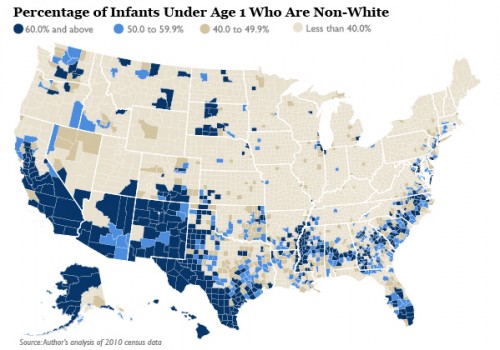
This demographic shift in metro areas should accelerate, given the racial/ethnic makeup of the population of children under age 1:
The Washington Post has an interactive map that lets you select an area and get detailed demographic information at the Census tract level (racial/ethnic makeup, household type, etc.) from 1990 to 2010.
Of course, as Sangyoub points out, being in the numerical majority doesn’t imply that a group no longer meets the definition of a minority group in a social sense. In many areas, racial/ethnic minorities continue to have less access to or control over economic resources, social prestige, and political power than do non-Hispanic Whites. Accumulated advantages do not get automatically redistributed when demographics change.


Comments 12
Cameron85 — February 10, 2012
Great images - thanks! Interesting how regional this demographic change is.
Gilbert Pinfold — February 10, 2012
Anecdotally, I understand that there have been serious turf wars between Black and Hispanic gangs in southern California. It's easy to see why as Blacks are the first to be displaced by this demographic tsunami.
Anonymous — February 10, 2012
Very interesting map! I do have one issue with it though. So, in the color key they have the color yellow for "other"; but other clearly seems to be Native American. When you hover over the yellow counties, judging by the bar graph it looks like whites are the majority - until you notice that the "20%" next to it. There isn't even a bar in the country bar graph for "other"! Aka Native American. They're being erased in both the key and the county bar graphs.
It really reminds me of this post: Native American Reservations, Representation, and Online Maps - http://thesocietypages.org/socimages/2011/06/02/native-american-reservations-representation-and-online-maps/
Anonymous — February 11, 2012
Missing Boston on there - we are majority people of color city.
Dodkf — February 11, 2012
Also, since americans define mixed people as non-whites, the minority number will increase (this is particularly true for blacks, since there isn't a strong immigration)
We whites need not fear minority status « Phil Ebersole's Blog — June 15, 2012
[...] on Racial, Ethnic Shifts in Metro Areas for more details from The Society [...]
Minority turnout will decide 2012 election « Phil Ebersole's Blog — August 21, 2012
[...] on Racial / Ethnic Shifts in Metro Areas for more details about U.S. metro areas with minority-white populations from The Society [...]