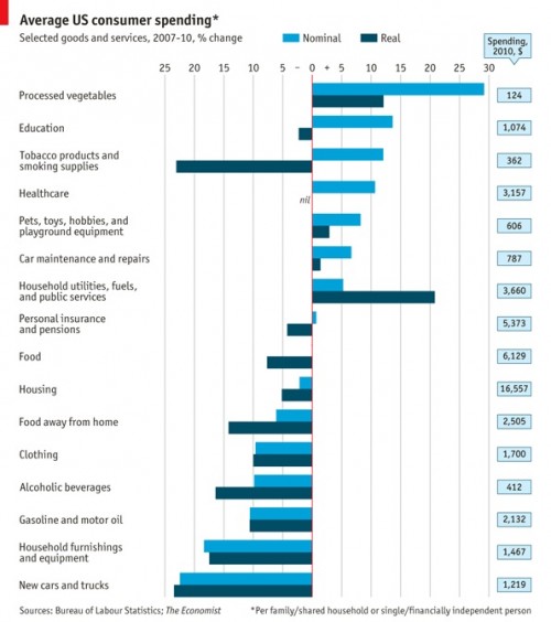
The Economist posted a graph, based on Bureau of Labor Statistics data, that shows how U.S. consumer spending changed between 2007 and 2010. The results provide a good snapshot of the economic trade-offs Americans are making (i.e., we’re buying more canned veggies and eating out less), as well as which industries are taking the biggest hit as consumers redefine their products as less essential.
The “nominal” numbers refer to the unadjusted overall changes in spending; the “real” numbers are adjusted for the fact that prices rose by about 5.2% on average, so consumers are getting less for what they spend. So the light blue bars tell you the absolute change in what we’re spending; the dark blue bars, the change in spending relative to how much we’re buying. When adjusted for price inflation, consumer spending fell by about 8%:
Via Talking Points Memo.


Comments 9
cee — October 28, 2011
Economics isn't my strong point, but I'm confused by what the dark bars mean.
Is it change in percentage of spending, or change in goods received?
To put it another way, if there was a category for 'all spending on everything' would the dark blue bar be at zero (because all money is spent on something) or at -8% to reflect the inflationary changes?
Anonymous — October 28, 2011
Typo in the first sentance:
Although I would love to see that data!
Changes in US Consumer Spending, 2007-2010 | Change 2010 — October 29, 2011
[...] Changes in U.S. Consumer Spending, 2007-2010 [...]
Changes in U.S. Consumer Spending, 2007-2010 | Environmental, Health and Safety News — October 29, 2011
[...] Changes in U.S. Consumer Spending, 2007-2010 Want more EHS News? Try our beta aggregate site at: [...]
S.I. fan — October 29, 2011
From a graphic design point of view, what an odd ordering this graph has. I understand that this graph is ordered by nominal %, but wouldn't an ordering by % total spending be more impactful? In other words, why does a topic like does "processed vegetables", for which total spending is TWO orders of magnitude lower than for housing (and more than an order of magnitude lower than for "food") get placed at such a powerful position in the graph... on the top line? Spending on processed vegetables (or tobacco), although relevant to issues of nutrition and health, is simply in the noise compared to other expenditures. And, sorry to nitpick at such a great site, but we aren't necessarily eating more "canned veggies". The data says only "processed vegetables", which I think can include some quite high quality frozen vegetables.
Changes In U.S. Consumer Spending; Pres. Obama’s Student Loan Plan; And More « Welcome to the Doctor's Office — October 30, 2011
[...] CHANGES IN U.S. CONSUMER SPENDING, 2007-2010 by Gwen Sharp [...]