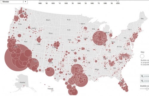
Jessica L., a doctoral candidate in sociology at Kent State and traveling adjunct instructor at Lewis University and Indiana University Northwest, let us know that the New York Times has an interesting interactive map that uses Census data from 1880 to 2000 to show where various immigrant groups have settled. You can select area of origin (some specific, such as China, others very broad, such as “All Africa”) and see where individuals from that area were living in the U.S. for different years (because of changes in Census categories and data gathering, information isn’t available for all groups for all years).
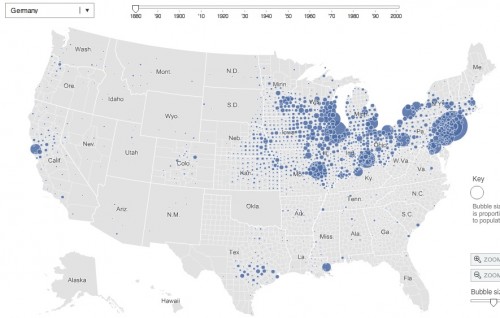
The German-born population in 1880:
If you go to the NYT site, you can roll over the circles to get the specific population.
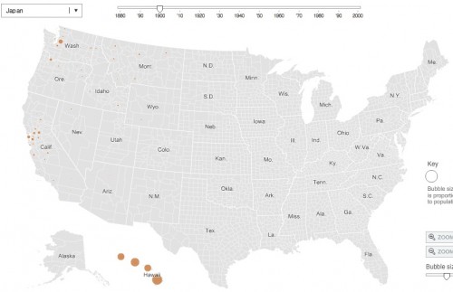
The Japanese-born population in 1900, indicating immigration to Hawaii and, to a lesser extent, California and Washington to work in agriculture:
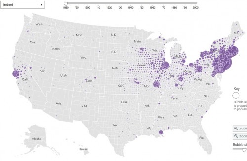
The map also lets you trace the rise and fall of some immigration streams. For instance, in 1880 there were 198,595 people born in Ireland living just in Manhattan alone:
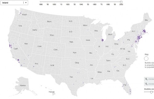
By 2000, the Irish-born population in the U.S. was tiny, and only 4,147 of them lived in Manhattan:
The Mexican-born population in 2000:

Comments 7
bbonnn — February 21, 2011
About the Irish-born population in 2000: interesting you should bring that up, as I happen to be connected professionally to several Irish nationals in the San Francisco Bay Area. The San Francisco/Marin/Silicon Valley region is one of the few places with dots on the map.
To hear them tell it, the reasons for immigrating are the same as in the 1800s: better job opportunities. In the case of the folks I know, there weren't any good tech-industry opportunities in Ireland (despite the Celtic Tiger explosion), so if you were technologically inclined and adventurous, you moved to the United States.
Evan — February 21, 2011
It's interesting to see what looks like a big mouth of immigrants swallowing the steadily unchanged south for decades. That sheds a little light for me on the origins of that fear I seem to see in the concept of 'losing my country'. That has always been a part of the conservative platform which I have struggled to understand.
Yvonne — February 22, 2011
Wow. The history of African immigration as told by this map is interesting. Nothing shows up until 1970. The timeline only goes back to 1880, so this is a story of when Africans started immigrating by choice.
Waiting Room Reading- 2/27 « Welcome to the Doctor's Office — February 27, 2011
[...] INTERACTIVE MAP OF IMMIGRANT SETTLEMENT PATTERNS IN U.S. by Gwen Sharp, [...]
Pirvonen — March 1, 2011
Place of origin called "China" is not very specific. The nation comprises several culturally and even ethnically distinct regions. I should expect there to be more difference between inland and coastal, north and south of China than between Norway and Sweden.
//Pirvo
katie — October 2, 2024
ilby34fruif6th bylhw