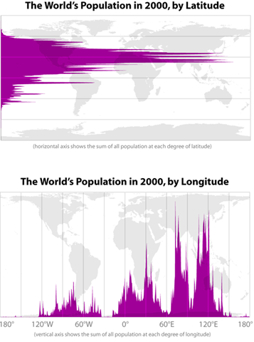
Martin W. found two neat graphs over at The Horizon that show the 2000 world population’s distribution by latitude and longitude.
It’s not that they’re shocking, in the sense that of course we’d expect more people to be living in temperate/tropical latitudes than in the Arctic, given availability of resources to support human settlements (at least until the development of modern conveniences like heat, canned food, and quick transportation to get them to people far from their sources). And the huge spikes where China and India are make sense too. But I still think it’s visually striking to see, for instance, how little of the world’s population is located in the Americas. And the patterns we see here certainly have important implications for global economic development and the likely highly uneven distribution of negative impacts of environmental/climate change, among other issues.
But then, I’m also just a geek about maps and like looking at them in general.


Comments 10
A mathologist's commonplace — August 15, 2010
[...] leave a comment » Histograms of world population by latitude and longitude. from radical cartography (Bill Ranklin), via Sociological Images: [...]
Martin W. — August 15, 2010
I took a trip back through the vias just now and found that Bill Rankin created it and he has several other interesting graphs on his site:
http://www.radicalcartography.net
Cheers, thanks for posting
Jon Christensen — August 15, 2010
It would be interesting to see this data controlled for area.
Greg D. — August 16, 2010
It looks like population are reported on the latitude/longitude of the capital of the country. That spike on the first graph just north of the southern coast of west Africa is probably due in large part to the Nigerian population reported for Abuja in scarcely populated middle of the country rather than the more densely populated coastal area.
Scott — August 18, 2010
The latitude graphic condenses a lot of Jared Diamond's thesis in "Guns, Germs and Steel".
Tom Hilton — August 25, 2010
I'd like to see population by elevation.
Digest – August 15 2010 – The Story — March 21, 2014
[…] World population by longitude and latitude. […]
Francis Banks — June 18, 2019
Why is it that I can't find a graph with the latitude axis actually labelled? As soon as I met graphs in school I was taught to fully label my axes! Why have these cartographers forgotten that basic lesson? We are not even told whether the scale is linear or otherwise! Why are the tropics not shown? At what latitude is the maximum population? In addition, given that land area decreases with decreasing latitude, wouldn't a plot of population density with latitude also be revealing?
fix — June 29, 2021
Every function will be easy how do i fix connections for bluetooth audio devices and wireless displays in windows 10 after to know full process.
Mandi Mandi — August 24, 2021
Your email address will not be published.