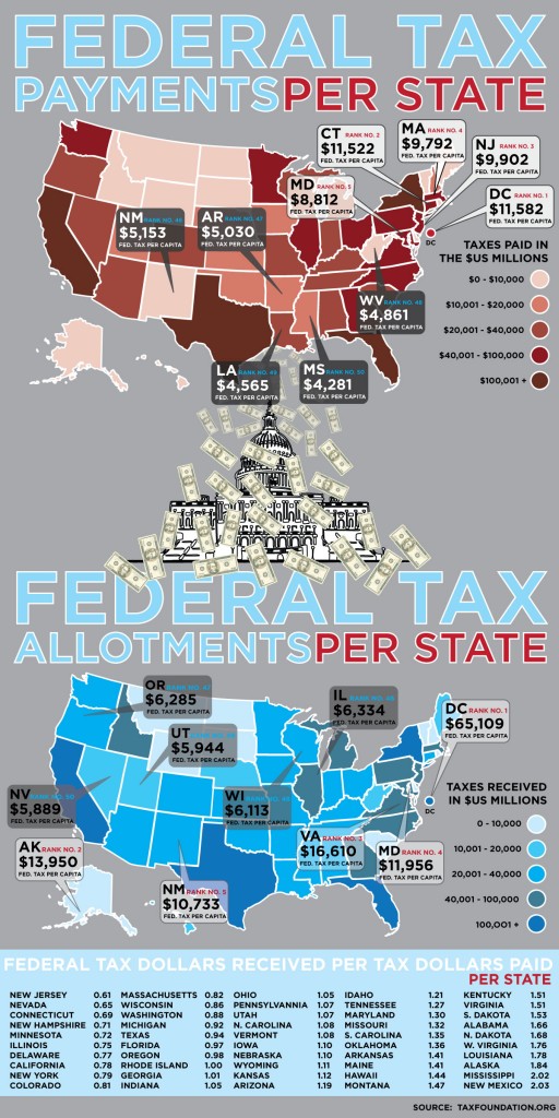
This graphic reveals which states pay the most in federal taxes and which receive the most in return. At the very bottom of the graphic, you can see the ratio of taxes out and taxes in. Rhode Island is exactly even, while the states above and to the left are essentially “donation” states and the states below and to the right are “welfare” states:

Found at Visual Economics, via ChartPorn.
Lisa Wade, PhD is an Associate Professor at Tulane University. She is the author of American Hookup, a book about college sexual culture; a textbook about gender; and a forthcoming introductory text: Terrible Magnificent Sociology. You can follow her on Twitter and Instagram.
Comments 19
Jamie — December 6, 2009
Am I reading it correctly to say New Mexico pays in very little but reaps the most benefit? Also, do farm subsidies affect this chart? I'm a little confused by it.
I work in NJ, where getting any federal funds for an infrastructure project is like pulling teeth.
nomadologist — December 6, 2009
So some of the most conservative (anti-tax) states--Mississippi, Alabama, South Carolina, Missouri--get the most federal tax dollars per tax dollar paid (what the post refers to as "welfare states")?
Quib9 — December 6, 2009
It is sort of confusing all around, starting with the legend. Am I reading correctly that the numbers refer to "$us millions", so $10,000 is ten billion? (dollars squared)
It's an interesting analysis, but doesn't seem to go very deep. There's no mention of population density, or distribution. It would be interesting to see this data compared to things like average income, or big state projects, like monuments and farm stuff.
Duran2 — December 6, 2009
Here's my advice to those who are confused. Disregard the maps, and instead focus on the list at the bottom. The maps are pretty much pointless for interpretive purposes, since the numbers are presented in absolute terms instead as a ratio to population or statewide income.
The list at the bottom is the important part.
This inequity always pisses me off. Conservatives like to present themselves as states-rightists, and make elaborate gestures of refusing federal charity (e.g. South Carolina w/ bailout money)...but if you look at the raw data, conservative states tend to be net receivers of tax money, and liberal states net donors.
It's disgusting, when you think about it. Though it might end up turning around, if high flying states like California can't get their finances in order.
Just goes to show you that you can work as hard as you want, and plan for the worst, but you'll always end up paying for someone who bought a Hummer they couldn't afford.
Duran2 — December 6, 2009
BTW, yes, agricultural subsidies are included.
Duran2 — December 6, 2009
And at the risk of spamming, one last reply.
lisa: you should have posted a comment to help people correctly interpret the maps.
cj — December 6, 2009
Is the secret to New Mexico's tax 'profit' Los Alamos & nuclear waste disposal projects? Because if so, New Mexico may be getting the raw end of this deal.
Rebecca — December 7, 2009
Do these numbers account for federal taxes paid by casinos? The top three paying states (NJ,NV,CT) all have major casino revenues.
Bagelsan — December 7, 2009
I was curious why Washington state was up there so high -- all those computer company billionaires, maybe? I don't know if even Bill Gates and Paul Allen by themselves are enough to bump up a whole state, though... Maybe Washington state is just richer than I thought.
legolandpenguin — December 7, 2009
I wonder if military basing has anything to do with it, too. Some of the profiting states might have a large military presence with smaller state populations.
Terrie — December 7, 2009
Do the numbers include the money for Indian tribes? New Mexico has over 20 different federally recognized tribes.
Shana — December 7, 2009
What on Earth is Louisiana doing with all that? New Orleans isn't finished... not even close 5 year later. Our schools are some of the worst in the country. Our police force is corrupt and over worked and we have more people in prison (per capita) than any other. Our roads suck, and our bridges are not only dangerous but far too narrow by DOT standards. Our universities are routinely gutted for every new pet project or to buffer massive losses. WTF are they doing with those dollars? Because it sure has not been used to benefit the state or its residents.
anna — December 8, 2009
Bagelsan, Washington state might just be richer than you though. It is very important agriculturally (in the top 5 and often the top 3 states in the US for products like red raspberries, apples, potatoes, mint, and hops) in addition to being the home of Microsoft, Amazon, Valve (gaming), Costco, Nordstrom, and Starbucks. Weyerhauser, Nintendo, and Boeing are also rather big. Quite a lot of international shipping, mostly Asian, comes through Washington ports, as do fishing fleets and cruise ships.
opminded — December 9, 2009
Does it include Social Security payouts?
opminded — December 9, 2009
From the foundation that put this chart together: "States with wealthier residents pay higher federal taxes per capita thanks to the progressive structure of the income tax. Other factors include whether states have powerful Members of Congress, the number of federal employees present in a state, and the number of residents receiving Social Security, Medicare and other federal entitlements."
Federal Taxes paid/received for each State « Visualizing Economics — February 17, 2010
[...] Found at Visual Economics, via ChartPorn and Context.org [...]