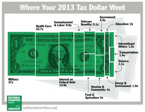
Each year the National Priorities Project releases a visual illustrating how our tax dollars are spent. This is the one for 2013, sans medicare and social security taxes.
 At the end of Sociology 101, I like to ask my students: “What is the state for?” This often takes them aback, as most of them have never considered the question before. Is it for defense? It is to maximize happiness or reduce misery? Is it for maximizing GDP? Protecting private property? Do we want to use it to influence other countries? How?
There are many questions to ask and they are not purely theoretical. I like how the spending of our tax dollars helps make the conversation more concrete.
Cross-posted at Business Insider.
Lisa Wade, PhD is an Associate Professor at Tulane University. She is the author of American Hookup, a book about college sexual culture; a textbook about gender; and a forthcoming introductory text: Terrible Magnificent Sociology. You can follow her on Twitter and Instagram.
Comments 8
Andrew — April 14, 2014
It should be noted, for readers outside of the US, that this chart only reflects the distribution of the federal income tax.
For most American households, this is only one of several layers of taxation; there are also state taxes, property taxes, sales taxes, etc., each appropriated in very different ways. With that in mind, the chart supports a discussion not so much of what the state is "for," but rather of how some spending priorities (and, therefore, powers) are centralized while others are localized. No two democracies are quite alike in how they negotiate those factors.
James McRitchie — April 14, 2014
Its an insurance company with an army.
deceptive diagram — April 16, 2014
"sans medicare and social security taxes" means this includes less than 50% of federal spending...
12 Awesome Links to Make Your Friday Better | Foreign Holidays — April 18, 2014
[…] in where your tax dollars from 2013 went? Here’s how they were split up. Hmmm…Education doesn’t get such a large slice of the dollar […]
RMP — April 18, 2014
What's the point of a chart that shows where taxes goes, that omits 50% of where taxes go (Social Security and Medicare)? This is extremely misleading. You lower the quality of your blog dramatically when you post obvious propaganda. At least be honest!
Yrro Simyarin — April 18, 2014
Graphs like this are next to useless when they exclude so much. This is how you get questions like "how do we spend so much on military and so little on education?" Because education is primarily funded by state and local taxes, is how.
http://www.usgovernmentspending.com/
Has much more useful graphs.
When you combine all levels of US government, the more accurate percentages are:
20% on health (this does ignore the massive tax deductions for health insurance)
19% on pensions (social security and government workers)
16% on education
13% on defense
8% on welfare
5% on interest
5% on transportation.
4% on protection (police, fire, etc)