Last week many media outlets were busy celebrating the Dow Jones record high, suggesting that it was indicative of the United States’ recovery from the greatest economic downturn since The Great Depression. The graph below comes from a New York Times story with the headline “As Fears Recede, Dow Industrial Hits a Milestone.”
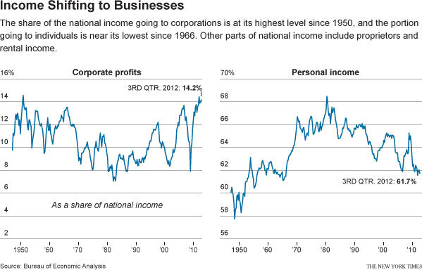
However, another story buried in the Business section of the New York Times, titled “Recovery in U.S. Is Lifting Profits, but Not Adding Jobs,” contains a graph illustrating how the supposed economic recovery is bitter-sweet at best:
The second graph uses data from the Bureau of Economic Analysis to highlight the fact that corporate profits and stock prices are at record highs, but the share of profits workers have taken home has steadily dropped since the early 1980s. Some of the steepest declines have come during the last few years, or during the supposed “recovery.”
These two graphs illustrate that while ”The Market” is probably considered the go-to indicator of economic well-being, stock indexes are not always indicative of the economic reality experienced by non-investors. If businesses and corporations were increasing their stock value by investing to expand productivity, thereby creating good-paying jobs and opportunities for workers, rising markets would be a sign good of economic times for all. But this data suggests that is not what is happening; instead, as the twin charts show, rising corporate profits are at least partly the result of wage suppression.
Jason Eastman is an Assistant Professor of Sociology at Coastal Carolina University who researches how culture and identity influence social inequalities.


Comments 2
LeilaM12 — March 18, 2013
I wish I had something more to say other than that graphs depress me beyond despair. This also part of why I have lost faith in us having an actual democracy (other than defined by "you could technically vote").
Jon — March 18, 2013
Did the BEA use US GAAP Income for its corporate profit chart? If so, consider that chart useless, as the charts may be comparing U.S. GAAP income to tax income. Even if the corporate chart is tax income, it can be also quite misleading in comparison to how individual income is accounted for.