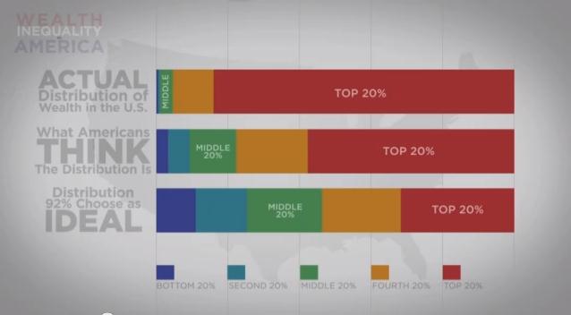
Emma K. submitted a sobering illustration of wealth inequality in the U.S. It compares American ideal distributions of wealth, with what they think it is and what it really is. Suffice to say, Americans wish for more equal distributions, but the reality far outpaces their worst nightmare.
Here’s a snapshot:
A worthwhile 6 minutes:
Lisa Wade, PhD is an Associate Professor at Tulane University. She is the author of American Hookup, a book about college sexual culture; a textbook about gender; and a forthcoming introductory text: Terrible Magnificent Sociology. You can follow her on Twitter and Instagram.

Comments 9
John Denver — March 10, 2013
Interesting graphic description of wealth distribution in America. I think a useful complement to this would be a similar look at 'opportunity' or social mobility in America - what people think it is , vs. how economically and socially mobile people actually are.
Personally I don't think the poor will ever rise up and just take from the rich. I don't think they can; see the situation of the poor as more of that of 1984 with a Boot in the Face for eternity.
[links] Link salad flies to Omaha | jlake.com — March 10, 2013
[...] Illustrating Wealth Inequality — Emma K. submitted a sobering illustration of wealth inequality in the U.S. It compares American ideal distributions of wealth, with what they think it is and what it really is. Suffice to say, Americans wish for more equal distributions, but the reality far outpaces their worst nightmare. [...]
Yrro Simyarin — March 10, 2013
Very well done video.. people don't realize just how much *bigger* a million or a billion dollars is, and what its effect on inequality is.
Still, I couldn't help but notice...looking at the graph for what people think the "ideal "distribution would be, my biggest impression is that most people surveyed can't do math, or hate savings.
If you take a group of people with exact income equality, who have had exact income equality for their entire lives (despite differences in experience or ability), and who all started from equal wealth - you have much greater wealth inequality than that ideal chart simply because some people have been working and saving for 50 years and some just got out of high school.
pduggie — March 11, 2013
I thought since they show a US map, they'd show state-by-state inequality. because Utah is really good on inequality. I wonder what they do that could be a model.
MPS — March 11, 2013
It is better to discuss consumption inequality or income inequality. Problem with wealth inequality, as analyzed, is it ignores government entitlements like Social Security and Medicare, which greatly enhance the meaningful consumption power of poorer and middle income people, and it does not account for the illiquidity of wealth of the wealthiest people (because for instance it is tied in major stakes in corporations that they founded), which greatly decreases the meaningful consumption power of the very very richest people. There are other problems too.
Oliver Wang — March 11, 2013
I like almost everything about that video EXCEPT for the casual way he just tosses "dreaded socialism" under the bus and presumes that a system predicated on equality of outcome would automatically mean that you'd be overrun with freeloaders. Heck, one commonality amongst European nations with lower rates of income and wealth equality than the U.S. is that they all have better social safety net programs, not the least of which is because they're more, ahem, socialist.
latest news — March 12, 2013
Nice input!Wealth inequality is good for every nation to a great extent. In my opinion, if a educated and hard working person earns good money then its fair enough. I do not see any positive factors of equal wealth distribution. Equal wealth distribution always leads to downfall.
MSteineker — March 24, 2013
There are many different factors that go into income inequality. As someone stated earlier, this video didn't take into account things like Social Security and Medicare which are provided for the lower class and elderly. I would also be interested in seeing what the gender income gap would be for the separation of the classes, especially within the 1%. The graph did help to visualize how big the gap is and how Americans think it isn't as bad as it really is.
Wealth Inequality in the U.S. | Multiracial Sky — October 3, 2013
[...] six minutes with this video that clearly explains and illustrates wealth distribution and inequality in the United [...]