Cross-posted at The Huffington Post.
Justin J.W. Powell and Liat Ben-Moshe have written a great short history of the icon signifying accessibility for people who use wheelchairs for the magazine Stimulus Respond. The story, they argue, is one of “exclusion to inclusion.”
For most of American history, they begin, there was no icon at all. This is because people in wheelchairs were largely excluded from public life. There were no efforts to ensure accessibility, so no signs of accessibility were needed.
In the late ’60s, however, Rehabilitation International partnered with the United Nations and the International Standards Organisation to sponsor an international competition for an icon. The winner, a Danish design student named Susanne Koefoed, had submitted the icon on the left. In committee, they noted that Koefoed’s design erased the person in the wheelchair. They added a head, creating what people around the world recognize as a symbol of accessibility.
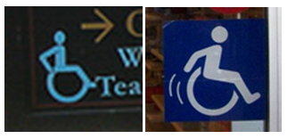
The symbol is still evolving. Powell and Ben-Moshe note that recent revisions have been aimed at emphasizing that people in wheelchairs are active users, not passive ones. Accordingly, some organizations have shifted to using a symbol that captures the fact that people in wheelchairs get themselves around. I’ve snapped pictures of the icons used by the Huntington Gardens and a T.J. Maxx (both in CA): the former has the users’ arms bent behind them to signify pushing their chair forward, while the latter leans the figure forward and adds motion lines.
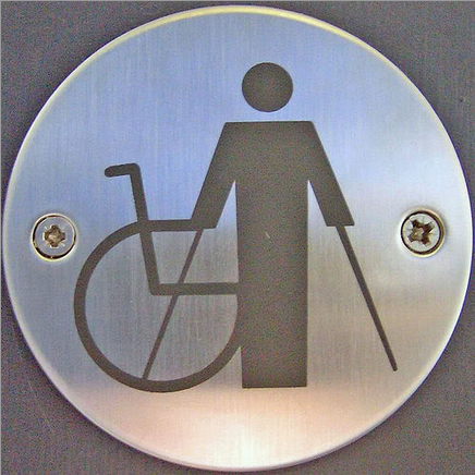
Another trend involves trying to break down the categorical binary between abled and disabled people, instead recognizing that there is a spectrum of ability. For example, this icon (source):
Ultimately, Powell and Ben-Moshe hope that access will be so universally designed into public buildings that it will eliminate the need for an icon at all: architecture would no longer be designed around a specific type of person considered “normal,” but instead would be designed for the range of people who will use the spaces. This full integration would mean that differently-abled people would be considered just “people” and we wouldn’t need an icon at all.
Lisa Wade, PhD is an Associate Professor at Tulane University. She is the author of American Hookup, a book about college sexual culture; a textbook about gender; and a forthcoming introductory text: Terrible Magnificent Sociology. You can follow her on Twitter and Instagram.


Comments 31
Tom Megginson — February 19, 2013
The problem with iconography is that they can't be too far ahead of the lowest common denominator of perception, or else they won't work. The wheelchair symbol for accessibility may exclude may categories of ability difference, but at least it's clear and intuitive. The evolution to the arms engaged in motion (the first one is elegant, the second, amateurish) is a good change. The one with a chair, two canes, and a standing person is not — clarity has been sacrificed for an inclusivity that is confusing and still incomplete.
Dianna Fielding — February 19, 2013
I used to stripe parking lots for a living. It makes you notice the lines we so frequently ignore.
One things I have noticed is that a lot people stripe the accessible symbol differently. There is a stencil you can order online, and the all appear the same. But, after you've got it, you can do whatever you want. There is one person in my area who puts the stencil at an angle (to imply motion), and has added a smiling face.
Owen Jones — February 19, 2013
The self-propelling one also excludes those who cannot move under their own power, for whatever reason, so I don't see it as much of an improvement.
Richard Gadsden — February 19, 2013
I suspect that the hope expressed in the last para is one expressed by Americans. There are just too many old buildings here in Europe that are inaccessible and cannot be made accessible without transforming an iconic or historically significant building in a way that would conceal or damage the history.
Nora Reed — February 19, 2013
Would it be possible to have an idealized world without iconography to indicate spaces made specifically for disabled people? For stuff where you need ramp/closer access or a wider bathroom, for example, it seems like you'd need some kind of icon, even if a wheelchair doesn't represent all the people who would whatever the icon is indicating.
Anna — February 19, 2013
You see, the point is Powell, Ben-Moshe, and many other proponents of disability rights envision a world where there are no spaces made specifically for disabled people - a world where everything is accessible to everyone, thus discarding the need for such iconography altogether. While industrial design and urban planning is not my forte, I assume that this is more an ideological, futurist projection than something that they envision as a realistic possibility for the near future. Currently, it's more about cultivating awareness and planting the seeds for this to become a reality. Baby steps...
Although it wasn't inferred in the original post, a crucial aspect to this is also, of course, strongly debating how all-inclusive physical spaces can become a reality, their practical and philosophical limitations, issues of resources, and so forth.
Rusty Longwood — February 19, 2013
Uhm I'm sorry, we aren't talking about differently-abled people here, we're talking about disabled people. If your legs don't work and you need a wheelchair to get around you're DISABLED. Unless being in a wheelchair has also allowed you to read minds or shoot lasers out of your mind, you're disabled. Understandably some disabilities such as autism can bring special mental abilities, but autistic people don't need ramps, braile or special doors to get around.
Naomi — February 20, 2013
I really like the Accessible Icon Project's symbol.
http://www.accessibleicon.org/
jen — February 20, 2013
Interesting about the more inclusive symbol. My mother has severe, debilitating arthritis and it is very painful for her to walk. Sometimes she needs a cane but sometimes she manages slowly without one. Because of the stigma against wheelchairs, she's not going to use one until she absolutely must.
She has a disabled parking permit, and being able to park close often helps her keep from having to use the cane for the outing. But I sometimes wonder if people think she's not "really" disabled because she has no visible assisting tools.
International Symbol of Access | Logo Design Love — November 9, 2013
[…] Susanne Koefoed’s design (left), with head added by Karl Montan (right), via Sociological Images […]
International Symbol of Access | rustledesign.com.au — November 9, 2013
[…] Susanne Koefoed’s design (left), with head added by Karl Montan (right), via Sociological Images […]
International Symbol of Access | Uber Patrol - The Definitive Cool Guide — November 9, 2013
[…] Susanne Koefoed’s design (left), with head added by Karl Montan (right), via Sociological Images […]
International Symbol of Access | Kata Studio — November 10, 2013
[…] Susanne Koefoed’s design (left), with head added by Karl Montan (right), via Sociological Images […]
International Symbol of Access | Design lance — November 16, 2013
[…] Susanne Koefoed’s design (left), with head added by Karl Montan (right), via Sociological Images […]
International Symbol of Access | Howdycom.com — November 21, 2013
[…] Susanne Koefoed’s design (left), with head added by Karl Montan (right), via Sociological Images […]
Jeannetta Rogers — February 20, 2014
How about showing just a wheelchair, crutches, a walker, and a cane? If you are prone to needing one or more of these aid devices, this spot is reserved for you.
Assignment #1 Revision | Van Le — October 10, 2014
[…] such as the International Organization for Standardization homepage in the second paragraph or the original design that “didn’t have a head” in the fifth paragraph. Though the hyperlinks are optional, at […]
Major Assignment 1 | kyle312 — October 14, 2015
[…] the new symbol. The text states “The winner was a Danish designer named Susanne Koefed—though her original design didn’t have a head!” The article links these words to an article explaining what the original design was. This […]
Kelly — February 24, 2016
I'm 21 years old and I was injured in a car accident when I was only 19. I am in a wheelchair now. I never before my accident used a handicap parking spot, bathroom, or anything else. I find the wheelchair sign very discriminating! There are so many fat, old, and unnecessary people who use my parking spot! It really irritates me as well when like 2 or 3 girls are in the handicap accessible bathroom taking selfies, putting on makeup, and goofing off in there. The wheelchair on the handicap sign needs to be changed. I plan on changing it. There can be something else there like, disability accessible. Anything, but the wheelchair because the majority of people who use the accessible accommodations are not in chairs.
Please be respectful and not abuse things that don't apply to you.
Draft of “Show vs Tell” – trinawritestuff — September 28, 2016
[…] they needed to be certain that after the readers learn that the original image by Susanne Koefed, “didn’t have a head!”, they would be curious enough to click on the hyperlink to see the headless logo. Slate also keeps […]
Revision of Show vs Tell – trinawritestuff — October 2, 2016
[…] they needed to be certain that after the readers learn that the original image by Susanne Koefed, “didn’t have a head!”, they would be curious enough to click on the hyperlink to see the headless logo. Thus, the reader […]
A Twist on A – Naomi Arlene Gorden — October 15, 2017
[…] and another article about how the original logo has been changed over the years (https://thesocietypages.org/socimages/2013/02/19/disability-rights-and-the-symbol-of-accessibility/). The cool part about this is the way the author embedded these […]