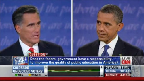
I watched the first U.S. Presidential debate of the election last night and I noticed something interesting about the coverage at CNN. Notice that the live viewer information along the bottom includes the degree to which female (yellow) and male (green) Colorado undecided voters like or dislike what each candidate is saying (measured by the middle bar).
By choosing to display data by gender, CNN gives us some idea of how men and women agree or disagree on their evaluations of the candidates, but it also makes gender seem like the most super-salient variable by which to measure support. They didn’t, for example, offer data on how upper and middle class undecided voters in Colorado perceived the debate, nor did they offer data on immigrant vs. non-immigrant, White vs. non-white, gay vs. straight, or any number of demographic variables they could have chosen from.
Instead, by promoting gender as the relevant variable, they also gave the impression that gender was the relevant variable. This makes it seem like men and women must be really different in their opinions (otherwise, why would they bother highlighting it), strengthening the idea that men and women are different and, even, at odds. In fact, men and women seemed to track each other pretty well.
It’s not that I don’t think gender is an interesting variable, it’s just that I don’t think it’s the only interesting one and making it seem so is problematic. I would have loved to have seen the data parsed in other ways too, perhaps by rotating what variables they highlighted. This would have at least given us a more nuanced view of public opinion (among undecided voters in Colorado) instead of reifying the same old binary.
Lisa Wade, PhD is an Associate Professor at Tulane University. She is the author of American Hookup, a book about college sexual culture; a textbook about gender; and a forthcoming introductory text: Terrible Magnificent Sociology. You can follow her on Twitter and Instagram.

Comments 16
Carolyn Fitzpatrick — October 4, 2012
All true, but at least the women voters' line wasn't pink. That's a win right there!
Yrro Simyarin — October 4, 2012
I didn't see the debate - was there even significant variance between the male and female opinions of these two candidates?
Jay — October 4, 2012
Do you mean sex rather than gender?
Stefan Krueger — October 4, 2012
"In fact, men and women seemed to track each other pretty well."
Really? I'm curious about how this claim is defended. I'm looking at the lines in the image, and I see quite a bit of difference, considering the percentage of the electorate might actually change their vote. The parties are fighting over a very small slice of the electorate, so the differences between those two lines might be quite important. Additionally, isn't gender actually quite a salient factor in political affiliation? Numerous studies support this idea. (e.g., http://onlinelibrary.wiley.com/doi/10.1111/j.2044-8309.1997.tb01118.x/abstract)
drdanj — October 4, 2012
Did anyone else notice that whenever the two cameras got into the just right positions, "pu" showed behind Romney and "berty" showed behind Obama to form puberty? It's almost lined up in the image above. Just a random observation.
Brandy — October 5, 2012
Had the candidates discussed gender salient issues the lines would have been more interesting. However, when you have a population you don't know anything about gender is the easiest way to split them in half. Economics and cultural background are not so cleanly cut as "gender" is for "most" Americans.
Sariel — October 5, 2012
Having watched the coverage after the debate the focus group was really small - only 6 -12 people and they mostly looked middle-aged and white to me. It's not really a relevant sample size just something to give people to pay attention to other than the actual policy being debated. What would've been interested (although probably not reliable data) is if the candidates had talked about GLBT issues, women's rights (fair pay, abortion, birth control coverage in healthcare), or anything else where we could reasonably surmise men and women would have different levels of interest.
nik robots — October 7, 2012
If any one finds the procedure/methodology discussed, let us know!
nik robots — October 7, 2012
I'm curious how was this data collected, and from what sample of women & men?
Guest — October 29, 2012
Could you explain how this is reification?
Joshua Clement Broyles — May 19, 2013
I'm not sure that it's so much reification as cherry-picking. Since it doesn't tell us much of anything anyway, the easiest ulterior motive to suspect would have to be to imply that the electorate is more close to evenly divided across demographic variables than maybe it really is. If they would show, instead, any of the variables suggested, the imbalance of responses would likely only be more pronounced. One possible implication is that the news venue wants to produce the impression of a less predictable election in terms of the way demography predicts voting patterns. Another possible implication is that they just don't know what they're doing with demographies, and chose the one they thought would be either the most provocative or the least provocative, depending on their viewership goals.