The National Partnership for Women & Families has posted an interactive map that displays the gender pay gap in each state and in the Congressional districts within the state. It uses Census Bureau data comparing full-time, year-round workers (that is, the scenario in which we’d expect women’s income to be closest to men’s). When you click on any state, it brings up information about it. For instance, in Nevada, women make 85% of what men do. Women working full-time have a median income of $35,484, while men’s median income is $41,803. The gap is smallest in the 1st and 3rd districts (both including parts of the greater Vegas metro area), but significantly larger in District 2, which covers the rest of the state, much of it rural:
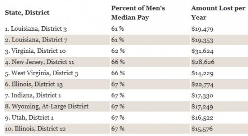
Here are the 10 U.S. Congressional districts with the largest gender gap in median pay:
They don’t list the state or districts with the smallest gap. Just from casually and non-systematically clicking around, the state with the most parity that I found was in Washington D.C., where women make 90% as much as men. Let us know in the comments if you find anywhere with an even smaller gap.


Comments 16
Karen Raquel — September 28, 2012
I looked at my home state, Texas, and was surprised to see that not only were South Houston women making 97% of mens wages, but that in District 30 (Dallas area) the gender gap was switched and women made 113% of mens wages (one of 12 in the country where women out earned men).
http://www.nationalpartnership.org/site/PageNavigator/issues_work_wagegap_map_tx.htmlObviously the gender gap is still tremendous. I just didn't expect to find examples of greater parity in Texas!
Ashley — September 28, 2012
District #33 in California is 103% - women earn more.
kingofmeows — September 29, 2012
This is great except it should really clarify WHAT women. These statistics are for white women, are they not? Women of color make far, far less.
Kate Wolfe — September 29, 2012
New York state has several districts where pay is 100% of men's pay or higher! Note on listing says only 12 districts have women making more than men.
Kate Wolfe — September 29, 2012
These stats must be for all women compared to all men; therefore we do not see ethnic differences the pay gap. Would love to see this broken down by ethnicity, education, and age.
Interactive Map of the Gender Pay Gap » Sociological Images « National-Express2011 — September 29, 2012
[...] on thesocietypages.org Sharen mit:TwitterFacebookTumblrPinterestEmailMoreLinkedInLike this:LikeBe the first to like [...]
And the Gender Gap Continues: INTERACTIVE MAP OF GENDER PAY GAP « Welcome to the Doctor's Office — September 29, 2012
[...] from SocImages [...]
Megan C. — October 2, 2012
A few districts in CA have women earning slightly more than men. They are marked with an asterisk, and the footnote reads: "One of just twelve congressional districts out of 435 where the median pay for a woman working full time is greater than or equal to the median pay for a man working full time."
Ben Zvan — October 4, 2012
Another factor that's not represented here is the pay gap by type of work.