Cross-posted at Montclair SocioBlog.
What’s familiar isn’t so bad, even if it’s bad.
One of the things I remember from my days in the crim biz is that people’s perceptions of crime don’t have a lot to do with actual crime rates. This was back in the high-crime decades, and people were more afraid of crime than they are now. But people felt safer in their own neighborhoods than in other neighborhoods, even when their own neighborhoods had a higher crime rate.
These were the days when I would give someone directions to my building — “Get off the IRT* at 72nd St…” — and they would often ask, “Is it safe?”
“Of course it’s safe. It’s my neighborhood,” I would say, “I live here. I ought to know.” Yet when I would go to a party in the East 20s or, God forbid, Brooklyn, I would emerge from the subway and follow the directions with a certain sense of apprehension and caution.
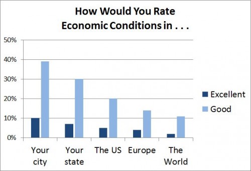
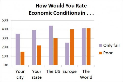
Apparently, the same link between far and fear holds true for people’s perceptions of economic well-being. A recent Gallup poll asked people how the economy was in places ranging from their own city or area to the world generally. The closer to home, the better the economy. The farther from home, the lower the percent of people rating economic conditions as excellent or good. And the farther from home, the higher the percent of people rating economic conditions as “only fair” or poor.
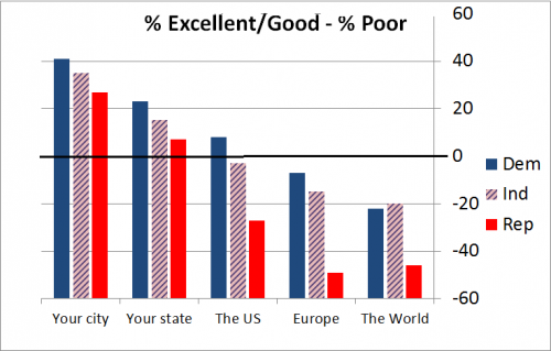
 Republicans were the most pessimistic about the economy, regardless of location. Democrats were the most sanguine, with Independents in between. The graph shows the percent who rated the economy positively minus the percent who rated it Poor.
 This obviously has nothing to do with familiarity but with contempt. Apparently, for Republicans, a Democrat – especially a Kenyan socialist Democrat – in the White House means that the economy must be bad everywhere.
* These old subway line designations – IRT, BMT, IND – are no longer in official use. But when did the MTA jettison them? If you know the answer, please tell me.
———————
UPDATE, June 22: Andrew Gelman has formatted the data as line graphs, making the comparisons and trends clearer. He has also added his own observations – things I wish I had known or thought of.

Comments 6
Yrro Simyarin — July 10, 2012
I think when we deal with local issues, we use our own perception. When we deal with larger issues, we are going off of what is on the nightly news, and news of shops closing, layoffs, and crime are much more exciting.
There are dozens or hundreds of murders in "a neighborhood just like mine" every year, but probably only one in your actual neighborhood every year, or even every decade.
In the republican/democrat case, it probably doesn't help that MSNBC has been trumpeting the "recovery" (hint: there really hasn't been one) for a few months, while Fox News is talking about how miserable everything is continuing to get (hint: it's still bad, but it *has* been improving a little).
NC73 — July 10, 2012
"This obviously has nothing to do with familiarity but with contempt.
Apparently, for Republicans, a Democrat – especially a Kenyan socialist
Democrat – in the White House means that the economy must be bad
everywhere."
This is sound logic but very harsh phrasing. Sure, Republicans might think negatively because they don't like the guy in the white house - but do you really think the numbers wouldn't have been skewed the other way when Bush was in before Obama? The baseless inflammatory GOP-bashing seems kind of unfair. (Never thought I'd say that, but there it is.)
Jay Livingston — July 10, 2012
@NC73. I don’t know if it’s unfair, but it is much too snarky. Still, there probably is a kind of halo effect such that the more anti-Obama someone is, the more they perceive things generally as messed up. I also agree that the effect would be probably have been the same, though with reversed valences, if you had asked this in the Bush years.
@yrro Precisely. Knowledge of things close to home comes from a variety of sources, especially personal experience. Even if unemployment is 10%, most of the people I know (90% of them) will be working and getting paid. For more distant places, I have to rely on the media, which have a bias towards trouble.
JM — July 11, 2012
To me, this isn't only about fear of the unknown but about how we define ourselves by what we're not. Think of the work on discursive oppositions, boundary maintenance, othering, etc. It's also a defense mechanism to put a rosy face on our own circumstances.
kdlmn — July 12, 2012
There is quite a lot of Europe hatred based on FoxNews "those socialist Europeans" narrative. I am always puzzled when people ask me about basically 'starving Europeans', when me, my family and friends in the UK, Germany, Sweden, Denmark and Austria are doing much better than people in e.g. Mississippi, Alabama or even Detroit. Or anyone American without access to free or affordable healthcare or to free university education. It would be laughable if it wasn't so darn sad.