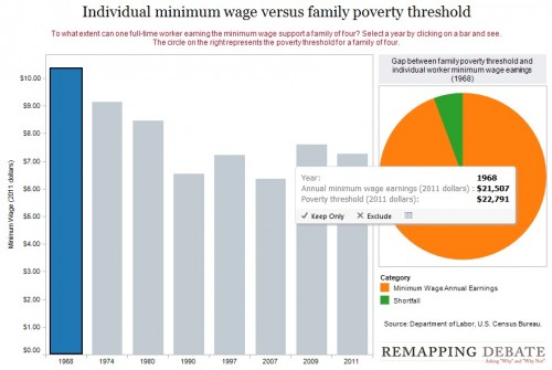
Remapping Debate has posted an interactive graph that lets you look at the decreasing relative value of the federal minimum wage. The graph shows the gap, at various points in time, between the annual income of a full-time worker earning minimum wage and the poverty line for a family of four (all expressed in 2011 dollars; you can see specific historical, unadjusted minimum wage rates here). In 1968, a single minimum-wage earner made about 94% of the federal poverty line for four people:
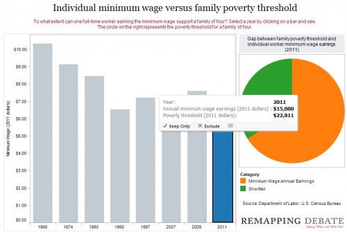
By 2011, the gap had widened significantly; one minimum-wage worker earns about 66% of the poverty threshold for a family of four:
Though the federal minimum wage has gone up over time, its relative value covers less and less of the costs of living in the U.S.


Comments 5
rowmyboat — June 11, 2012
Thoughts on the poverty level threshold? What does that mean throughout time -- how close has it historically been to, say, a living wage or some cost of living metric? And that's not accounting for geographical variability -- it costs much more to live in, say, NYC than rural areas or even other cities.
rowmyboat — June 11, 2012
(Let me be a little less opaque -- I think the poverty level is too low, especially as doesn't take local cost-of-living variations into account.
RELATIVE VALUE OF THE MINIMUM WAGE « Welcome to the Doctor's Office — June 11, 2012
[...] from SocImages [...]
boyer — July 14, 2025
llustrations of federal minimum wages losing value over time are similar to the dangerous challenges in tap road where overcoming challenges requires strategy to win.