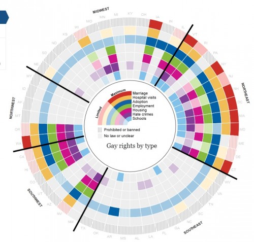
Yesterday I stumbled upon a really great interactive graphic posted by the Guardian that summarizes the degree to which a number of rights and benefits are available to gays and lesbians in the U.S., by state. Each state is represented as a segment radiating out from the center of the circle; each colored ring represents a particular right, benefit, or protection:
- Light blue = whether state has a law addressing discrimination or bullying in the school system
- Purple = state-level hate-crime laws
- Pink = protection against housing discrimination
- Green = protection against employment discrimination
- Blue = right to adopt (lighter shade indicates individuals are allowed; darker shade means gay and lesbian couples are allowed to jointly adopt)
- Yellow = right to visit partner in the hospital
- Red = marriage
The different shades indicate differences in the scope of coverage (say, full marriage rights vs. domestic partnership — and it has been updated to reflect yesterday’s passage of the bill outlawing same-sex marriage in North Carolina — or whether a law bans discrimination based on sexual orientation but not gender identity); the Guardian website explains each issue. Their post also allows you to hover over a state and get a more detailed summary. Here’s the info for Nevada, for instance:
The graphic also lets you scale states by population if you want to get a better sense of the proportion of the U.S. population living in areas that do or do not provide these protections.


Comments 4
Speaking of Same-Sex Marriage: Laws Addressing Sexual Orientation, By State « Welcome to the Doctor's Office — May 9, 2012
[...] LAWS ADDRESSING SEXUAL ORIENTATION, BY STATE by Gwen Sharp, [...]
Infographic on LGBTQ Laws By State Simultaneously Fascinating and Horrifying | The Opinioness of the World — May 10, 2012
[...] stumbled upon this intriguing infographic on Sociological Images originating at The Guardian. It details LGBTQ rights in the U.S. by region and state. If you visit [...]
beans — May 11, 2012
This is great! One caveat though: you can't get married in Washington yet--the law will become effective in June. However, if opponents gather enough signatures by the start of June, then it will go on the November ballot.
yourqueerprof — May 16, 2012
This is actually a very interesting map however, it is also very untelling of the true lived experiences of many. For example, many states have no laws that address issues of sexual orientation. In these places, one may assume an unfriendly space. For example, TX is actually legally considerably more favorable toward gay families compared to say LA however they both appear to be coded in the same way quantitatively. In fact, I moved to LA thinking it would be like TX. The city I live in is much more liberal compared to rural TX where I moved from and even offers partner recognition, and has anti-discrimination statutes. However, in trying to legally protect my family, it is actually quite improbable and may as well be "illegal."