Cross-posted at Montclair SocioBlog.
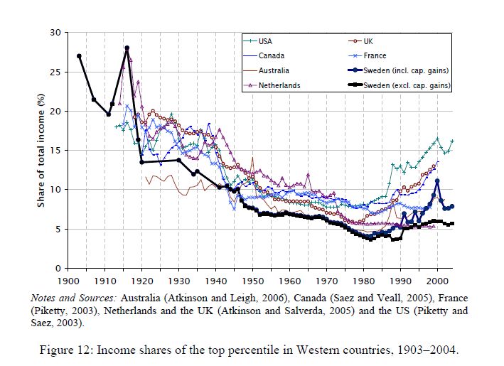
This graph tracks the share of income going to the top 1% in seven countries. It’s from a paper by two Swedish economists, Jesper Roine and Daniel Waldenström (pdf).”’
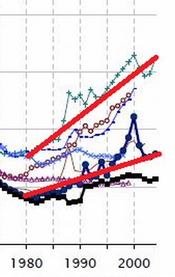
The trend was towards greater equality up to 1980 — the share of the 1% was shrinking. Since then, the 1% have increased their share of the income pie in all seven countries. But the graph seems to show important differences, especially in recent decades. Here is a cropped version of the graph showing the 1980-2004 years. I have added straight lines connecting those two points for Sweden and for the U.S.
Both changes are increases, but are they the same or are they different? The answer is crucial. The U.S. and Sweden have different economic policies. If the changes are no different between countries, then inequality is just one of those inevitable things that’s happening no matter what governments do. But if the growth of inequality in the US is much greater than in Sweden, maybe government policy can in fact mitigate the trend towards inequality.
The Swedish 1% share went from a little under 5% to about 7.5%. In the U.S., the 1% share increased from about 7% to 16%.* You might see those increases as very similar.
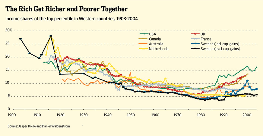
In fact, Allan Meltzer in the Wall Street Journal takes precisely that view. He stretches out the graph to de-emphasize the vertical differences, and adds a title implying that all countries are “together” in this shift of income to the top 1%.
He adds this explanation:
As the . . . chart . . . shows, the share of income for the top 1% in these seven countries generally follows the same trend line. That means domestic policy can’t be the principal reason for the current spread between high earners and others. Since the 1980s, that spread has increased in nearly all seven countries. The U.S. and Sweden, countries with very different systems of redistribution, along with the U.K. and Canada show the largest increase in the share of income for the top 1%. [emphasis added]
If your pay went from $5 an hour to $7.50 an hour while your co-worker’s went from $7 to $16, you might think that your co-worker had gotten a substantially heftier raise. But if so, that’s because you’re not the Wall Street Journal.
Meltzer’s main point in the article is that we should not raise taxes on the very wealthy. However, as Bruce Barlett points out (here), if the rich are getting just as rich in high-tax countries like Sweden and the Netherlands as they are in low-tax countries like the U.S., we may as well raise taxes on them. They’ll be doing just as well, like their Swedish and Dutch counterparts, and the nation will have more revenue to put towards Medicare, education, deficit-reduction, etc.But Meltzer is wrong. Sweden and the Netherlands are very different from the U.S. As the graph shows, the income share of the 1% in the U.S. is twice that of the 1% in Sweden and 3 times that of the 1% in the Netherlands. And it has risen more rapidly. Yet Meltzer claims that inequality trends are similar everywhere.
So who are you going to believe – the Wall Street Journal or your lying eyes?


Comments 7
Anonymous — March 16, 2012
You also have to take the poitn of reference into account. The analysis of these graphs are focusing on the difference between countries, but it would be incorrect to think that just because it happens all over the western world it's independent of politics.
But in fact there *has* been a change in policy over the past 20 years. At least in Sweden there has been a very clear right turn, with the liberal party winning the election twice in a row for the first time in 70 years, and with economic liberalism taking hold even in the socialist party long before that. Taxes are being cut, state owned services sold out and reforms are made that favor the rich at the expence of the welfare system. This does affect income equality, and with right wing rhetoric gainign popularity all over Europe, it is hardly an isolated case.
Anonymous — March 16, 2012
So, if the trends are different, why is there a consistent downward trend across countries, with outliers, before the 1960's, a consistent flat trend until the 1980's, and a consistent rising trend until the present? The overall trend is the same, even if a cherry-picked 24 year-over-year trend shows a 50% difference.