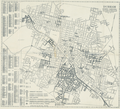
Trudi Abel, who directs the Digital Durham Project at Duke University, sent in a map she thought we might like to post. Created by the Department of Public works in Durham, NC, in 1937, the map illustrates the legal and taken-for-granted racial segregation of the time. The map indicates which parks and residential areas were for Whites and which for African Americans:
The map:
Obviously you can’t see much, other than a general idea of which parts of town each race lived in. Go to the Digital Durham website and click on the map for a version that lets you zoom in to read all the details.
You might also want to check out our posts on a 1934 redlining map of Philadelphia and 2010 Census data on segregation.


Comments 10
Kristina Killgrove — March 9, 2012
Oh man, my old house is just a little further north than the map covers. It would have been cool to see what that area looked like in 1937.
Consider Magazine » Blog Archive » Endpoint (3.9.12) — March 9, 2012
[...] Sociological Images has an interesting post about what segregation looked like geographically in Durham, North Carolina circa [...]
Alex51324 — March 9, 2012
Looking at the big version of the map, I find it interesting that, with one exception, the incinerators are all located at the point where a black neighborhood joins up with a white one. Given that few people want to live near a 20-ton incinerator if they have a choice (but that, if households were responsible for transporting their own trash there, one would also have not wanted to be too far from one), I wonder which direction the causality goes there. Were the incinerators placed in black neighborhoods, or did the neighborhoods become black after the incinerators made them less desirable for whites?
I'm also interested in the couple of places where there is a bit of street marked as "Negro" that, based on the scale in the upper right corner, can't account for more than a couple of houses. There are also some places where there is a little black box, just off the street. Those boxes aren't shown on the legend, so I don't know what they were--my initial read was that they indicated a black household in a white neighborhood, but maybe they're something else. (One of these can be seen along the left edge, about two-thirds down, at the corner of Elmwood and Jersey. Based on the layout of the streets in that area, I'd guess it's one of the nicer neighborhoods. Is that where 1930's Durham's richest black family lived? I'm looking at other maps in the archive trying to figure this out.)
Ariel — March 10, 2012
It would be interesting to see a recent map of Durham that shows racial makeup. I wonder how less/more black or white the segregated areas have become.
Anonymous — March 12, 2012
One of my professors suggested that along the East Coast of the U.S., the southeast part of town was likely to be less affluent and less white, and the northwest part of town the opposite, because those towns often were built along the fall line -- where the coastal plain shifts to mountains, and it's harder for ships to move upstream -- and the NW area was generally more pleasant than (cooler, less muggy, and literally above) the SE area. It seems to apply to Durham, which does lies on the fall line, if I'm reading Google's terrain map correctly.
(Of course, the south side of town often is understood to be a less desirable area, even in places where the fall line theory doesn't apply. I'm thinking of southside Chicago, or -- my favorite -- "south Detroit," which is immediately understood to be a rough neighborhood, even though it doesn't exist outside of a Journey song. South of Detroit is *Canada*.)
A 1937 Map Of Segregated Durham | Disinformation — April 23, 2012
[...] needing such a map for the purpose of decoding what locations could be accessed by whom. Via Sociological Images: Trudi Abel, who directs the Digital Durham Project at Duke University, sent [this] in. Created by [...]
A 1937 Map Of Segregated Durham « I Love History…and Research — August 1, 2012
[...] needing such a map for the purpose of decoding what locations could be accessed by whom. Via Sociological Images: Trudi Abel, who directs the Digital Durham Project at Duke University, sent [this] in. Created by [...]