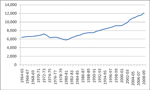
Whether you are in college or not, fall semester 2011 is upon us. Below, courtesy of Everyday Sociology, is a graph illustrating the rising cost of college, controlled for inflation.
Public College/University Tuition, Room and Board (held constant in 2007-2008 dollars):
Consequent to this increase, the average student in 2008 graduated with twice the debt as a student in 1996, from $12,750 to $23,200.
The pay-off of a college education, however, is higher than ever. So why don’t more people go?
In the seven-and-a-half minute video below, UC Berkeley Professor Michael Hout gives a history of higher education putting all of this in perspective. The answer is class-specific and how different classes think about debt and possibility. More:
Lisa Wade, PhD is an Associate Professor at Tulane University. She is the author of American Hookup, a book about college sexual culture; a textbook about gender; and a forthcoming introductory text: Terrible Magnificent Sociology. You can follow her on Twitter and Instagram.

Comments 8
Melanie S. — August 31, 2011
An interesting explanation of demographic trends there. I imagine dropout rates are different as well; I wonder if that's significant in relation to the self-selection out of the student pool in the first place.
(I still find it very odd to think that only 30% of people get a college diploma these days--my parents are academics, as am I, so the norm among people I know is a grad degree or two per person. And that's also probably influenced by my always having lived in college-centered neighborhoods.)
The data set that was used to make that graph is also lots of fun--I might have, uh, plotted public and private costs, percentage breakdowns of tuition, room and board for public and private institutions, and public institution costs as a fraction of private institution costs.
Larrycharleswilson — August 31, 2011
There will most likely be a continuing demand for plumbers, who are at least as important to the maintenance of modern society as an historian such as myself.
Bulla — August 31, 2011
But the graph doesn't show the cost of college as a % of, say, median household income. So it's a bit pointless, as it doesn't show whether the college costs burden people more or less..
Anonymous — September 1, 2011
Can we, instead of 'costs' of college, see numbers approaching what people spend (out of pocket or out of deficit) for college?
In two years of (community) college, after tuition/fees/books/transportation/marginal food costs, but less the various types of money given to me by various agencies, I'm very close to dead even on money.
I find my experience hard to reconcile with the assertion that an 'average year of college' costs between $10k and $12k. It seems to me that groups which should not be grouped together in this calculation are being grouped together.
Yea for Mmmmmmmitch Daniels .. - Page 2 - City-Data Forum — March 7, 2013
[...] [...]