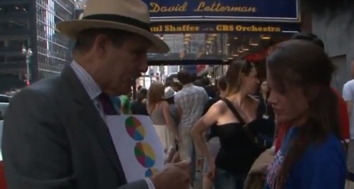
Katrin let us know about this great clip from PBS News Hour (and posted at Boing Boing) about inequality and Americans’ perceptions about how wealth is distributed in the U.S. It’s a great clip:
PBS posted the pie charts used in the video as well.

Katrin let us know about this great clip from PBS News Hour (and posted at Boing Boing) about inequality and Americans’ perceptions about how wealth is distributed in the U.S. It’s a great clip:
PBS posted the pie charts used in the video as well.
Comments 11
Umlud — August 18, 2011
I think that the reporting at the end nailed the sentiment: Americans believe that we are a country of equality, that we are a fair country, and therefore, we cannot be the third graph. Confronting the difference between the perception of what we think America is and what America ought to be is something that not too many of us do too often. (Indeed, when some do it, they are castigated for "questioning" the tenets of the country -- think Michelle Obama in 2008.)
However, if we want to have a populace that is clued into what the situation is, active and insightful questioning of what we think is real and what is actually real need to be encouraged as a part of teaching, learning, and living.
Anonymous — August 18, 2011
Let's see... country A is a literal communism, where the poorest person has the same wealth as the richest person. Country B looks like it might be an almost-perfect truncated bell curve, where there are only a few people significantly worse and none hugely better off than any other.
I've got the strange feeling that even among the top 20%, the trend holds. I can't find information broken down for the 80-84th percentile and so forth, but I see that in 2004 the average net worth of the 75th-90th percentile is about 17% of the average net worth in the 90-100th, and the 82nd percentile is about a third that of the 95th, roughly the same ratio of the 40-60th and the 60-80th.
There's something about Americans that makes earning logarithmic. A few outliers are enough to cause the swelling at the top 20%; outliers cannot explain the difference between the bottom two quintiles and the middle.
Brandon Engmark — August 19, 2011
I feel like this is a really solid demonstration on the power of infographics.
Anonymous — August 19, 2011
I think this is a really great piece of reporting, and something that more Americans should see. However, I wish convincing the hoi polloi didn't rely on employing other forms of discrimination and on referring to other bad situations that we have helped create (always using the "countries" of "Africa" and "Asia" to illustrate how, if we're anything like them, things must be REALLY bad).
bighouse — October 7, 2011
Well, I think this predicts the Occupy Wall Street movement as being inevitable. So was the Bolshevik revolution. But socialism is not the answer. Unregulated consumer capitalism is obviously not the answer. What is?
#016: Income Inequality | Challenge the Culture of Violence — March 5, 2014
[…] PBS News Hour has a 12 minute video which talks about the perception people have about wealth distribution in the US. The video shows […]