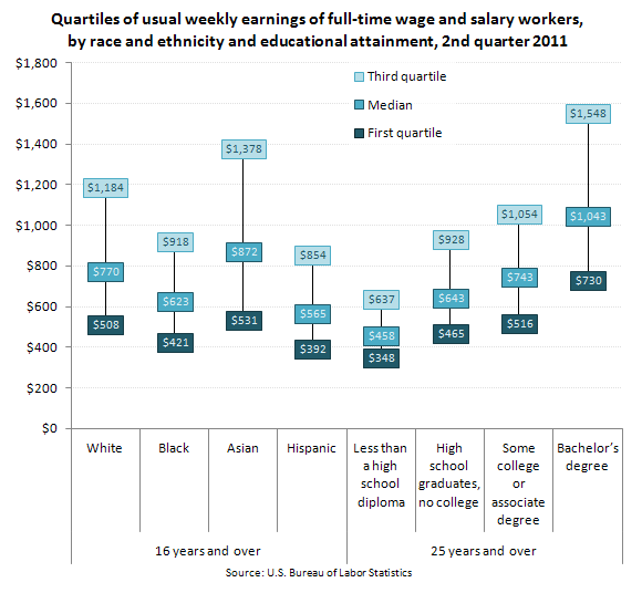
Kelsey C. sent in a some great data from the Bureau of Labor Statistics that helps illustrate why variance matters as much as a measure of the average. The figure shows the median income by race and education level, as well as the typical earnings of each group’s members in the third quartile (or the 75th percentile) and first quartile (or the 25th percentile). What you see is that the median earnings across these groups is different, but also that the amount of inequality within each group isn’t consistent. That is, some groups have a wider range of income than others:
So, Asians are the most economically advantaged of all groups included, but they also have the widest range of income. This means that some Asians do extremely well, better than many whites, but many Asians are really struggling. In comparison, among Blacks and Hispanics, the range is smaller. So the highest earning Blacks and Hispanics don’t do as well relative to the groups median as do Whites and Asians.
Likewise, dropping out of high school seems to put a cap on how much you can earn; as education increases it raises the floor, but it also raises the variance in income. This means that someone with a bachelors degree doesn’t necessarily make craploads of money, but they might.
Lisa Wade, PhD is an Associate Professor at Tulane University. She is the author of American Hookup, a book about college sexual culture; a textbook about gender; and a forthcoming introductory text: Terrible Magnificent Sociology. You can follow her on Twitter and Instagram.

Comments 9
Melanie S. — August 13, 2011
This looks more like a logarithmic distribution than a linear one--that is, that comparing one number to another makes more sense if you multiply or divide than if you add or subtract. (Easy rule of thumb: if the lower end of the error bar is much closer to the mean than the upper end, it's probably logarithmic.) In that case it's appropriate for the larger mean to have the larger linear variance. Quick calculation that's 0.5*(mean/low+high/mean):
White: 1.53
Black: 1.48
Asian: 1.61
Hispanic: 1.48
Less Than High School: 1.35
High School: 1.41
Some College: 1.43
Bachelor's: 1.46
So there's still a wider range in the salaries of Asians than in other groups, but it doesn't look as big as it does in a linear plot. As you mention, it's more because the low end is lower than you'd expect from the mean (ratio:1.64) than that the high end is higher than you'd expect (1.58)--the other groups are much more uniform in the two ratios. This also is intuitive if you look at the graph; compare the Asian boxes to the White boxes. The mean salary goes up, the high salary goes up even further, but the low end barely budges--you'd expect it to go up, although less than the mean and definitely less than the high end.
And I'd say logarithmic is an appropriate way to talk about incomes--I think the gap going from $10,000 a year to $20,000 is bigger than from $50,000 to $60,000, for example. But I'm not an economist or social scientist of any variety, so please feel free to challenge me on that! And the fact that those ratios go up with mean (within the two samples, at least--over 16 and over 25) says it's probably not *purely* logarithmic.
Guest — August 13, 2011
It certainly highlights how misleading a category like 'Asian' can be. Even more-specific categories can inappropriately lump together members of an ethnic group who are, in fact, stratified in other relevant ways. Highly educated, English-fluent Indian Tamil immigrant professionals, or struggling Sri Lankan Tamil refugees?
Monday Morning Breakfast Links | Points and Figures — August 15, 2011
[...] Whenever you see statistics, you have to know where they came from, and you have to remember, variance always matters. [...]
Interesting News Stories…8/15 « Welcome to the Doctor's Office — August 15, 2011
[...] WHY VARIANCE MATTERS: RACE, EDUCATION, AND INCOME by Lisa Wade, [...]
Em Maynard — August 16, 2011
This is a fantastic chart. Thank you for sharing. I'm teaching an undergraduate course on multicultural issues in psychology this fall and I was browsing the web looking for graphics that simply present data on income inequality. This one is excellent! I will be showing it to my class, for sure.
Best of 2011: The Failure of Racial Profiling and Other Race-Centered Stories « Welcome to the Doctor's Office — December 29, 2011
[...] WHY VARIANCE MATTERS: RACE, EDUCATION, AND INCOME by Lisa Wade, [...]
ShaNTA 220437 — November 27, 2020
This article of this article is about why variations matter: Race, Education, and Income. This article gives a graph that desxcribes the median of full-time salary workers and education level as well he race and ethnicity according to education atainment in the second qjuArter of demployment in 2011.
Shanta Brown — November 27, 2020
This article is about Why Variationsd Matter: Race, Education, and Income, It shows a graph that describes the median earnings of eah full-time salary workers employment and their education attainment in 2011.
shanta Brown — November 30, 2020
This article is about Why Variations Matter. The article includes topics on race, education, and income. The graph shows median income according to the race and education level as well as the typical earnings of men and women salary workers in the seventy-five percent based on their education attainment.The highest earnings for salary employees were Blacks and Hispanics