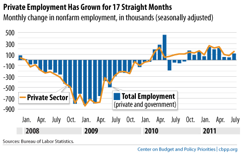
Laura E. sent in a link to the Off the Charts blog by the Center for Budget and Policy Priorities. They posted a set of charts highlighting ongoing unemployment in the U.S. Overall, the private sector has been adding jobs, but at generally very low levels:
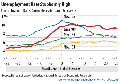
But we lost so many jobs relative to the overall working-age population during this recession that the slow job growth simply isn’t enough to significantly alter the unemployment rate, which is still hovering around 9% (though much higher for some groups, particularly young people and racial and ethnic minorities):
The increased labor force participation we saw during the 1990s and 200s have been erased:
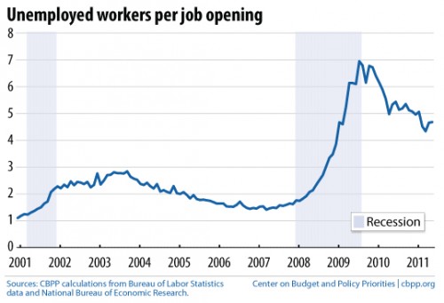
The CBPP has a collection of recession-related charts, including this graph of the number of individuals needing a job per each available job opening, a ratio that remains quite discouraging:
In the last few days since the debt ceiling fiasco, a number of economic experts have begun discussing the possibility of a double-dip recession and, as you may have heard, last night Standard & Poor’s downgraded the U.S. debt rating. Overall, it’s not an encouraging picture of our immediate economic future.


Comments 5
Interesting News Articles For August 8th, 2011 « Welcome to the Doctor's Office — August 8, 2011
[...] from Sociological Images [...]
Games — January 22, 2026
Interesting insights on the U.S. unemployment datacaleb james goddard. Thanks for the update!
John Seth — January 22, 2026
This data really helps in understanding the current economic situation apeoplesmap.org services. Great post!
Ali Shan — February 20, 2026
Thanks for sharing this insight. It's interesting to see how the private sector is slowly adding jobs, but the overall unemployment still remains high. Hopefully, these charts encourage more policies to support job growth techbunch.
Ali Shan — February 20, 2026
This is a helpful overview. The low levels of job additions in the private sector highlight the ongoing challenges in the labor market. Hopefully, we see more positive changes soon thetrender.