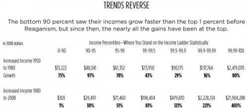
Captain Crab sent us an article by David Johnston in the Willamette Week that looks at changes in income inequality in the U.S. since 1950.Based on an analysis of research by Saez and Piketty (2007, with updated 2008 data available at Saez’s website–the first entry under “Income and Wealth Inequality”), Johnston calculated changes in income for various income percentiles in the U.S. Between 1950 and 1980, the bottom 90% of income earners saw their incomes increase by 75% (a gain of $13,222), a rate higher than or comparable to the highest income groups. However, between 1980 and 2008, incomes of the bottom 90% has largely stagnated, while the incomes of the super rich have soared (all data in constant 2008 dollars, adjusted for inflation):
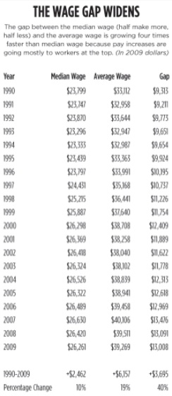
As a result the difference between the median wage and the mean wage has widened (data from the Social Security Medicare Database):
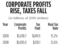
Johnston also includes data on changes in corporate income tax rates, based on IRS data. The actual tax rate — how much corporations pay after various loopholes and tax breaks — fell between 2000 and 2008:
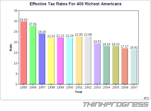
On a similar topic, Deeb K. sent in a link to images at Think Progress showing the actual tax rate of the 400 richest Americans between 1995 and 2007, based on IRS data. During that period, the effective tax rate of this group fell by 13 percentage points:
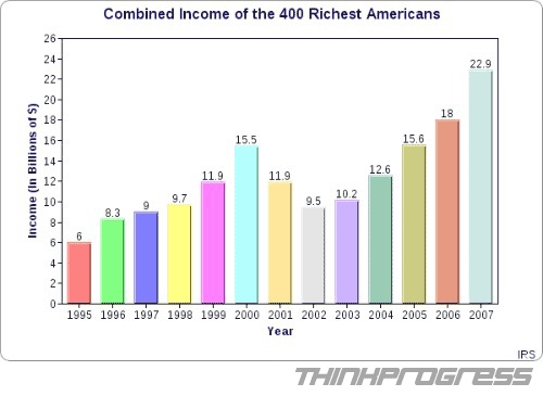
Their incomes, on the other hand, jumped significantly:
Also see my recent post on various illustrations of inequality in the U.S.

Comments 8
Grizzly — April 20, 2011
Even though their effective tax rate went down, their overall tax liability increased from $1.8 to $3.8 billion dollars, an increase of 212%, or about $5 million per person.
They also covered more of the overall federal budget. In 1995 this 0.00016% of the population covered .13% of the federal budget. In 2007 they covered .15%.
So even though their tax rate went down, they still payed more actual dollars, and covered more of the total tax bill.
I'm not arguing whether that their tax rate should have remained the same, but the charts as stated could imply that they pay less, and that the burden on the rest of us would have increased as a result. Neither of these things are the case.
JGA — April 20, 2011
They DO pay less than their fair share, unless you really want to argue that "fair share" is better defined by absolute amount rather than effeective rate (percentage). Choosing the former is simply ludicrous.
Ian Welsh — April 20, 2011
They pay more because they are far far richer than they were before. What do I care if my tax goes from 60$ on 100 income to 100 on 380 income.
Yrro — April 21, 2011
These graphs always compare the top X% to the median, or to the lowest ten %... I'm curious how it looks for each 10% increment.
Did no one but the top 10% show growth? or did the 60%, 70%, and 80% groups show growth, and the lower ones a decrease?
I guess I can see a strong possibility for bifurcation in this regard, as more and more well-paying jobs are depending on higher education.