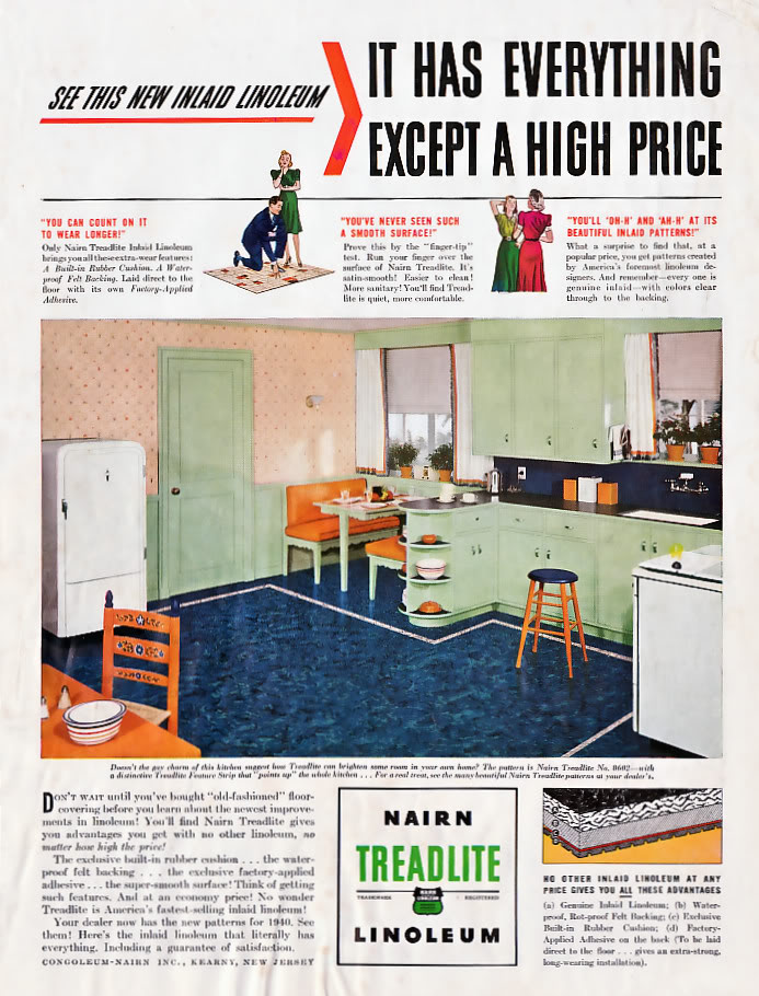
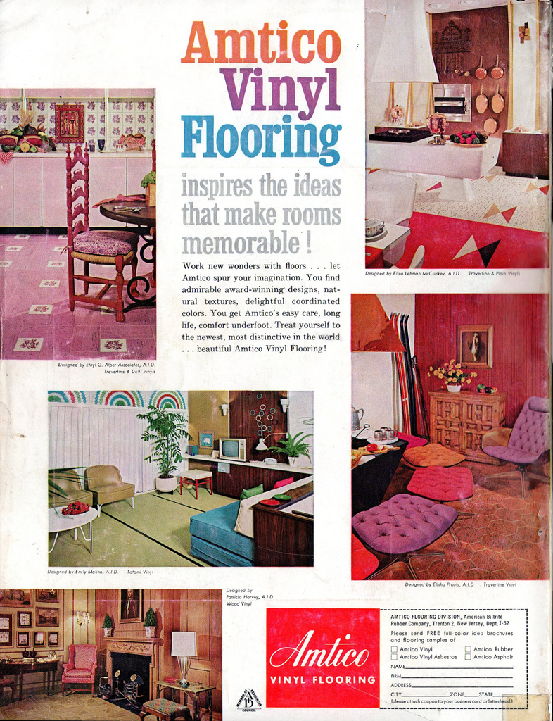
I love how these two vintage ads reveal that colors are experienced differently across time and cultures. Both ads feature color schemes that, today, seem outrageous, even hideous. Yet, at the time, they must have been cutting edge and quite fashionable.
Both images from Vintage Ads (here and here).
Lisa Wade, PhD is an Associate Professor at Tulane University. She is the author of American Hookup, a book about college sexual culture; a textbook about gender; and a forthcoming introductory text: Terrible Magnificent Sociology. You can follow her on Twitter and Instagram.


Comments 19
Ben — December 26, 2010
There is literally a secret cabal of designers who meet every year in Italy or Germany and decide what next year's colors will be. Generally, they meet before the annual Première Vision fashion trade fair and write up a report where they suggest the next hot color combination. Fabric and dye manufacturers take this report and start producing variations on this theme and designers use it to inspire their collections. About 6-10 months after the report comes out, the designs hit the runway and get covered by the fashion and design press, further spreading the news. And a few months after that, the process starts anew.
Erika — December 26, 2010
Another factor that might contribute to the appeal of the intense floor colours is the newness and expense of linoleum. In the same way that jello molds indicated the wealth of a fridge, linoleum might be a display of wealth.
larrycwilson — December 26, 2010
Hideous? Oh, really?
shykate — December 26, 2010
The garish Mauveine that was the first synthetic dye was all the rage when it premiered in the Victorian era. It got used in some rather peculiar color combinations, so make sure to tell your local Steampunk enthusiast that their drab wardrobe would have been quite scorned back in the day. (And they will probably remind you that nobody wore mauveine on a pirate airship, please.)
Carol the Long Winded — December 26, 2010
I want the top kitchen, except with a modern fridge, stove/oven and dishwasher.
gasstationwithoutpumps — December 26, 2010
Dated, yes. But neither hideous nor outrageous. Or is the original poster so tied to following the current fashions that anything a few years old looks outrageous?
Alix — December 26, 2010
The first image is oh so like my grandparents' home; the second, I grew up with. I like *both* in different ways, and would decorate my house in either one. Retro yes, but hideous is in the eye of the beholder.
Danny — December 26, 2010
It doesn't look that bad... The blue one is actually kind of nice. I tend to hate cream-colored anything, though, so I'm not the best indicator.
...Is white still the only color anyone is allowed to decorate in?
Syd — December 26, 2010
IDK. The pink/purple/orange and bright green/bright blue combination are still pretty popular among girls of a certain age; I see them a lot in college dorm rooms and Target/WalMart ads aimed at teens and pre-teens. The color combinations aren't so much what's outdated or 'hideous' as the furniture it's on. Also, retro for the sake of retro regarding this era (presumably the late 1960s or 1970s, in the second picture) has been pretty popular since the 90s and never fully faded out.
Alll — December 26, 2010
My bathroom (c. 1960) is pink. As I understand, that was very popular for bathrooms.
Susanjune — December 26, 2010
I'm deeply in love with the pink flowery 'Lino' as we called it here in Australia. Then again I loved my parents pink bathroom circa 1960.
Basiorana — December 26, 2010
Most people don't realize that all those statues and buildings in Ancient Greece were painted-- and by our modern aesthetics, quite garishly
http://www.google.com/images?q=greek+statues+painted&oe=utf-8&rls=org.mozilla:en-US:official&client=firefox-a&um=1&ie=UTF-8&source=univ&ei=4MwXTYSgDcH6lwfXz_zGCw&sa=X&oi=image_result_group&ct=title&resnum=1&ved=0CCkQsAQwAA&biw=1051&bih=504
We tend to assume there is something innate in our sense of taste; that what we consider to be good taste or bad taste has always been so-- completely wrongly, of course.
DCM — December 27, 2010
Clearly, I was born into the wrong decade. I love some of those garish colours, and would especially like to pair the strange flowery floor and pinkish wall.
AitchCS — December 27, 2010
Anything Mid-Century right now is hot---