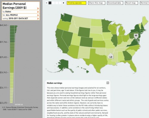
Dmitriy T.M. and Jeff H. sent in a link to Mapping the Measure of America, a website by the Social Science Research Council that provides an amazing amount of information about various measures of economic/human development in the U.S. Here’s a map showing median personal (not household) earnings in 2009:
The District of Columbia has the highest, at $40,342; the lowest is Arkansas, at $23,470 (if you go to their website, you can scroll over the bars on the left and it will list each state and its median income, or you can hover over a state).
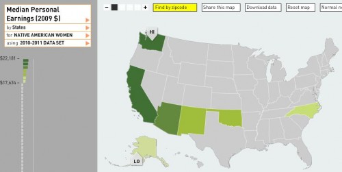
You can break the data down by race and sex as well. Here’s median personal income for Native American women, specifically (apparently there is only sufficient data to report for a few states):
Native American women’s highest median income, in Washington ($22,181), is lower than the overall median income in Arkansas, which is the lowest in the U.S. as we saw above.
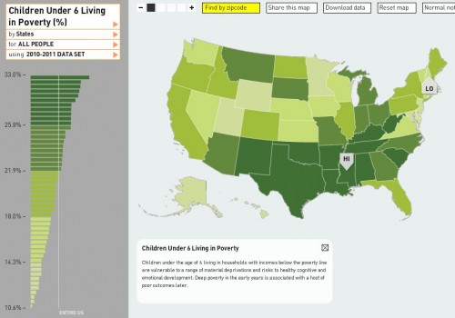
Here is the percent of children under age 6 who live below the poverty line (for all races):
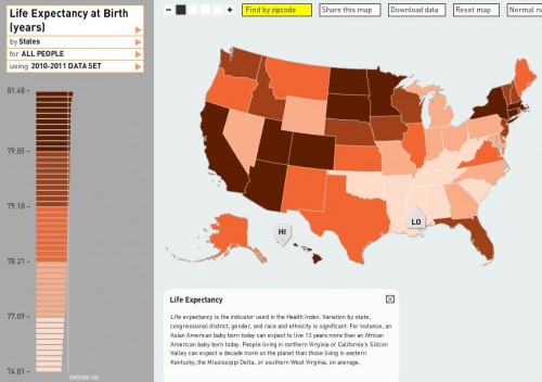
Life expectancy at birth differs by nearly 7 years between the lowest — 74.81 years in Mississippi — to the highest — 81.48 years in Hawaii:
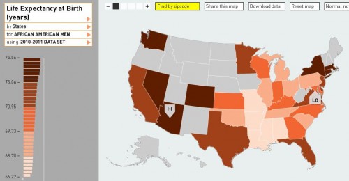
It’s significantly lower for African American men, however, with a life expectancy of only 66.22 years in D.C. (again, several states had insufficient data):
The site has more information than I could ever fully discuss here (including crime rates, various health indicators, all types of educational attainment measures, commuting time, political participation, sex of elected officials, environmental pollutants, and on and on), and it’s fairly addictive searching different topics, looking data up by zip code to get an overview of a particular area, and so on. Have fun!

Comments 8
Dave Garber — November 19, 2010
Thanks, Gwin, for this link. Fairly interesting stuff. I would caution the reader, however, to be weary of using the income statistics to make any general conclusions. These are nominal income statistics, not taking into differences in cost of living. What is more revealing is informaiton on real income that takes into account cost of living, thus being a better indicator of quality of life (or living standards). For example, even though Washington, DC, has the highest median income, the quality of life in DC and its metro area is noticeably significantly lower than a place like Minneapolis where median incomes are fairly high and cost of living is very low. But, then again, if you don't like the cold, DC may be better for you.
Meg — November 19, 2010
I think one of the most interesting things about this chart is if you notice the highest and lowest congressional districts for for the income index in the entire country are right next to each other. CD14 and CD16 New York. That's pretty extreme.
j-p — November 19, 2010
Surprising how uneven results are in New England states...
Edward Ingram — November 20, 2010
What an interesting graphic... really nice interactive interface, too...
Like the other commenter, I also wondered why cost-of-living was not factored against median incomes. Also, perhaps they could tweak the index to add crime rates .. I would also add quality and quantity of museums/performing arts organizations, etc. to the "Access to Knowledge" component.
Or just add dozens and dozens of data sets so people could rate their own factors and come up with their own maps.... but still, it's really a neat map as is..
Bagelsan — November 20, 2010
Very few data points, but I'm intrigued by how the map of Native American women's income seems to match the pattern/timeline of European expansion across the continent... (at least somewhat.) I wonder if there's an actual correlation between length of time white people were in an area and the impoverishment of the original inhabitants. I'm sure it's not that simple in reality but the visual is striking.
More generally, I freaking love information displays like this. It's easy to get carried away, sure, (as I start to above... :p) but I'm very visual and I really find it so much more exciting and approachable than lists and stats.
Sociological Images course guide: Asian Americans and Pacific Islanders : Asian-Nation : Asian American News, Issues, & Current Events Blog — April 16, 2013
[...] Database of Human Development Information [...]
Jeremy Klein — April 26, 2024
Database systems are intricate constructs that require adept handling. Successfully navigating them demands not only experience but also a deep understanding of their nuances. When seeking proficient management, consider entrusting the task to seasoned experts who possess the requisite expertise. For reliable support and optimized performance, I highly recommend exploring the services offered by https://dbserv.com/managed-dba-services. Their track record speaks volumes about their proficiency in this field. With their assistance, you can ensure that your database operations are in capable hands, allowing you to focus on your core business objectives without the burden of technical intricacies.