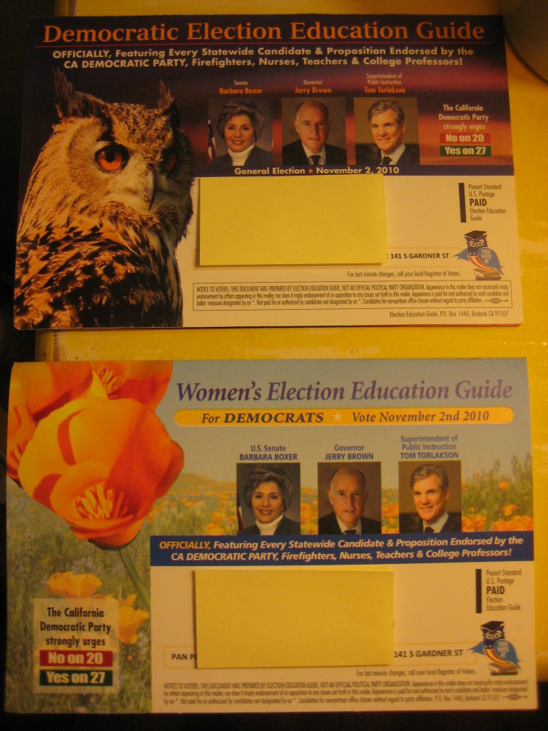
Being a voter in Nevada, I have been inundated with political mailers this season. I have clearly been identified as a Liberated Woman Voter who will respond to arguments that a candidate’s opponent hates women and plans to have us all chained in the kitchen immediately upon taking office. I meant to save some of the images from the mailers for a post about targeting female voters, but I forgot to. Well, not so much forgot as became so overwhelmed with the pile that I threw them away. Apparently I have not been targeted as a voter who cares about environmental concerns and might be horrified by the number of things I’m receiving in the mail, often the identical mailer several times a week.
Luckily, Leigh C. sent us a nice example. Leigh got both of these voter guides in the mail on the same day, both from the exact same group, with the exact same content inside. However, as you’ll notice, one is the default guide, and one is the guide specifically for women. And how do you clearly signal something is for women? With a flower! (Or, as Leigh put it, a “vaginal poppy”):
The mailers I got tended to prominently feature women in business suits, the universal signal for Liberated Career Women, obviously.


Comments 14
Madeleine — November 2, 2010
Ugh. Must you describe California's state flower (the California poppy) as vaginal? I quite like it, and it's common symbol for the state.
It's true that all flowers are literally sex organs (male and female), but so are pine cones. It's not like we're looking at an orchid. If this flower looks like a vagina, so does any bowl shaped object: a tea cup, a bathroom sink, or a pot hole.
Laura Beth — November 2, 2010
This liberated woman and raptor rehabilitator would be very upset to NOT receive the owl mailer.
R — November 3, 2010
I'm shocked the content is exactly the same inside. Nothing additional about candidates' stances on "typical" women's issues or easy-to-tear-out voter's guide?
I don't see the gains by creating a new outer packaging just for women if it's the same inside - this isn't product marketing where the packaging impacts buyer behavior. Putting a flower on something isn't likely to convince someone to vote a certain way (and for those on whom it might work, they'll likely just vote for everyone with a "D" anyway). I'm confused by this.
Anonymous — November 3, 2010
men = default, women = other, as usual.
Lindsey — November 4, 2010
I find it weird as well that they actually stated "women's" on the flower version - in case you weren't drawn the bright soothing colours and images you are also explicitly told that this is what you should be looking at. Having an authority endorse the idea that you should seek out and focus on imformation addressed specifically as "for women" seems like a really good way to put subconscious limits on what information women will access - even if in this case the information was the same it reinforces the idea that some information is just not for you. Obviously it works the other way around too, discouraging men from accesses information about "women's issues" and appreciating plant images.