Sorry for the sporadic posting. I’m visiting family in Oklahoma and that means very, very limited internet access.
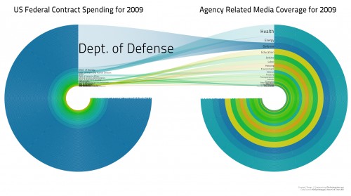
Zac from Georgia sent in a link to some interesting images that illustrate the mismatch between what the federal government spends money on and what the media cover. This image shows spending only via federal contracts (not all spending) compared to all articles in the New York Times in 2009 (granted, a very small sample of all media coverage, so keep that in mind):
Contract spending data is available here.
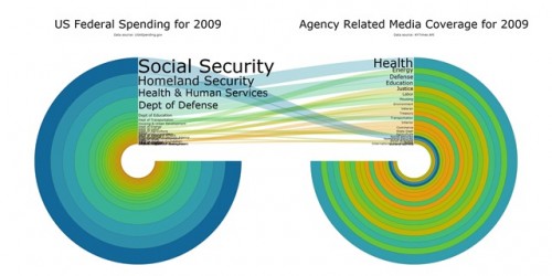
This time we have all spending, not just spending through contracts; the Department of Defense has dropped down to 4th place:
Gwen Sharp is an associate professor of sociology at Nevada State College. You can follow her on Twitter at @gwensharpnv.


Comments 10
Scapino — June 8, 2010
Looks like the first graph is all artifact (I'm surprised they didn't present contract involving overseas personnel, to distort the data even more; it's pretty clear they had an agenda). The second graph has Defense on 4th on actual spending and 3rd on media coverage. Pretty close (and errs on the side of over-representation), not sure where the "mismatch" comes in.
Nizam — June 8, 2010
These graphs are exemplifying the same problem we had with the pyramid charts about the food subsidies a couple of weeks ago.
When the data is rendered in concentric circles, the relative proportions are squared, which throws off the actual quantitative relationship between the categories of spending.
md — June 8, 2010
Isn't the point of a graph to clearly present data so that it can be easily understood? This "graphs" are terrible.
Raegal — June 8, 2010
It looks like viewing these graphs in small size does them a disservice, but I think the point of these are to inform in an artistic way. This is pretty interesting. Information driven art. And by what they had to say, it looks like they are exploring new ways of visualizing data. I support that idea because the common ways of portraying data today are typically uninteresting and boring. It made me look at and think, which a bar graph won't do.
Media Coverage of Federal Spending | Free Market Mojo — June 9, 2010
[...] Gwen Sharp has posted a series of interesting images showing the “mismatch between what the federal government spends money on and what the media cover.” [...]
Anonymous — June 9, 2010
Yes. It's the case in large parts of the world. I suppose, then, that the rest of the world is just "mad", right? What a nice example of a first-world privileged viewpoint so easily packaged into a casual throw-away line. "Oh, no! Difficulty in getting onto the Internet! Such madness!!!!"
... and if memory serves, you've had the same problem in the past when you visited your folks in OK. And you had the same reaction. If you know that this will be a problem that you will be having; one that you don't want to have; and one that you might be able to fix, then why not fix it? Is the OK such a backwater as not to have access to cable internet, DSL, satellite, or cellphone-based access?
Quasi — June 24, 2010
Ahem, this is quite late, but aside from the valid points on the somewhat-misleading data representation in these pictures, why are we making the assumption that percentage of dollars spent on a budget item should translate directly to percentage of words spent on covering this area in the news?
One obvious example would be health, which obviously took more space out of media airtime during 2009 - not because of arbitrary reasons like "we spend more or less money on it", but because the healthcare system was rightfully receiving a lot of attention due to the Obama administration plans for it.
Ultimately, I think that this comparison is meaningless since it fails to establish why we would want to hear more about areas in which we spend more money.